Frame It Right: The Art of Composition in Photography Part III


In my last article, we talked about using framing in photography, as a way of adding depth to our photographs.  We talked about using negative space to emphasize the subject in our image, and we introduced the notion of colour theory so we could use colour deliberately, and not just as an afterthought.  This week we will learn about pattern and repetition, scale and proportion, and depth and layering. 

Again, as before, I urge you to look at past articles first and know how to implement each concept before jumping ahead.  You can read this article and can always come back to it later.  But the idea of mastering a rule or guide, and then moving on, in my opinion, is the best way to proceed.  As we explore these notions we will find that our eyes become aware, and not in a Jean Claude Van Dame kind of way, of our surroundings and you will notice that you see things that you had previously ignored.  Develop the way you look at a scene and enjoy seeing differently.

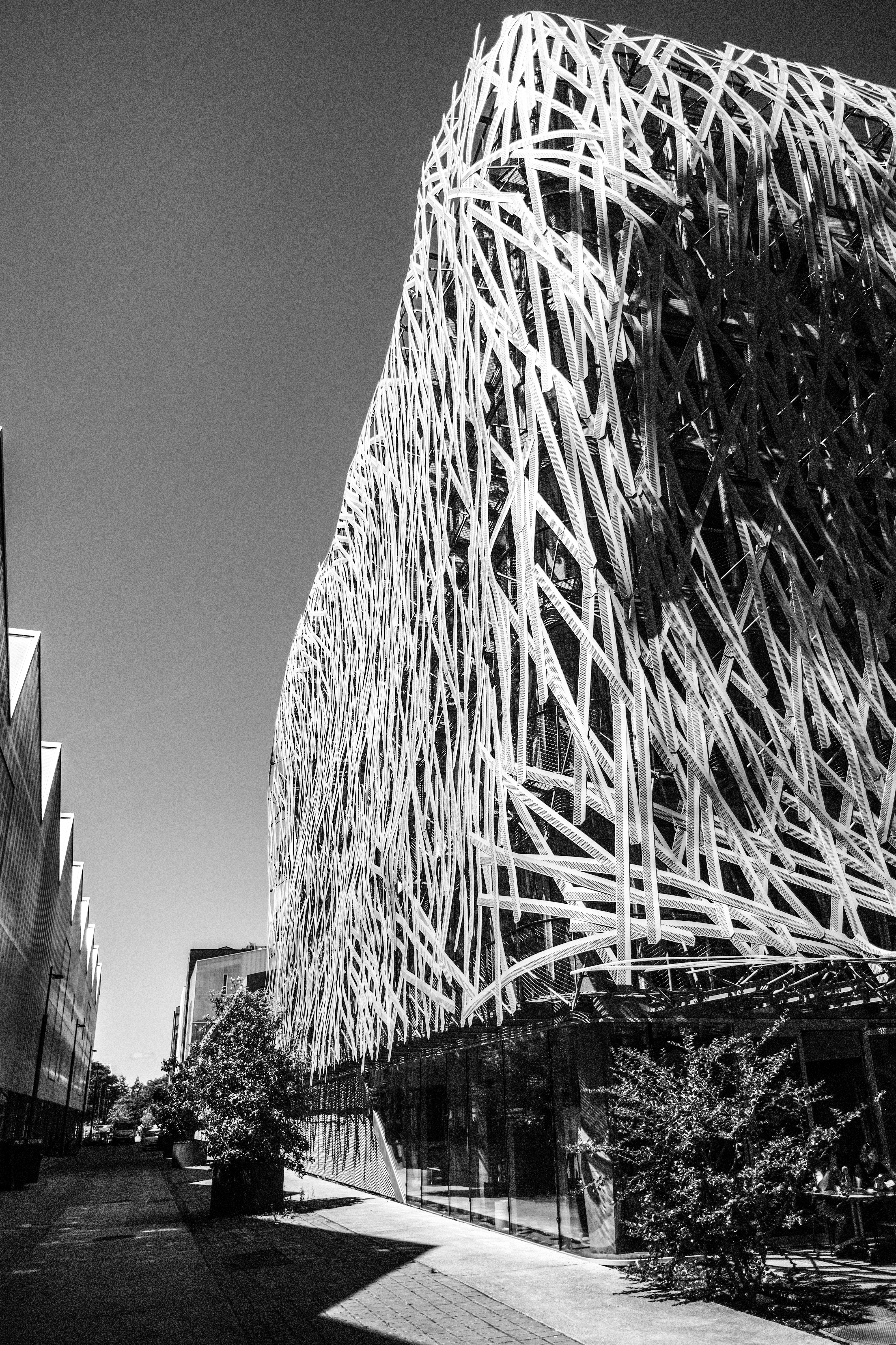
Pattern and Repetition in Photography

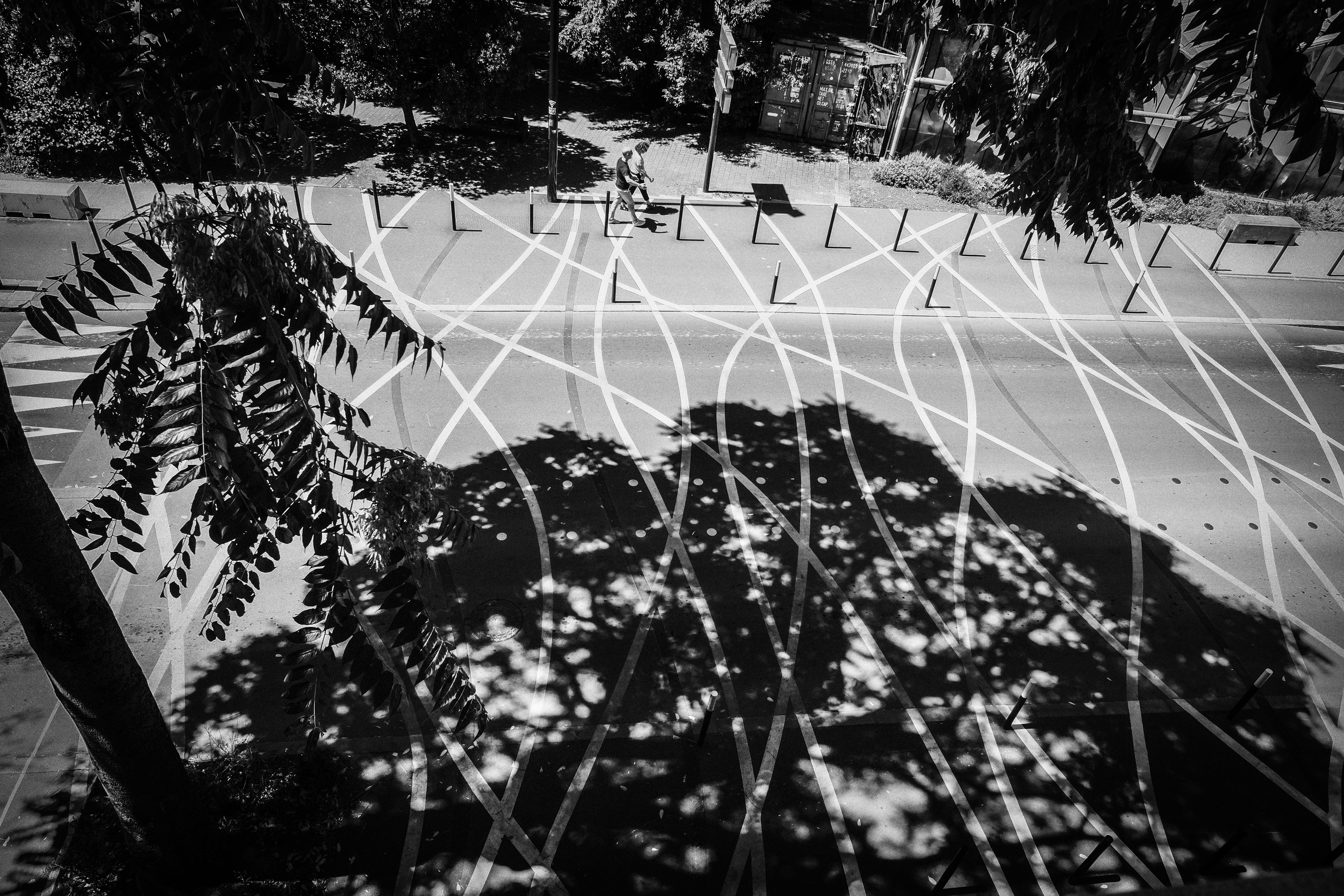
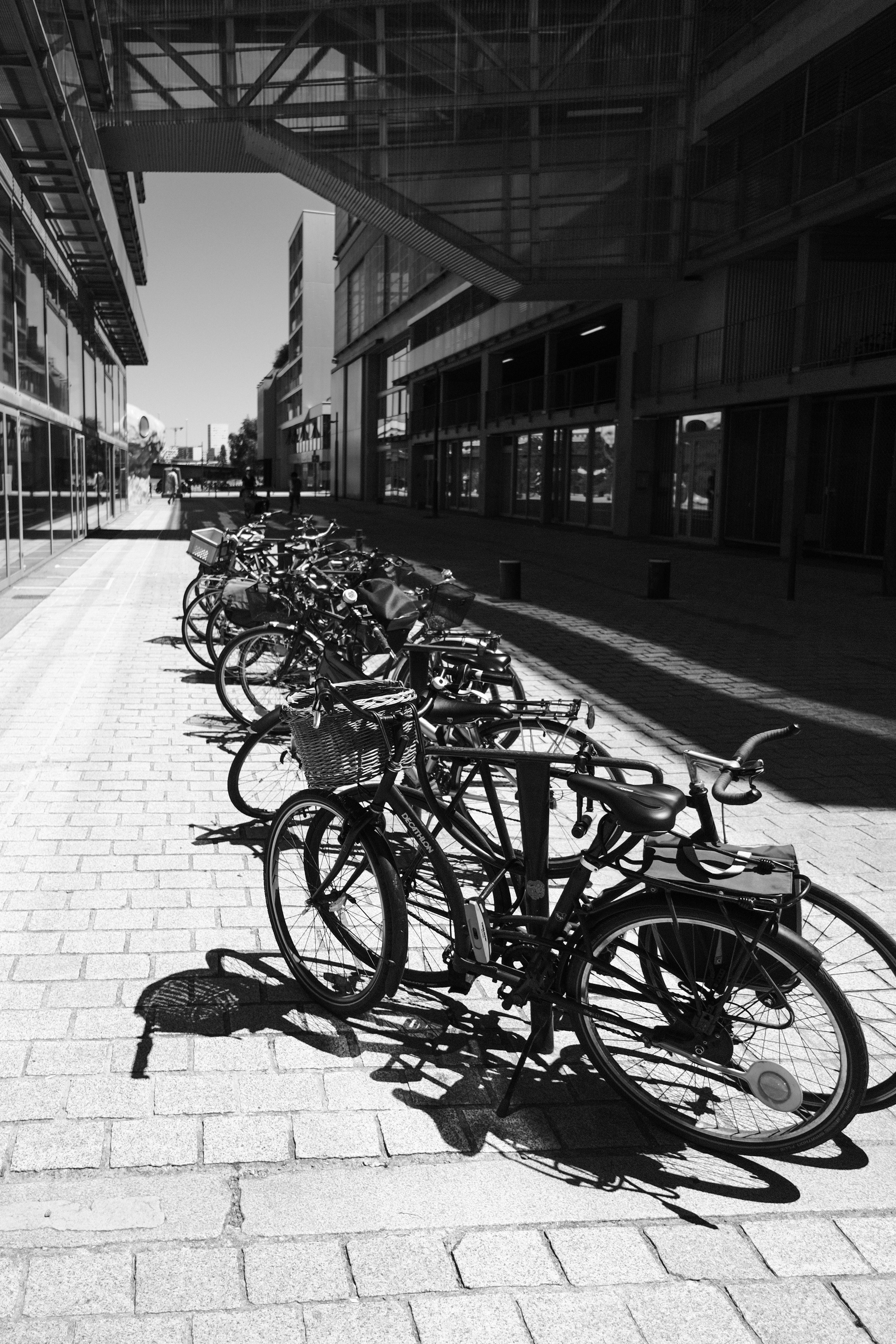
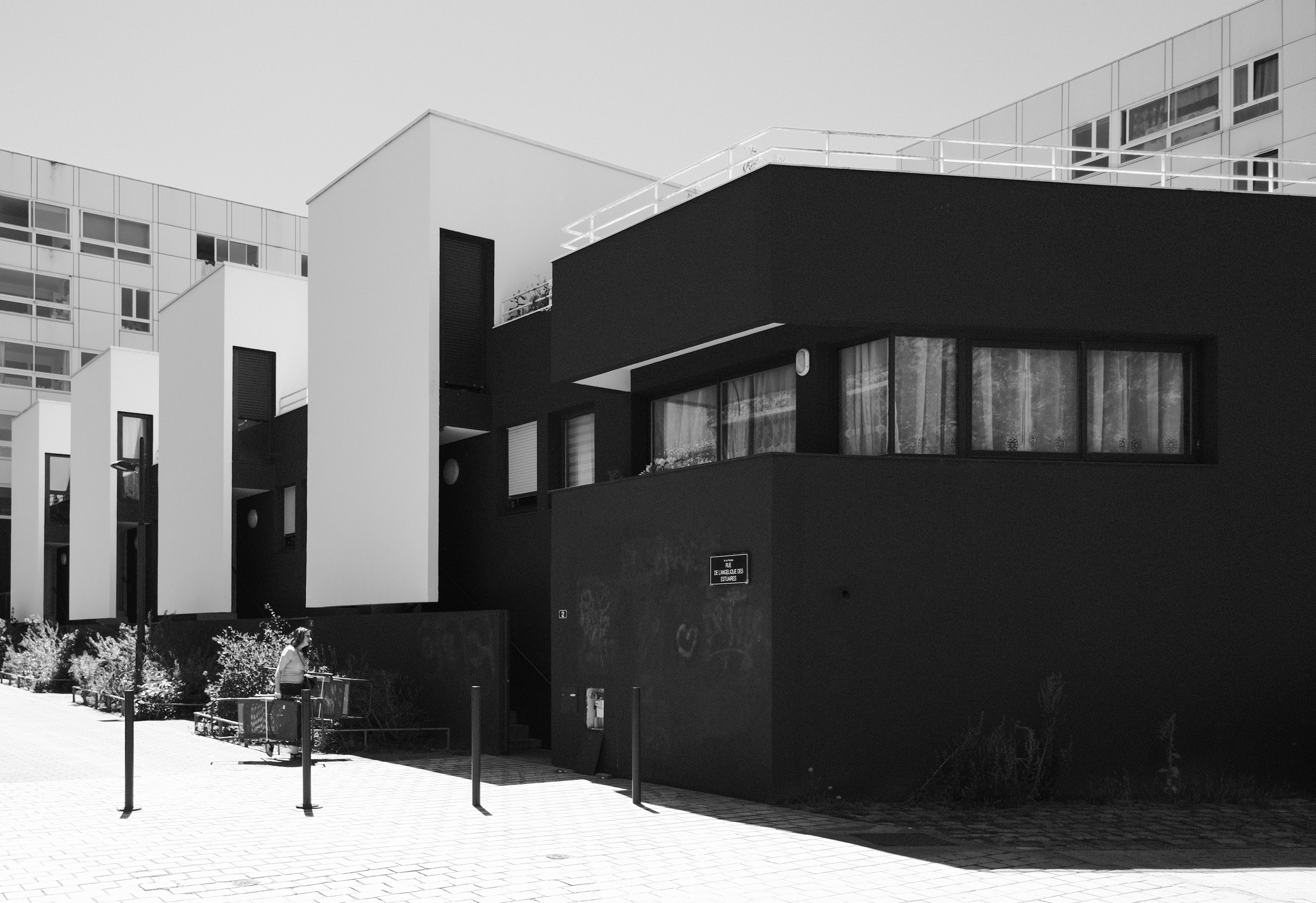
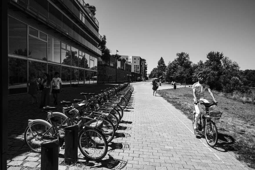
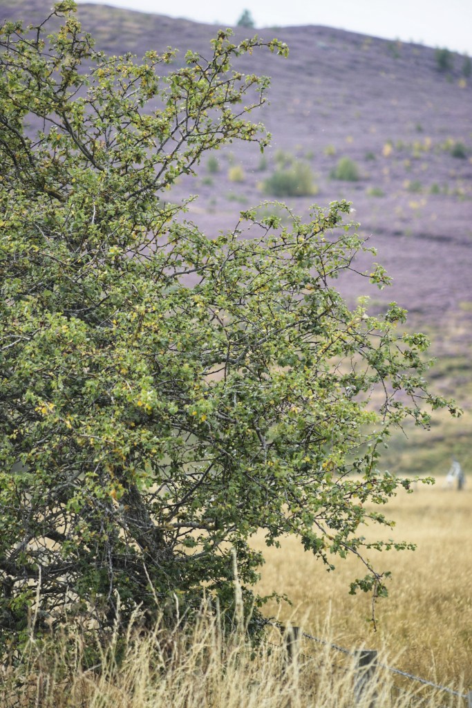
Patterns and repetition are essential elements that enhance your photos, creating visual interest and symmetry in your compositions. They can be found in both natural and man-made subjects, offering captivating visual rhythms and opportunities for exploration, and even notions of minimalism. Think of modern architecture.

Creating Visual Interest:

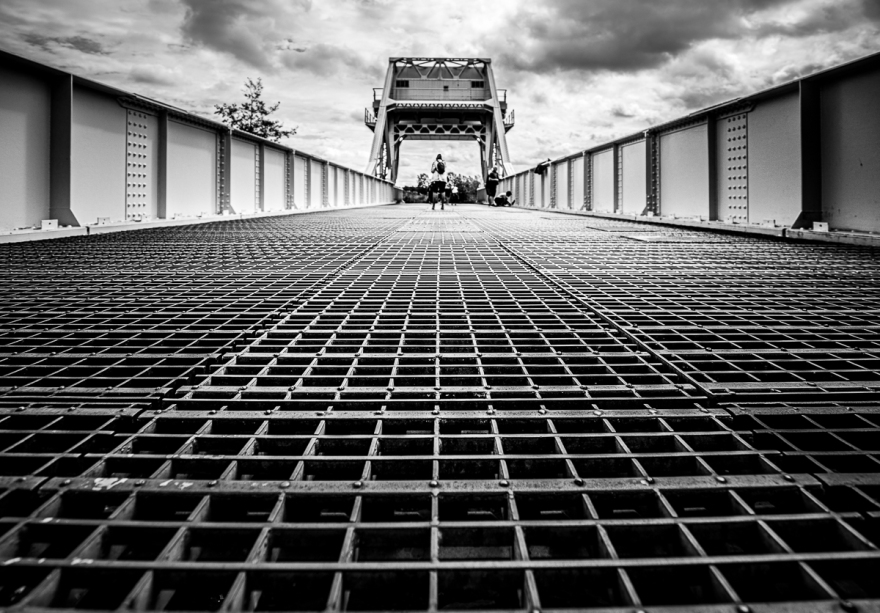
Patterns can be discovered in various forms, from natural occurrences like tree bark textures and waves on a beach to man-made elements such as architectural details or streetlights. These repeating elements draw viewers into your images, providing a sense of order and captivating visual interest, especially when you use them as leading lines.  Once you start thinking about patterns, you will begin seeing them everywhere. 

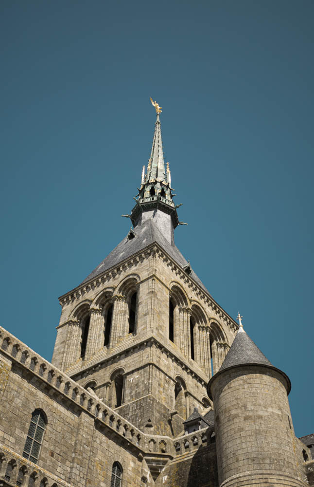
Achieving Symmetry and Balance:

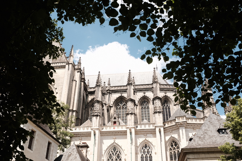
Repetition plays a crucial role in achieving symmetry and balance within your photographs. This is particularly effective in architectural photography, where the balanced repetition of elements like windows, columns, or arches can result in visually pleasing and harmonious compositions.

Scale and Proportion

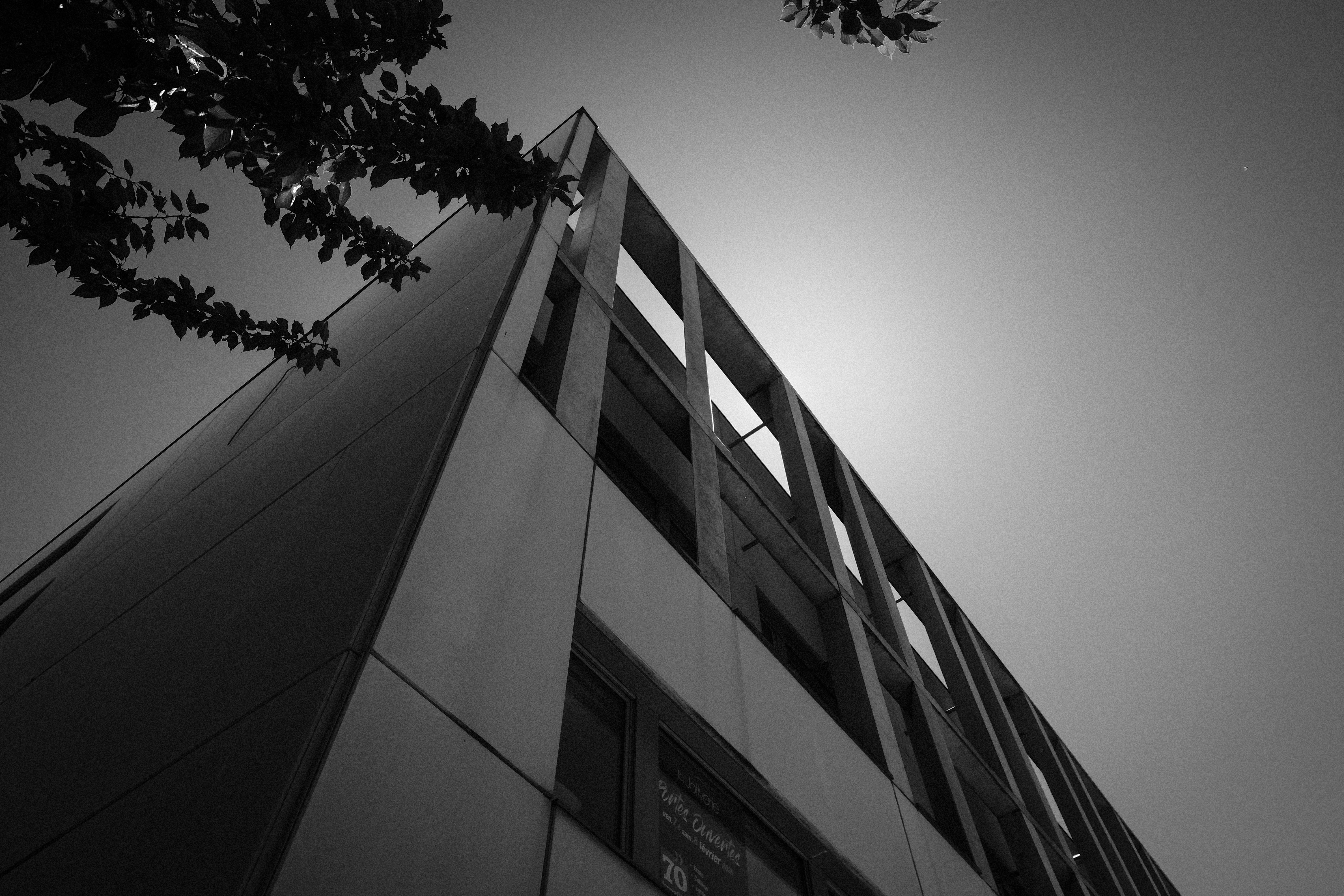
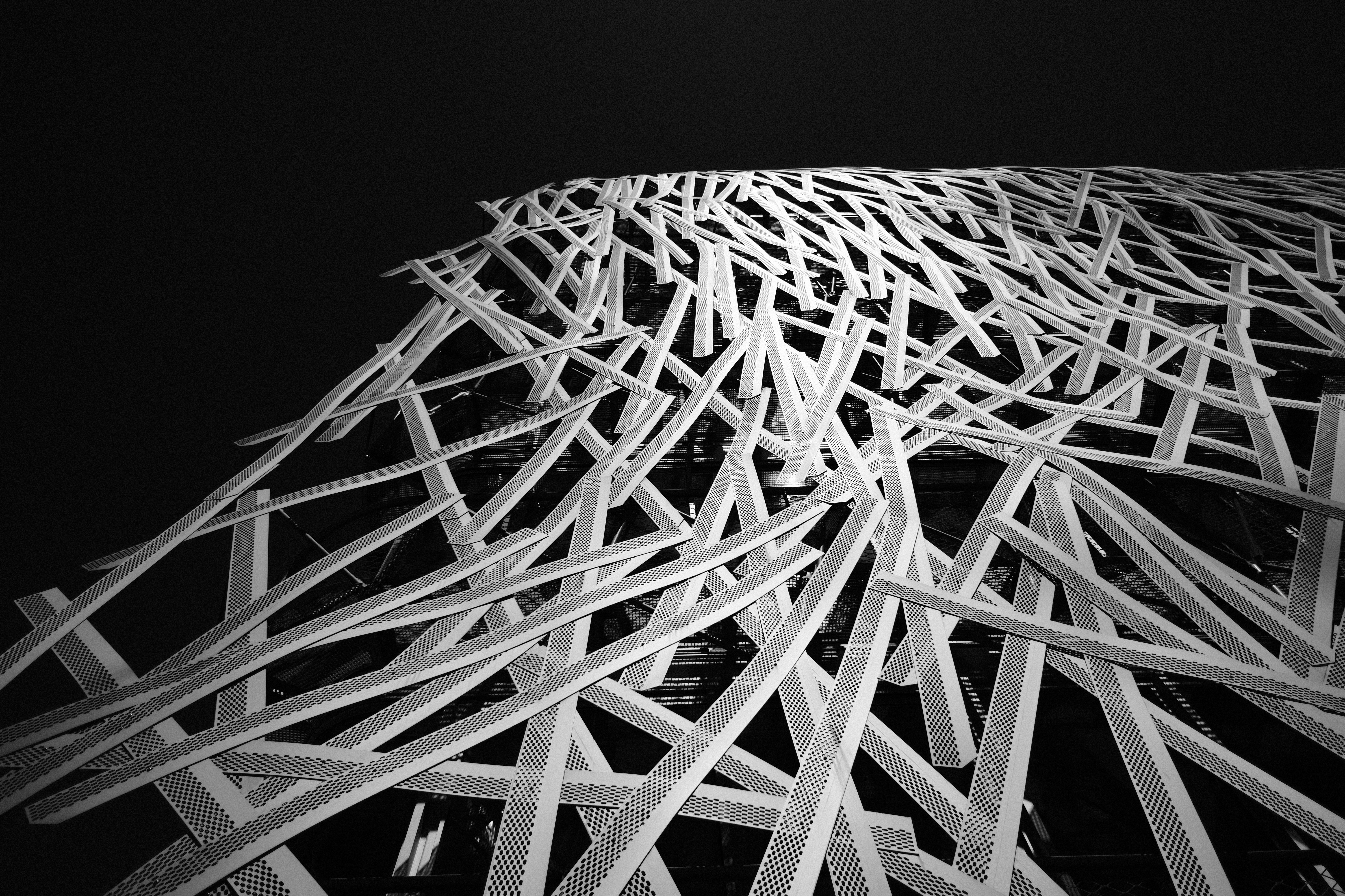
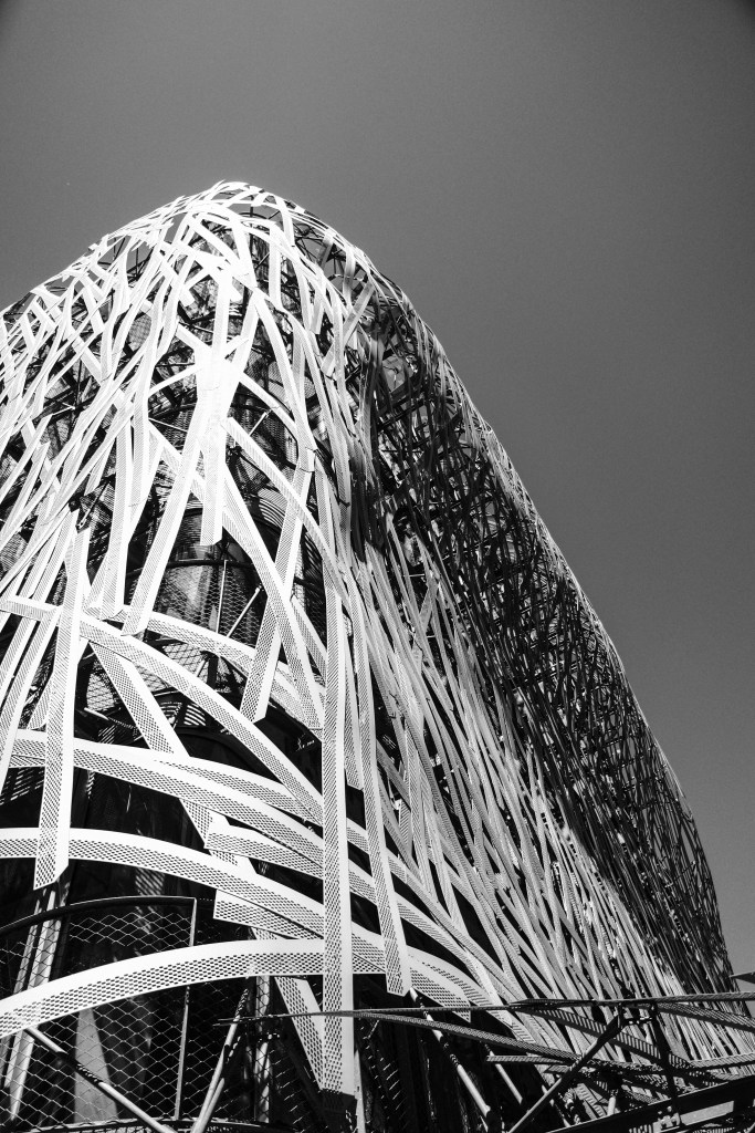
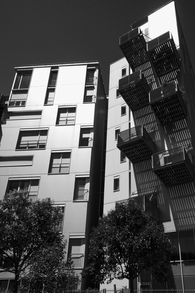
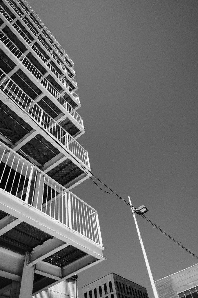
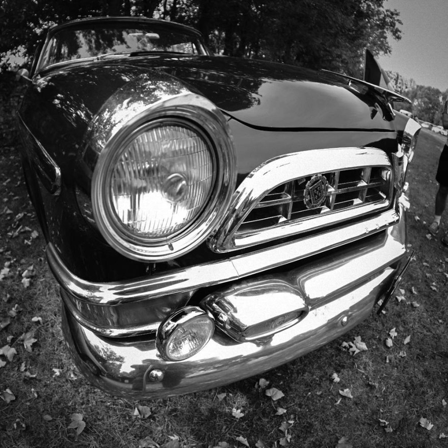
I have a weakness for my wide angled lenses, especially my 16-35mm F4 from Canon, and my TT Artisans Fish eye lens.  Instead of using the 50mm or 35mm prime lens, which traditionally show what the eye sees, the wider you go, the more distortion you can get.  Now this is interesting for when you just want to go more abstract, and make the eye wonder what it is seeing.  Scale and Proportion are thrown out of the window.

Wide-angle lenses when used as a creative tool, allow for distortion in scenes beyond the typical human perspective. For instance, a landscape captured with a fish-eye lens may distort foreground elements to appear exaggerated, casting doubt on the true proportions. This departure from reality opens doors to the realm of abstraction, inviting viewers to question the nature of what they see.

However, it’s crucial to maintain balance when utilising wide-angle distortion. Thoughtful composition is essential to ensure that the deliberate distortion serves artistic purpose. By carefully placing subjects within the frame, experimenting with angles, and embracing foreground elements, you can master the art of playing with scale and proportion, enriching your visual storytelling and artistic expression.

During my first more formal photography lessons when I was 11, I saw a photograph of a horse taken with a wide-angle lens and its head appeared as big as its body.  I was subjugated by this image and it has stuck in my head all these years.   
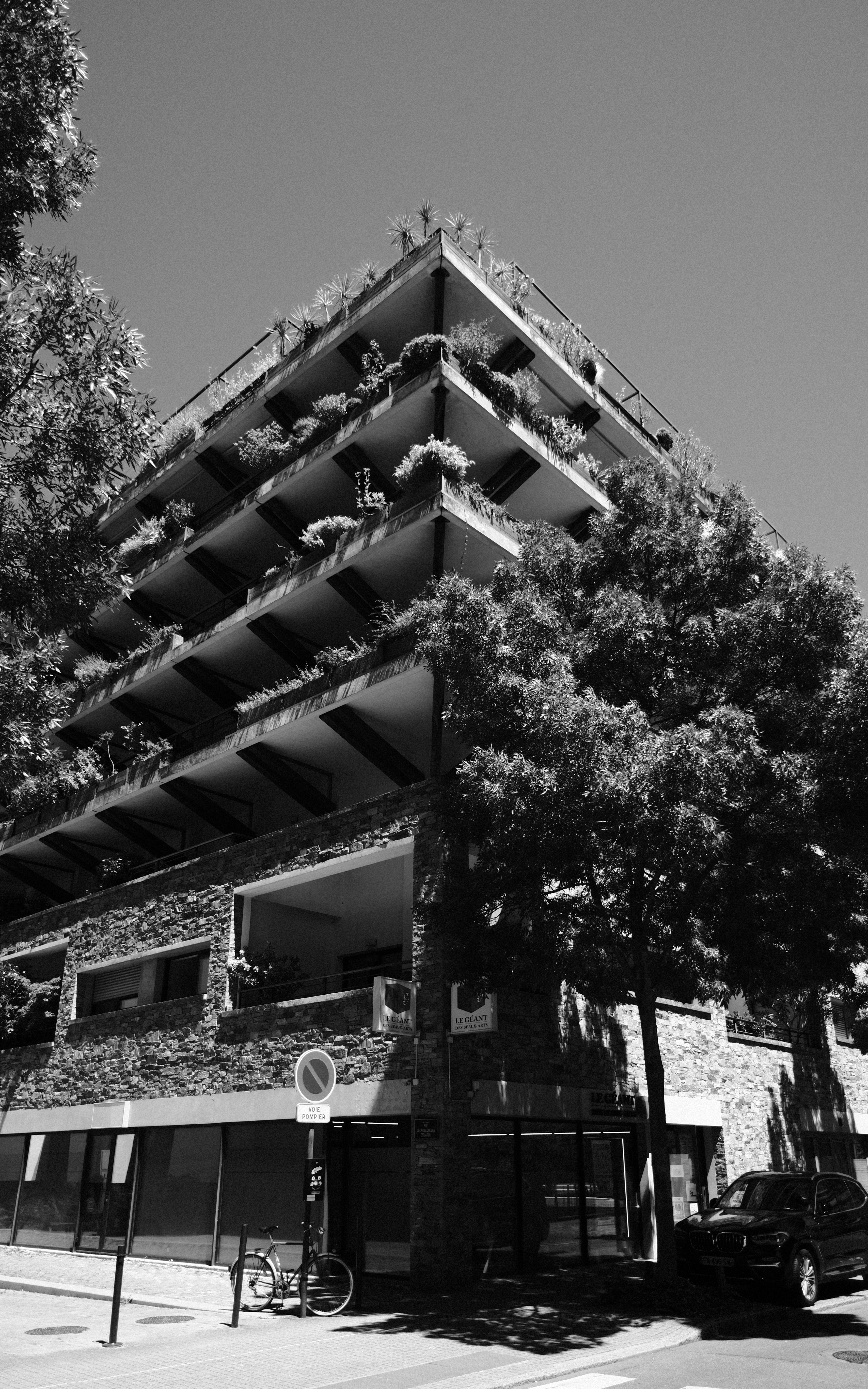
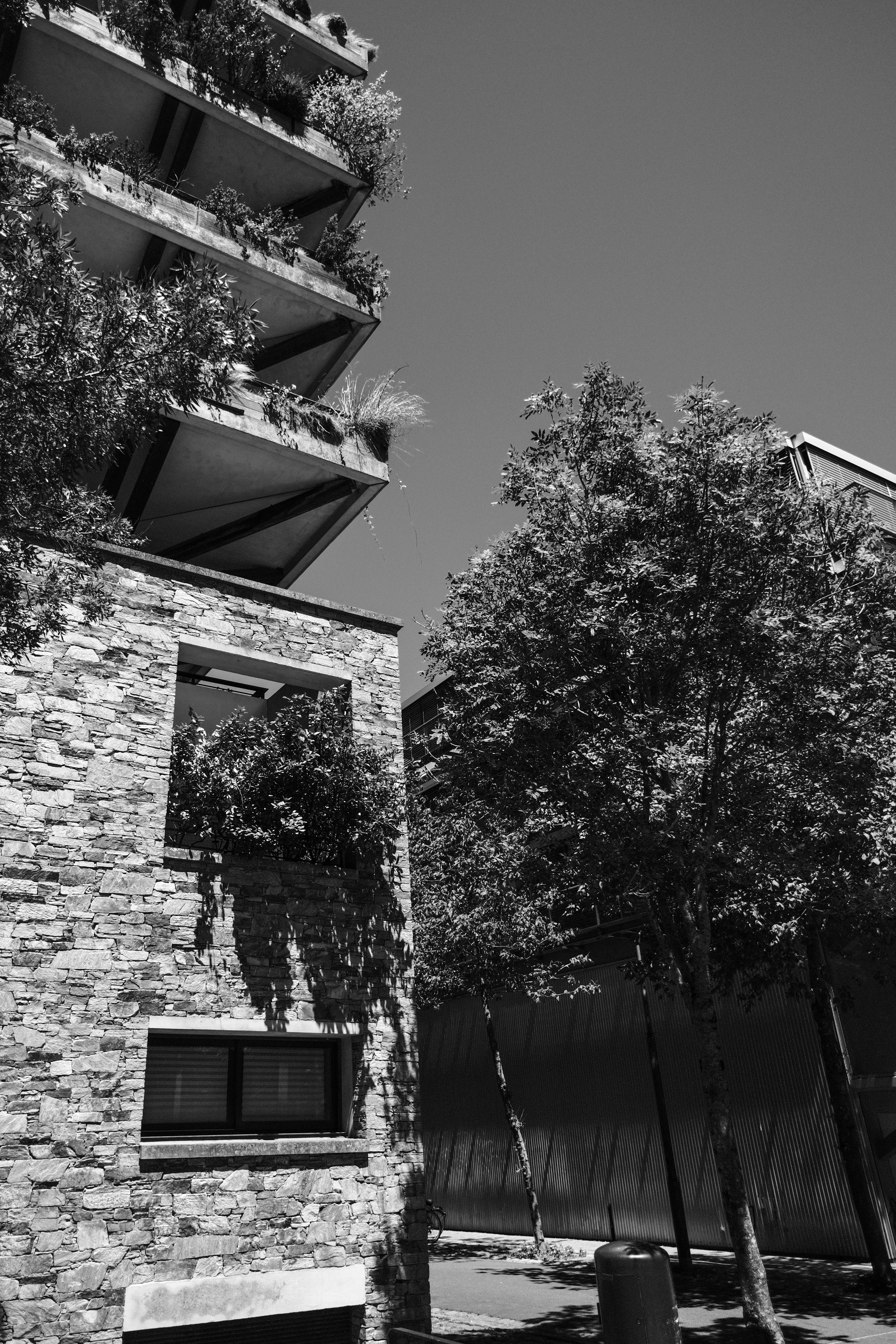
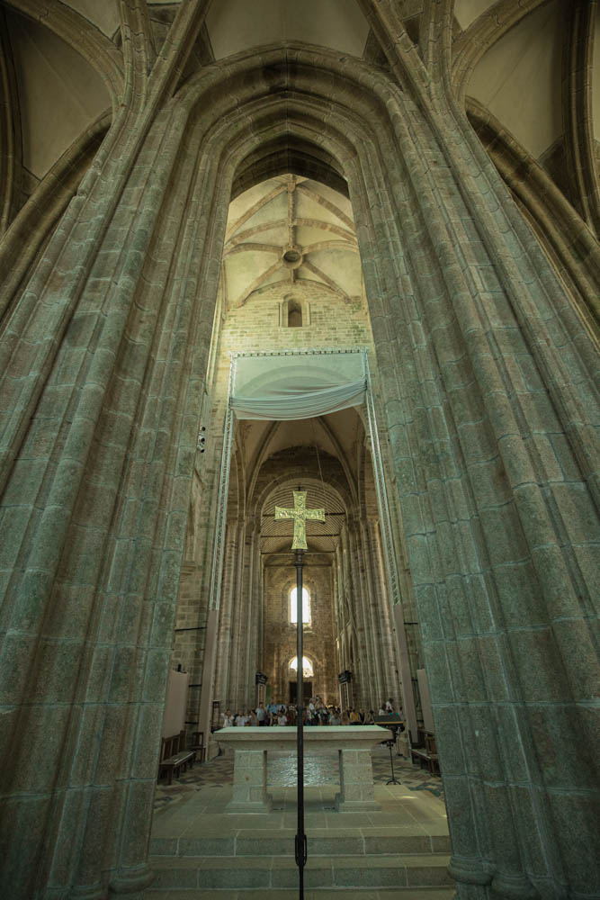
Depth and Layering

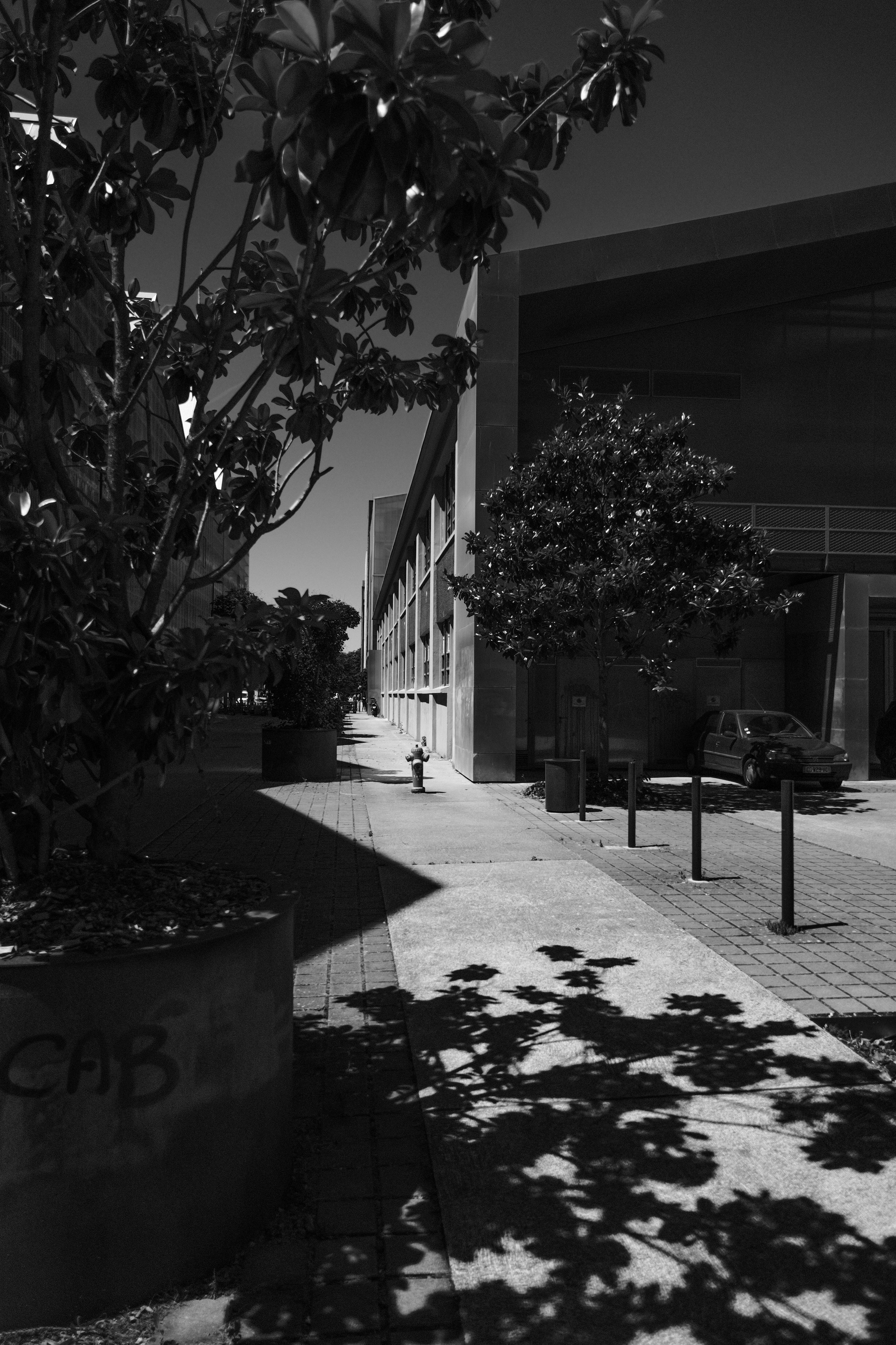
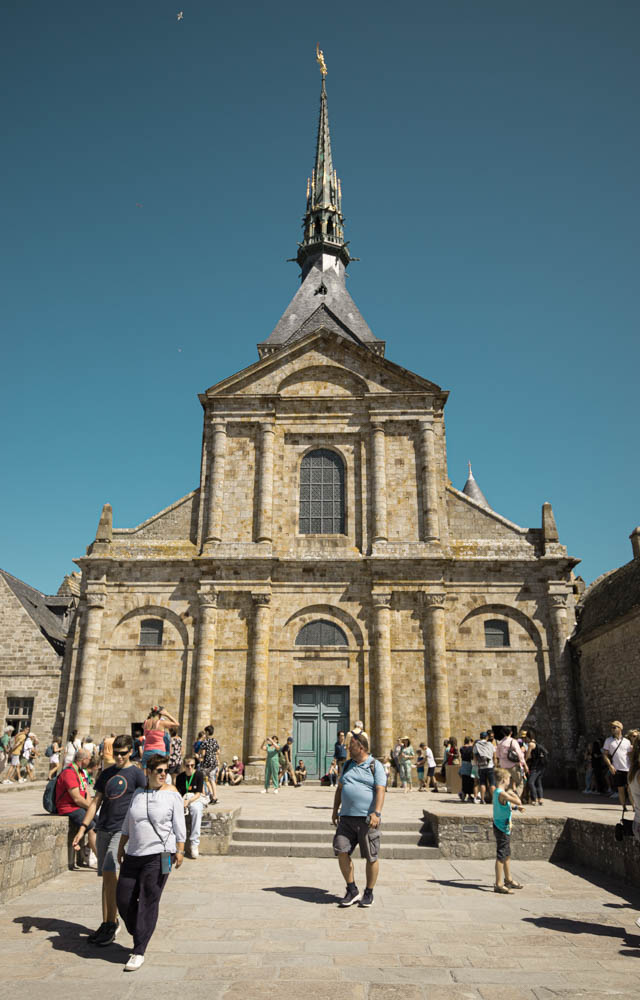
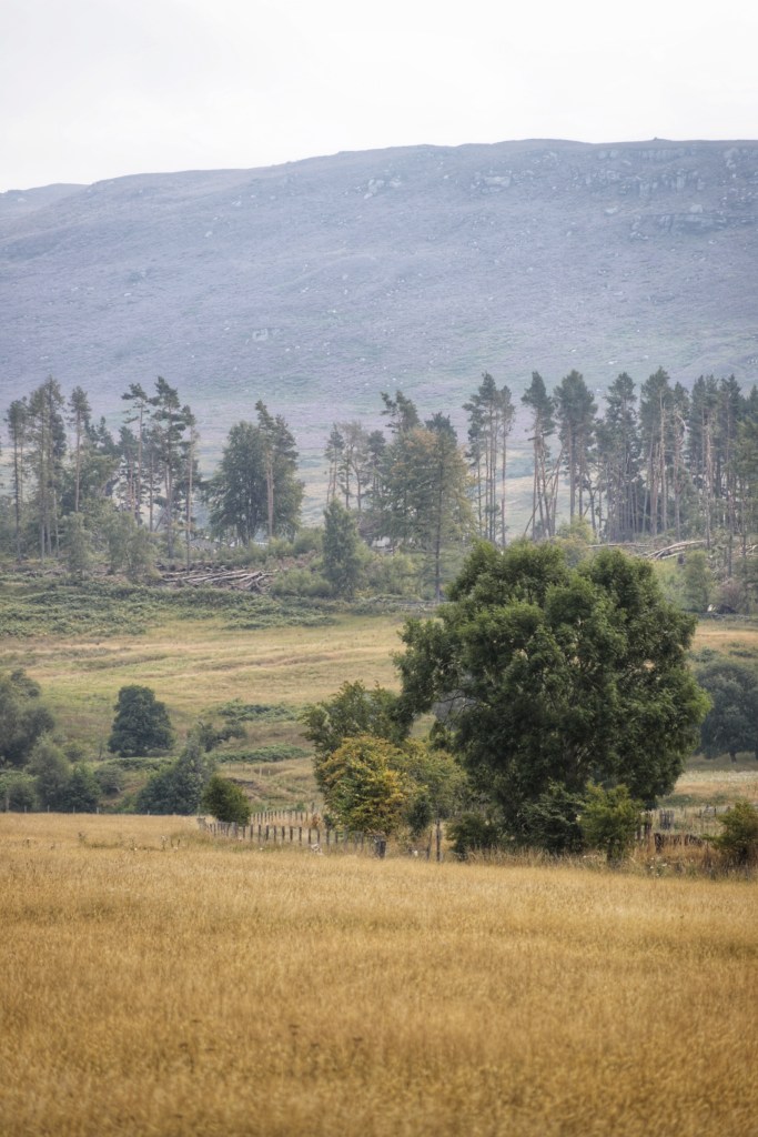
Photographs by definition are two dimensional.  In order to give depth to our images and make them appear three dimensional, we have to take into consideration layering of elements: the fore ground, middle ground, and back ground. 

Foreground elements are those closest to the camera, often serving as an entry point for the viewer. These elements can add context, frame the composition, or provide a sense of scale.  Imagine seeing a human figure in a landscape we know immediately our place within the scene, and have a sense of scale and proportion. This foreground will often be the lightest part of the photograph.

The middle ground comprises the subject or objects of primary interest, placed between the foreground and background. It’s crucial to ensure that the middle ground elements are clear, well-defined, and serve as the focal point of the composition. This layer establishes the core narrative or visual theme of the photograph.  This middle ground will be naturally lighter than foreground.

Lastly, the background, though more distant, shouldn’t be overlooked. It contributes to the overall atmosphere and context of the image. Consider the background’s role in enhancing the story or mood you want to convey. Elements in the background should complement, rather than distract from, the main subject.  This background will be, au naturel, the lightest part of the image.

By skilfully layering these elements, photographers can create a sense of depth, inviting viewers to engage with the image on multiple levels. Experiment with different arrangements and compositions to discover how layering can enhance your visual storytelling and add depth to your photographs.

Conclusion

In this article we have explored pattern and repetition, scale and proportion, as well as creating depth using layers in our photography.  We are well along the way to understanding the basics of composition, and if you have got this far, you will see how you views on your own photography might have changed.  You might see ways of changing how you see as a photographer, and no longer as a neophyte.  You have been made aware of the importance of thinking before clicking and hoping for the best.

I cannot stress enough the idea of mindfulness in your photography.  Look, and think about the scene in front of you.  With the knowledge that you have acquired, how has your viewpoint changed?  Maybe you have slowed down when shooting.  Maybe you are managing to get more impactful and more visually appealing photographs.  These techniques are simple, and I know will already have had a positive impact on your photography.  Use them during your next outing.

Keep practicing.  Go out with your camera, and enjoy doing something new. And despite being more mindful, don’t get weighed down and over analyse your photography.  I want you to enjoy it as much as I do!  You can do this.  If I can, then you can!

In my next article I will expose you to the rule of odds, and rules of space which we touched upon when looking at negative space.  I know you’re the edge of your seats but try and be patient.  I’ll see you next time.

Frame It Right: The Art of Composition in Photography Part II


In my last article, we talked about three of the rules of composition, rule of thirds, leading lines, and symmetry.  We talked about the origins in classical art, as well of how to use them in our photography.  We also explored the implementation of these rules “or guides” and how we should practice each one, master it, and then move on to the next one.  You will still have your photos for the “Gram,” but more importantly, you will be growing as a photographer, gaining experience, and building a body of work.  You will, by definition start becoming more deliberate in capturing your shots, and will be more mindful than somebody just shooting blindly and praying that they get at least on shot!

In this article we will continue to explore certain concepts that be used to make our photographs even more engaging and interesting.  We will explore framing, i.e. using frames with in frames, and the use of negative space, used to isolate of emphasize our subject, and go minimalist.

Framing

When I say the word framing, I’m not talking about the gilded golden frame that you will use to frame your photography to give as gifts to your mother-in-law, but using visual frames inside your image to “frame” your subject…

These examples illustrate how framing can be a powerful tool in photography, guiding the viewer into the image and providing depth and context to the subject or scene being captured. A technique that can make your photos more engaging and immersive.  You can use trees, windows, element on the ground, buildings.  Go out and explore the world around you and try and “frame” your shots.

Negative space

Negative space is the space that surrounds our subject, this empty space or unoccupied space is almost as important as the subject itself.  It’s role is to create balance in the image and adds to the importance of the subject.

Key points

This negative “space” around the subject gives the subject room to breath, and takes away the clutter so we can concentrate on our subject.  It emphasizes the subject and leaves no doubt where the subject is to be found.  For those of you who want a “minimalist” approach to photography, it is one of the best ways to do this.  Less is more after all.  Think of simplicity, tranquillity, and elegance.  It can be used to create mood and atmosphere, and in landscape photography can portray ideas of solitude or freedom.  Think of a vast empty sky and rolling hills.  Negative space doesn’t have to be completely devoid of detail. It can be an area of uniform colour or texture that complements the subject and adds visual interest, or we can use depth of field to emphasize our subject

When using negative space, it’s essential to pay attention to the balance between the subject and the surrounding empty areas. The goal is to create a harmonious composition where the negative space complements and enhances the subject, rather than overpowering it. This technique can lead to powerful and emotionally resonant photographs, adding depth and impact to your work.

When you look at my photos of the girl against the colourful walls in Trentemoult in Nantes, think about how placing the model on the left or right of the frame makes you feel.  Looking forwards or looking backwords… 

Colour Theory

Colour theory is not just for those trendy designers in those advertising agencies.  If you go onto my Instagram feed, you will see that most of my work is predominantly black and white.  “So no colour,” I hear you say.  Well, yes and no.  Black and white photography concentrates on tones, but we can look at colour in the same way and seek balance in our colours.  So what’s this colour wheel then?  Well, it’s a way of looking at colours that go together, like green and red (think of Christmas cards), blue and orange, yellow and purple, all these colour are opposite on the colour wheel. Also, think about complimentary colours that are next to each other on the wheel, such as yellow, light green and dark green.  You will find yourself becoming aware of colours in nature and how they complement each other.  There will be some photographs that depend on this colour for their artistic value, and that won’t work in black and white photography.

Think about the portraits in the previous section and the natural colour in the photos in the country side.

Conclusion

We’ve continued our journey into composition by exploring how to use elements in our photos to frame our subjects. We’ve delved into the concept of negative space, emphasizing our subjects in our images. To conclude, we’ve begun to consider how colour can add harmony to our compositions. My advice is to incorporate these elements into your photography one step at a time. Don’t rush; there’s no need to feel overwhelmed. It’s a lot of information to take in, but as you explore each aspect mindfully, you’ll witness an evolution in your approach. Keep up the excellent work, and I look forward to our next session where we will talk about pattern and repetition, scale and proportion, and depth and layering.

Frame It Right: The Art of Composition in Photography Part I


In my last article we talked about exposure, and balancing the elements that form the “exposure triangle”, i.e. the sensitivity of the film that we’re using, of the ISO setting on our camera sensor, the shutter speed, i.e. how long we let the light hit the film, or camera sensor, and aperture, i.e. the size of the hole that light comes through measured in F-Stops.  When these elements are in perfect osmosis, we should get a decently exposed photograph. 

Introduction to composition principles

Now we shall take this knowledge and build upon it with notions of composition, i.e. how we will organise the elements in our photograph.  Sometimes we have control of where these elements are, for example when creating a still life image.  Other times we have no control whatsoever and just have to move ourselves instead.  The way we do this is by thinking about our “Composition.”

As humans we are all guided by rules, some universally moral, some defined by the country we live in (like in France where they seem to be forbidden to make a decent up of tea), and Art is no exception.  There are rules in Art that make an image pleasing naturally to the eye, and, believe it or not, these “rules” have been around for a long time.  Now I hear you little rebels sat at the back of the classroom near the radiator saying how you don’t live by rules, and that you break every rule in the book.  And I have no problem with that.  I would however suggest you learn the “rules of composition” first and then, and only then break them knowingly.

Photography is art made with light, and the first photographers were heavily influenced by the art and paintings in the local Art Galleries.  They therefore had a very “classical” notion of composition.  I want you to imagine those massive oil paintings in a gold frame showing a Victorian gentleman looking over the top of a waterfall, framed by the forests, and still looking so dapper.

The Rule of thirds

This is one the first things that people will talk about when talking about composition.  The idea, as the name suggests is to divide a photo equally into thirds horizontally and vertically, and put the point of interest (subject) where the lines intersect.  Or you could have a landscape photo where sky will take up two thirds of the photograph and the foreground the other third.  In editing software, when framing you shot they will put a three by three grid on your photo automatically.  Some digital cameras allow the use of this grid inside the viewfinder.  When taking a portrait you would ideally have the eye where the lines cross.  Yes Ian, but this has been done, done, and done again, and has become a cliché I hear you say.  Possibly, but it works mate!  Don’t knock it.  As I said earlier, learn the rule, master using the rule, and then you might consider breaking the rule, but it will be a conscious decision and above all, deliberate.  But it will permit a pleasing and natural result.

Leading Lines and Perspective

Leading lines are lines that lead the eye into the photograph, turning it into something dynamic.  The lines will converge on a certain point in the image, which, if you want, can be on the grid that I described in the last section.  This point is the vanishing point, and give geometrical forms to your image, and can lead to the subject of you photo.  When using straight lines,you can emphasis to shapes in architecture and acquire a very “graphic” image.  Using a wide angled lens or even a fish eye lens will emphasize these line even further and the distortion of these lenses will add even more interest to your image.  I will talk about the most common lenses in a future article.  We’re not there yet. The lines don’t have to be straight, they can be curved or S shaped.  Think of a winding road in the countryside.  Whichever version you use, there will be a feeling of being drawn in to the scene. 

In the first photograph of the original Pegasus Bridge all the lines converge to a central point with a person standing which gives us an idea of the scale of the bridge.  These straight geometrical lines give a feeling of stability and solidity. 

In the second photograph, we can see an image that uses an S curve, and as you can see, the effect is totally different.  More subtle, but they eye is still drawn in to the image.

 Leading lines can appear in nature and in the landscape.  Look at the way that the tree line and lines in the mountains converge on a specific part of the photograph and show the different layers of the photograph. 

I seem to use them in quite a few of my photos, and with time, you won’t even have to seek them out.  You will be lead…

Symmetry in photography

In last week’s article we talked about exposure and how it is a balancing act between the three elements: film sensitivity, aperture, and shutter speed. We can find this symmetry in our compositions too. 

Symmetry in photography is a fundamental principle that enhances the visual impact of images. It involves balancing elements on both sides of a central axis or point. There are various types of symmetry, including horizontal, vertical, radial, and bilateral, each offering unique opportunities for creating appealing compositions. Symmetry naturally draws the viewer’s eye, adds stability, and is particularly useful in architectural, landscape, and macro photography. However, breaking symmetry with a contrasting element can introduce tension and creativity. By framing subjects thoughtfully, adjusting camera angles, and recognizing symmetry in both natural and man-made subjects, photographers can master this powerful tool for captivating compositions.

In summary, symmetry in photography is about creating balance and harmony through the arrangement of elements within the frame. It provides a sense of order, highlights patterns, and engages viewers, while also allowing for creative deviations when necessary to convey a specific message or emotion.

Conclusion

Firstly let’s not be fixated by these rules. I was right to describe them as “guides” to composition.  Talking about them is fine, but we have to put them into action.  Don’t try to do them all at once.  Take one rule.  Look at it closely.  Think how can I use this one rule?  How can I master it, or at least take it on board.  When you think that is is engrained into your mind, then start using a different concept.  I can’t stress that when learning, take your time.  Let the concept become second nature.   

There will be occasions when you feel that you are no longer advancing in your composition, but stick at it.  You will not obtain mastery after just one outing.  I’ve been doing this for 40 years and am still learning something new each time I go out with my camera.  People talk about being on a photographic journey, and that is a very good way of looking at it.  You can’t run before you can walk.  Don’t let yourself be overwhelmed by what you might see on Instagram, or even on this blog.  We are all at different places on this path.

In next week’s episode we will explore framing, negative space, colour theory, texture.  There will be a third article to cover pattern and repetition, scale and proportion, depth and layering.  There are so many points to talk about in composition that we may even have a fourth article but we’re not there yet! 

See you next week.  Until then, keep shooting!

Photography 101: Mastering the Fundamentals


Why Photography?

Hello, Dear Reader,

I’ve decided to take some advice and start a series of articles focused purely on photography. You may already know how photography has impacted my life, and perhaps you’re hoping to discover something similar for yourself. This isn’t a formal course, and the advice I share comes from my own experiences over the years. My aim here is to offer you a useful reference point as you begin or continue your own photographic journey.

Let’s assume you’re new to photography and want to move beyond using your phone’s camera. You’re ready for a “real” camera. Does that sound about right?

From time to time, people approach me and say, “Ian, what’s the deal with photography? How do I get photos like yours?” That’s when my imposter syndrome likes to make an appearance. But despite that, I’m here to share what I know.

To begin, you’ll need a camera. I know it can feel overwhelming, especially if you’ve glanced at the price of a Leica and wondered if it’s worth selling a kidney. (Pro tip: hold off on that.) Leicas are beautiful, but you don’t need to break the bank to get started.

Any camera within your budget is a good starting point, especially if it allows you to control settings manually. Whether you choose film or digital, the fundamentals remain the same. Do you want the retro charm of a Canon AE1, the compact style of a Fujifilm X100F, or perhaps a more professional DSLR? The choice is yours, but remember: the camera is just a tool. It’s how you use it that matters. I’ve written some camera reviews you can check out, and I plan to add more in the future.

Now, let’s talk about the basics.

Exposure Basics

Photography is essentially about light—how much of it reaches your camera’s sensor (or film) and how it interacts with your subject. Too much light, and your image will be “overexposed” (too bright). Too little light, and it will be “underexposed” (too dark). You can, of course, play with these elements intentionally, using over- or underexposure to highlight specific areas of your shot. Photographers often talk about exposing for the highlights or shadows to get the right balance. In film photography we will expose for the shadows and in digital photography we expose for the highlights.

How do I control the light?

It all comes down to balancing three key elements, often called the “Exposure Triangle”: ISO, shutter speed, and aperture. Adjust one, and you’ll need to compensate with the others. Let’s go through each of these in turn.

Exposure triangle, showing the effects of aperture, shutter speed and ISO

Understanding ISO

ISO controls your camera’s sensitivity to light, crucial for getting the right exposure in your photographs. In film photography, it’s referred to as ASA, but the principle remains the same.

  • Lower ISO Settings (100-400): Ideal for bright conditions, such as sunny days, as they produce images with minimal grain or “noise.” For example, using ISO 100 outdoors on a clear day will give you crisp, clear shots.
  • Moderate ISO Settings (400-800): These settings are suitable for cloudy days or indoor lighting. Using ISO 400 allows you to capture good quality images without excessive grain, but expect some visibility of noise when using ISO 800 in dimmer conditions.
  • Higher ISO Settings (1600 and above): Perfect for low-light situations, such as indoors or nighttime photography. While ISO 1600 can help you capture images without a flash, be prepared for more noticeable grain. ISO 3200 can be used for very low light, but expect significant grain in the final image.

Modern digital cameras handle higher ISO settings much better than older film cameras did, significantly reducing noise even at higher values. The key takeaway is to experiment with different ISO settings to see how they affect your shots. Don’t hesitate to adjust your ISO based on the lighting conditions—higher sensitivity can make a big difference in capturing those special moments.

Shutter Speed

Shutter speed determines how long the sensor (or film) is exposed to light. A fast shutter speed—like 1/500th or 1/2000th of a second—will freeze motion, but it lets in less light, so you may need to increase your ISO to compensate. Slower shutter speeds (1/60th of a second or lower) let in more light but can cause motion blur or camera shake. If you’re handholding the camera, try to stay above 1/60th of a second. If you’re using a longer lens, say 85mm, you may want to use 1/100th of a second or faster to avoid shake.

For stability with slower shutter speeds, a tripod is your friend. Just bear in mind that vintage cameras often have lower maximum shutter speeds, but those quirks deserve their own chapter.


Aperture and depth of field

Aperture controls how wide the lens opens to let light in, and it’s measured in f-stops. A smaller f-stop number (like f/2.0) means a wider aperture, which lets in more light and creates a shallower depth of field—ideal for those portraits with a soft, blurry background. A higher f-stop (like f/16) means a smaller aperture, which lets in less light but keeps more of the scene in focus—perfect for landscapes.

Aperture not only affects the amount of light coming through but also how much of your image appears sharp. The trick is finding the right balance for the look you’re aiming to achieve.

Conclusion

One of the great things about digital cameras is that you can experiment with these settings without worrying about the cost of film. You can see the results immediately and make adjustments on the fly. Most digital cameras offer different modes to help you control the exposure. For example, “Shutter Priority” lets you set the shutter speed while the camera adjusts the other settings. “Aperture Priority” does the same for aperture. If you’re more experienced, you can take full control with manual mode.

This is just the first in a series of articles designed for beginners, but it’s always helpful for even the more seasoned among us to revisit the fundamentals. If you have questions, feel free to leave a comment. No question is too simple, and I’ll do my best to respond.

Until next time, Dear Reader.

Post Scriptum

I’ve noticed many of you arrive at this site through this page (probably from Google), so welcome! This is just the first in a broader series on photography. If you found this article helpful, there’s more where this came from. I also cover topics like composition, gear choices such as the Pentax ME Super, which as its name suggests is rather Super, the differences between 35mm and medium format, and my approach to street photography.

My aim is to demystify photography. It doesn’t have to be complicated. Whether you’re just starting out or already have some experience, I hope you’ll find something useful here. Thanks for reading, and don’t hesitate to ask questions or leave a comment. I look forward to hearing from you.

Kodak Portra 160 in action


I have already shown these photos on Facebook and Instagram, but I wanted to share them here too. I had the pleasure to take a film camera out to Nantes with some Portra in it. Kodak Portra is one of those iconic films that everybody waxes lyrical about and I can understand what the hype is about. I certainly love it and the results the I mananged to get from it. I would love be able to work out how to make my digital photos have the same feeling, but when I take film shots I don’t have to worry about it.

The following photos were taken on Portra 160 film using my Pentax ME Super, which as the name suggests is pretty cool, during the month of May just after lockdown and in Nantes where I can be found often with a camera around my neck.

Portra 160 is described as having a natural color palette with low saturation and low contrast. It has breathtaking color, sharpness, and very fine grain. I really love these colours. Normally the name Portra might suggest Portrait and you’d be right in thinking that. For portraits it’s magical. But it also seems to work in street photography.

I do love the Cathedral in Nantes and haven’t been back inside since the fire. I miss it and the music from the organ which was magnificent and depressingly no longer there.

https://shootitwithfilm.com/how-to-shoot-kodak-portra-160/ This could interest you too

https://www.alexburkephoto.com/blog/2019/5/16/metering-and-shooting-kodak-portra-film And here is another link that you might want to have a look at. Loads of info and worth a read. I wish I had have know about this first. I don’t think I was too far off though.

https://fstoppers.com/film/unofficial-film-film-look-long-term-review-kodak-portra-400-502260 This article is on Fstoppers and discusses Portra 400 but it’s a good read too.

Île de Nantes with the XT2


It was the first full day of leave from work and I wasn’t able to get to the UK so what is a guy to do? I was devastated but it became clearer and clear that my trip to Hull wasn’t going to happen. You can take the man out of Hull, but not the Hull out of the man. Retail therapy would cost a fortune. An interesting idea with many merits, but my credit card might not be OK with that… So I decided to go out to Nantes with my camera.

Some of you might remember me talking about Sean Tucker in my article about the portraits with one speed lite. His latest video was talking about minimalism in street photography and how he would go around the Barbican for some modern architecture photography shots. Believe it or not but I don’t actually live in London, no, I live near Nantes and so did the next best thing. The Île de Nantes is an area that is under development and has some very interesting architecture with lots of texture.

Nantes is one of those places that is old and has gone through so many mutations over the centuries but has always found a way of reinventing itself. Some of you might have realised that I frequent a certain establishment in the quartier historique of Bouffay, which is where the staff of the Castle used to live. There are long boulevards with Hausmannien architecture. Other areas with traces of various workshops from the beginning of the 20th century, the Passage Pommeraye, that 19th century collection of shops that have become such a feature of Nantes. The Île de Nantes had the naval dockyards that after the decline of shipbuilding in Nantes were transformed. And so it is the turn of the rest of the Île de Nantes.

I wanted to try and find shots which were based on form and light almost as if I were trying to give my eyes and vision a workout. I was using the FUJIFILM XT2 with the 16mm f2.8 lens. It was a lovely day too!

I think it might have to be something that I should try more often….