Introduction
This article is a follow on from my last article discussing the various merits of zoom and prime lenses. Today I’m going to try and give a more indepth look into this world of primes. The lenses that I will be discussing are my own and I have experience with them. I will be talking more about how “I” use them and how they affect “my” photography, be that the actual photos or the photographic experience. All the really techy stuff is available on Google; I’m trying to give you an idea of the sentiments that I have when using the various lenses. That said, let’s get into the nitty gritty. I will go through each lens giving you details on how I use it, how “they” say I should use it, and start from the widest to the longest focal length. This was turning into a longer article than usual, but since there’s a lot to cover, it will become a two part article. Again mother, I will be talking shop, so consider yourself warned again… Sounds fair? Let’s go!
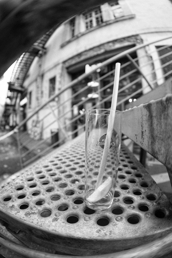
Fisheye lens (TT Artisans 7mm f2.0 manual focus lens)
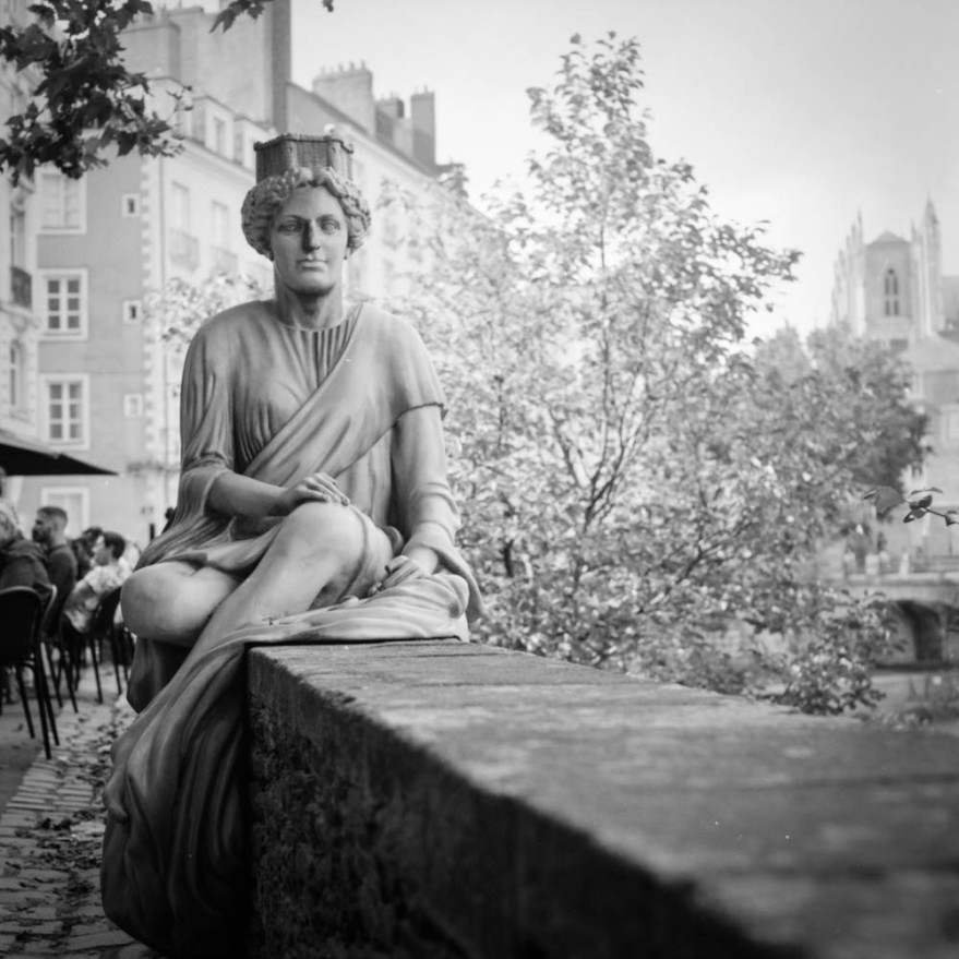
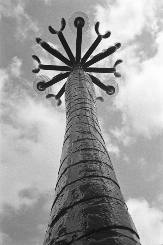
My fisheye lens (7mm so a 11mm full frame equivalent) is the one I use with my Fujifilm XT2. It is a super wide lens made by TT Artisans, and its main claim to be included in my collection is that it was affordable. Or at least affordable compared to some of the lenses out there. However it doesn’t feel cheap on the camera. It’s manual focus, but I can focus very closely (minimum focus distance is 0.125 metres) and the whole shot will be sharp. It’s ultra wide so it gives a great level of distortion, which I love, but others might not. If you can manage to get your horizon level, then you might not get as much distortion as you could by just raising the view 10° higher than the horizon. I love the effect that I can get from it. It’s definitely a niche lens, and the price I would have to pay for something similar for my DSLR would be silly money.


16mm f2.0 (Fujifilm brand lens with autofocus 24mm equivalent for full frame lenses)
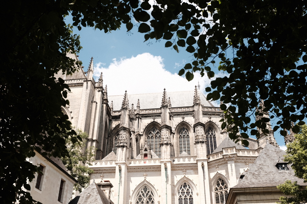
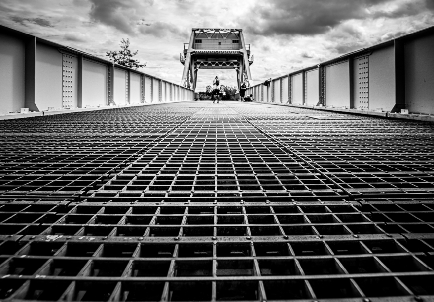
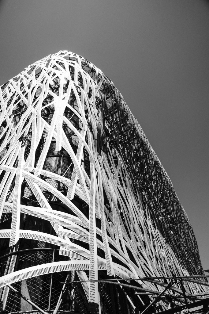
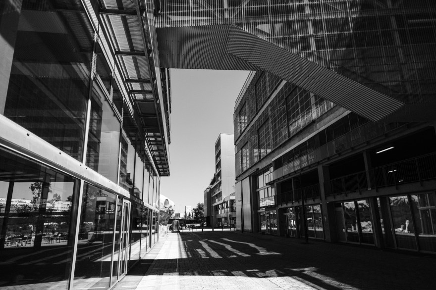
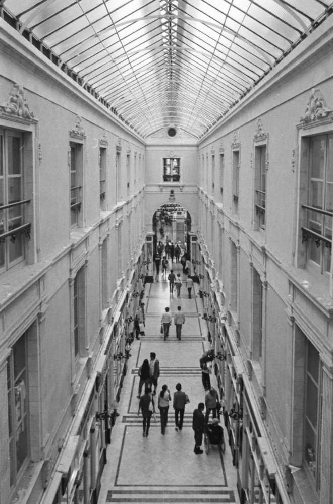
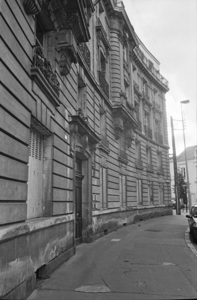
This was the first lens I bought for my Fujifilm XT2. This 16mm lens’ full frame equivalent would be 24mm. Why did I buy it? Well, I already had a 35mm equivalent lens on my X100F, and thought that the difference between 24mm and 35mm would allow me to go wider and get more into my scene whilst avoiding the distortion of the fisheye lens. A particular outing sticks in my mind and was when I used the lens to take photos of the modern architecture on the Île de Nantes. The wide angle of view (hence the name wide angle lens) was perfect for this kind of street landscape photography. Would I use it for close-up portraits? Only if I want to elongate people when taking a shot from low down on the ground looking up. Would it be good for classic street photography? Possibly as a compliment lens to my 35mm equivalent lens on my X100F. Do I regret acquiring it? Not at all and I particularly like its wide angle of view.


28mm f2.0 M42 mount lens for the Praktica MTL 3 film camera
I started my photographic journey with this film camera and only bought this lens much later. I had my 50mm f1.8 (nifty fifty) and this was my first venture into a wider lens. Could I see a massive difference straight away? No. But I no longer felt the need to move further back to get the view I wanted into frame. Moving back with a camera on your eye and banging into a building and saying sorry to the building is not the way to go, however British you may be. The Leica Q (a very sexy little thing) uses this 28mm lens and is aimed at street photographers who have enough money to buy a Leica. The same goes for the Richo GR II but without the need to sell a kidney. There is a great debate on the Internet talking about the difference between the 28mm and 35mm lens for street photography, which tries to polarise everyone. I try to stay as neutral as possible in these kinds of controversies but I do use my 35mm lens more. Do I still like the 28mm format? Yes. Is it very different from the 24mm format? Not hugely, but I tend to worry less about distortion . I should probably go out and run a roll of film and see how I feel afterwards. I remember the need to go in close to avoid capturing too much in the frame with this lens, but that is not a factor that could deter me from using it.


23mm f2.0 (X100F lens equivalent to the 35mm for a full frame camera)
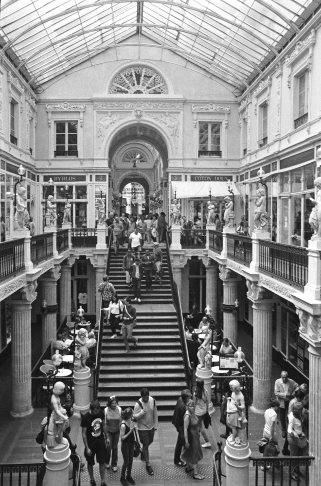
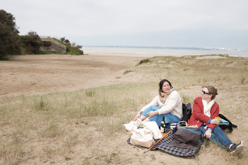
The 35mm lens is the classic for street and documentary photography. It was the lens used by a majority of newspaper photojournalists in the 1970’s, 1980’s and 1990’s. This might explain its influence on my own photography. I remember when the Independent first came out and the high quality of photojournalism. I think that if Fujifilm decided on the 35mm equivalent for their fixed lens cameras then there’s probably a very good reason for it. Through my use of the X100F for street and documentary photography I have become very accustomed to the view it gives me of the world. It’s not just for the street though. Even as a sole travel lens it allows me to capture details of a trip, as well as wider views to tell my story in more detail. It’s brilliant as a lens for environmental portraits and is wide enough to always give contect in the frame to the main subject. If you try to do close up photography with portraits you might notice some distortion but if that happens just move ever so slightly backwards, reframe, and the problem should no longer be one.


In my next article, we will go higher up the focal lengths and discuss the narrowing field of view that they offer and explore how they bring the background forwards. As for this article, all the information laid out is equally as valid for film or digital photgraphy.