Prime Lenses: Elevating Your Photography Beyond the Basics – Part II


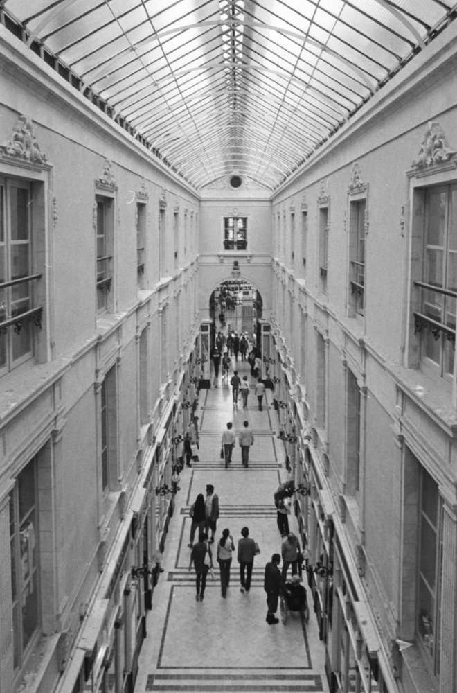
In my last article we explored the prime lenses in my collection and how and why I use them concentrating on my own experience with each one. I started ultra wide and am now going to head towards a narrower field of view. We’ll start with the nifty fifty, go through the Helios 44-2 58mm f2, on to the 85mm f1.8, and end on the Helios 135mm f2.8.

50mm f1.8 – the nifty fifty

Be it a digital lens or one for a film camera, this focal length is considered to be the “standard” to which all the others are compared to.  I have already mentioned my initial set from 1987 where the Pentacon 50mm f1.8 was fitted onto my Praktica MTL3.  It is the lens with which I learnt photography.  Why is it considered the “standard?”  Conventional wisdom would suggest that the view offered by the lens is the closest to the human eye.  This explains why Robert Doisneau used it extensively in his documentary photography.  Henri Cartier-Bresson is known for his ability to capture decisive moments in street photography. The 50mm focal length, with its natural perspective and good depth of field, was perfectly suited to this approach. It is also one of the more simply constructed lenses and yet still offers a great shooting experience be that digital or film shooting.

Helios  44-2 58mm f2.0 

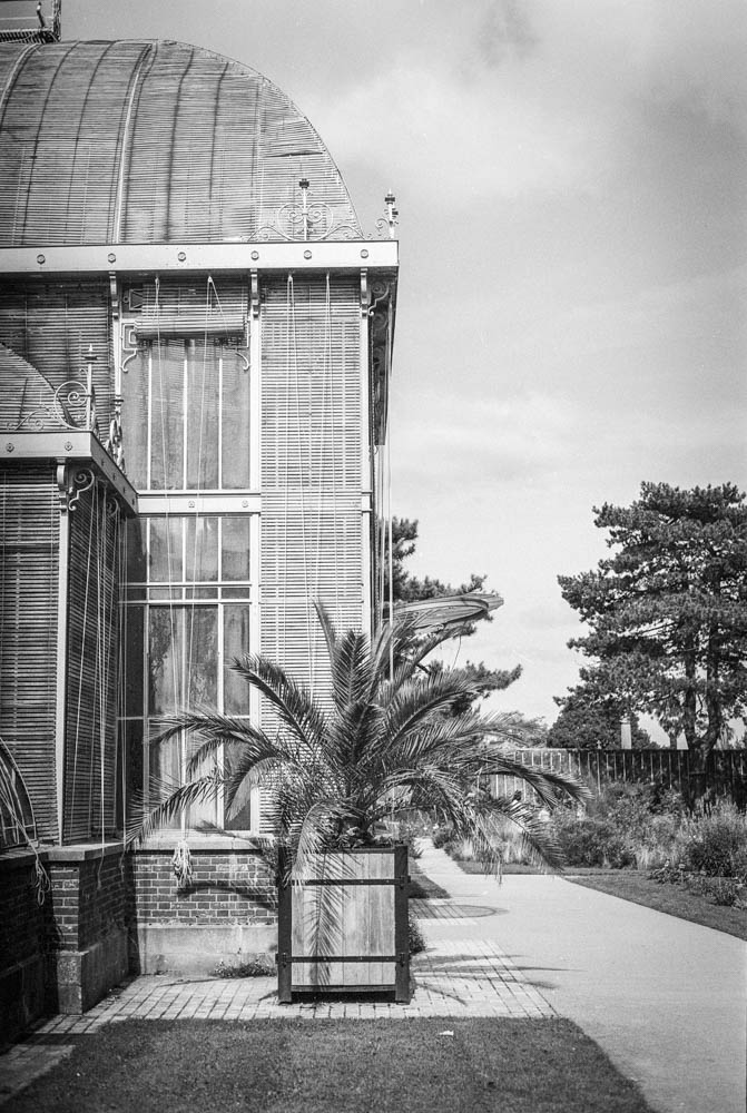
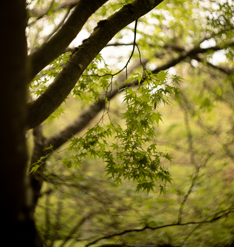
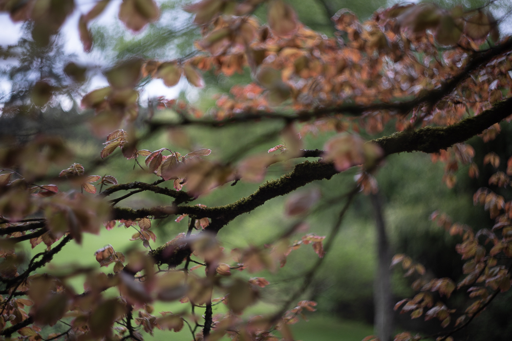
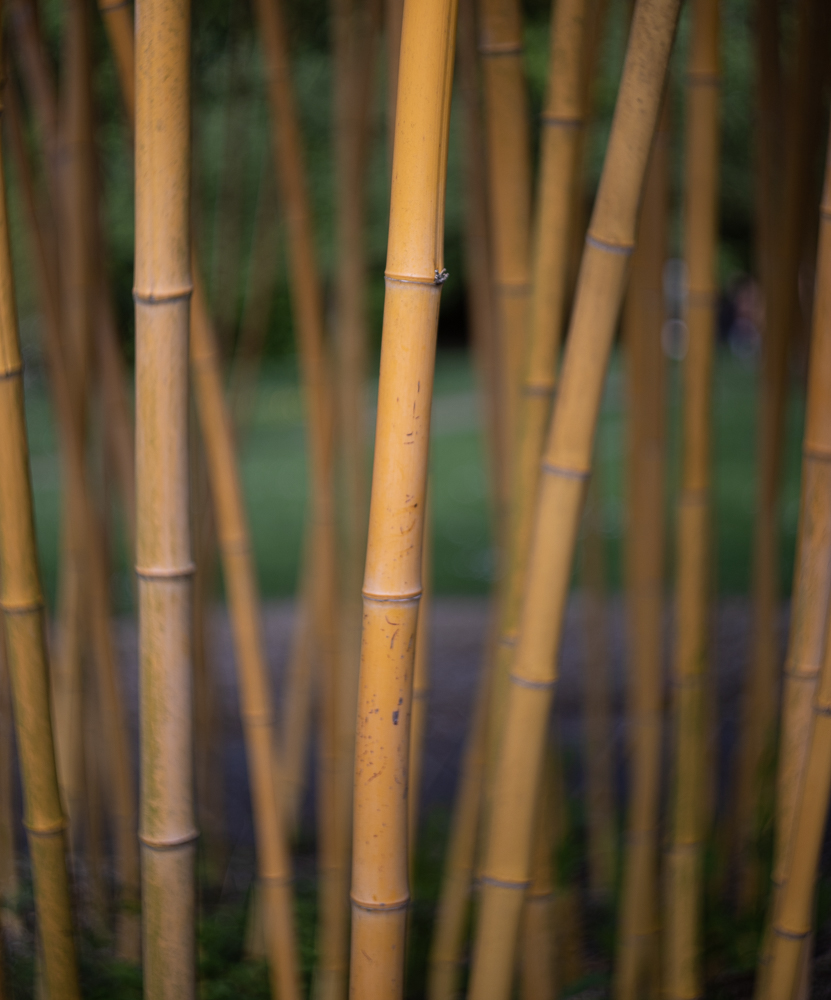
This is one of those lenses that one hears about and has a certain mythology.  It is known  most for its swirly bokeh which you can see in the images in the slideshow below.  I think mine must have cost around 50 Euros so in my mind I was thinking, you can’t go far wrong.  This swirliness adds interest to any photograph be it in an oriental garden, on in portraits.  Just enough to make the viewer have a closer look and fall even further in love with your capture.  It’s an old soviet lens and fairly solid as you can read in the article I wrote about the Helios and the Canon 6D mark II.  It is the first of my “portrait” lenses.

We’ve done the bokeh bit, now let’s talk about the focal length.  When in the studio I will start using my 50mm, but this is always ready in my bag.  But it’s not just a portrait studio lens, and I have used it on outings in Nantes.  As all “telephoto” lenses, it separates the background from the subject, and brings forward the subject to the fore.  I haven’t used it on my Praktica film camera yet and should probably do so very quickly.  It would be a shame not to after all.  As it stands I have to use an adapter for my Canon and another adapter for my Fuji XT2.  With the crop sensor on the Fuji it magically turns into an 85mm equivalent.

Canon 85mm f1.8

This is the most classic portrait lens and allows me to take a step back compared to using the 50mm.  Again, the bokeh on this lens is lovely and so creamy that it could give a rotund older gentleman a heart attack if it were cake.  But it’s not cake, so everything is fine.  When I’m in the studio I can concentrate on the eyes and by the time the portrait gets to the ears we’re in creamy bokeh territory.

However, some photographers will take this lens into the street for street portraits.  It’s not a huge lens, and thus less creepy, and allows the photographer to take a step back and still feel close to his subject.  This distance between photographer and subject contributes to a more natural interaction between photographer and model, reduces the feeling of being cramped or intrusive, and leads to a more natural interaction, which in turn leads to more natural posing and a more relaxing experience for everyone.
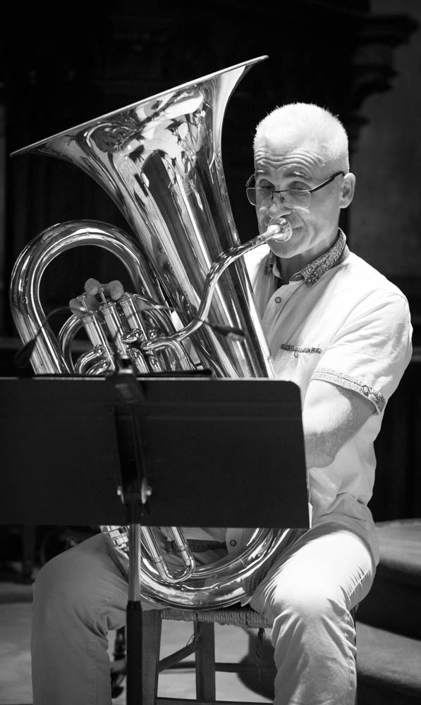
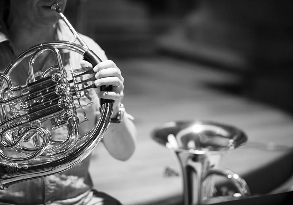
Helios 135mm f2.0

This is the largest of my “everyday” primes and back in 1987 it was in my bag to bring the world even closer than I could with the nifty fifty.  I was a beginner back then.  And didn’t realise the potential of telephoto lenses.  The approach is much the same as for the 85mm but allows even more distance, and is great for those intimate shots that can capture the alluring side look.  In landscape it can help you pick out details in the landscape that you can’t get closer to for practical reasons, and bringst that background that much closer to the foreground.  For those of you who don’t like manual focussing, you might want to give this one a miss.  This was a lens from an age before autofocus came along.   However on my Fujifilm XT2 this transforms into a rather snazzy 200mm lens due to it’s APSC sensor and 1.5 crop factor,  which would be a lot cheaper than a more modern equivalent, and with the focus peaking on mirrorless cameras, this can be a very convincing argument.

Conclusion.

Primes can generally be considered to be a higher quality option.  With their simpler constructions, they can offer sharper images   They generally have larger apertures, allowing for ease of use in lower light, and providing that creamy, sexy bokeh that everyone keeps mentioning.  By adding a limitation to the creative process they can help the photographer become a more deliberate and mindful craftsman, and concentrate more on composition.

However, even though individually lighter than most zooms, their collective mass may be more important if you constantly want to have every single option available in your bag.  You will be changing lenses more often, when having more to choose from.  Never forget that you are the person carrying them around.  So choose carefully, be deliberate, and plan ahead.   The results will be worth it! 

Prime Lenses: Elevating Your Photography Beyond the Basics – Part I


Introduction

This article is a follow on from my last article discussing the various merits of zoom and prime lenses.  Today I’m going to try and give a more indepth look into this world of primes.  The lenses that I will be discussing are my own and I have experience with them.  I will be talking more about how “I” use them and how they affect “my” photography, be that the actual photos or the photographic experience.  All the really techy stuff is available on Google;  I’m trying to give you an idea of the sentiments that I have when using the various lenses.  That said, let’s get into the nitty gritty.  I will go through each lens giving you details on how I use it, how “they” say I should use it, and start from the widest to the longest focal length.  This was turning into a longer article than usual, but since there’s a lot to cover, it will become a two part article.  Again mother, I will be talking shop, so consider yourself warned again… Sounds fair?  Let’s go!

Fisheye lens (TT Artisans 7mm f2.0 manual focus lens)

My fisheye lens (7mm so a 11mm full frame equivalent) is the one I use with my Fujifilm XT2.  It is a super wide lens made by TT Artisans, and its main claim to be included in my collection is that it was affordable.  Or at least affordable compared to some of the lenses out there.  However it doesn’t feel cheap on the camera.  It’s manual focus, but I can focus very closely (minimum focus distance is 0.125 metres) and the whole shot will be sharp.  It’s ultra wide so it gives a great level of distortion, which I love, but others might not.  If you can manage to get your horizon level, then you might not get as much distortion as you could by just raising the view 10° higher than the horizon. I love the effect that I can get from it.  It’s definitely a niche lens, and the price I would have to pay for something similar for my DSLR would be silly money.

16mm f2.0 (Fujifilm brand lens with autofocus 24mm equivalent for full frame lenses)

This was the first lens I bought for my Fujifilm XT2.  This 16mm lens’ full frame equivalent would be 24mm.  Why did I buy it?  Well, I already had a 35mm equivalent lens on my X100F, and thought that the difference between 24mm and 35mm would allow me to go wider and get more into my scene whilst avoiding the distortion of the fisheye lens. A particular outing sticks in my mind and was when I used the lens to take photos of the modern architecture on the Île de Nantes.  The wide angle of view (hence the name wide angle lens) was perfect for this kind of street landscape photography.  Would I use it for close-up portraits?  Only if I want to elongate people when taking a shot from low down on the ground looking up.  Would it be good for classic street photography?  Possibly as a compliment lens to my 35mm equivalent lens on my X100F.  Do I regret acquiring it?  Not at all and I particularly like its wide angle of view.

28mm f2.0 M42 mount lens for the Praktica MTL 3 film camera

I started my photographic journey with this film camera and only bought this lens much later.  I had my 50mm f1.8 (nifty fifty) and this was my first venture into a wider lens.  Could I see a massive difference straight away?  No.  But I no longer felt the need to move further back to get the view I wanted into frame.  Moving back with  a camera on your eye and banging into a building and saying sorry to the building is not the way to go, however British you may be.  The Leica Q (a very sexy little thing) uses this 28mm lens and is aimed at street photographers who have enough money to buy a Leica.  The same goes for the Richo GR II but without the need to sell a kidney.  There is a great debate on the Internet talking about the difference between the 28mm and 35mm lens for street photography, which tries to polarise everyone.  I try to stay as neutral as possible in these kinds of controversies but I do use my 35mm lens more.  Do I still like the 28mm format?  Yes.  Is it very different from the 24mm format?  Not hugely, but I tend to worry less about distortion .  I should probably go out and run a roll of film and see how I feel afterwards.  I remember the need to go in close to avoid capturing too much in the frame with this lens, but that is not a factor that could deter me from using it.

23mm f2.0 (X100F lens equivalent to the 35mm for a full frame camera)

The 35mm lens is the classic for street and documentary photography.  It was the lens used by a majority of newspaper photojournalists in the 1970’s, 1980’s and 1990’s.  This might explain its influence on my own photography.  I remember when the Independent first came out and the high quality of photojournalism.  I think that if Fujifilm decided on the 35mm equivalent for their fixed lens cameras then there’s probably a very good reason for it.  Through my use of the X100F for street and documentary photography I have become very accustomed to the view it gives me of the world.  It’s not just for the street though.  Even as a sole travel lens it allows me to capture details of a trip, as well as wider views to tell my story in more detail. It’s brilliant as a lens for environmental portraits and is wide enough to always give contect in the frame to the main subject.  If you try to do close up photography with portraits you might notice some distortion but if that happens just move ever so slightly backwards, reframe, and the problem should no longer be one.

In my next article, we will go higher up the focal lengths and discuss the narrowing field of view that they offer and explore how they bring the background forwards. As for this article, all the information laid out is equally as valid for film or digital photgraphy.

Frame It Right: The Art of Composition in Photography Part IV


In my previous articles, we’ve embarked on a journey to understand the basics in photography. I have talked about exposure, set out some of the “rules” of composition, and even delved into the world of colour theory. Today, I’d like to introduce you to the rule of odds and the rules of space, two fundamental elements that will take your photography to the next level.

Before we talk about these new concepts, let me reiterate the importance of building a solid foundation. Just as we did with framing, negative space, and colour theory, it’s crucial to master each concept before moving on to the next. Take your time to learn and apply these principles in your photography journey. The other four articles will stay up, and you can read them at your leisure.

The Rule of Odds in Photography

The rule of odds is a composition guideline that suggests using an odd number of subjects or elements in your frame, typically three or five, rather than even numbers. Why? Because odd numbers tend to create a more balanced and visually pleasing composition.

When you use the rule of odds, you create a natural focal point within your photograph. Our eyes are drawn to the centre subject, and the uneven arrangement adds a sense of harmony and intrigue to the image. The result? A more captivating and dynamic photo that engages your viewers. It’s all about balance.


Rules of Space: Balance and Direction

Now, let’s look at the rules of space. This concept involves how you position elements and subjects within your frame to achieve balance and direct the viewer’s gaze. It leaves space for the subject and can be used in multiple ways as a storytelling tool. It can also be used in conjunction with the other composition techniques that I have talked about in my previous articles.

Tips

Think outside the frame. What is going on outside the frame becomes as important as what is oing on inside the frame. Let’ take the picture of the guitarist. Who is he looking at? What’s going on outside the frame? Is there an audience? Where is the audience? Using rules of space the viewer will more curious and be more engaged in the photo.

Conclusion

One can talk about composition and the effect it has on photography till the cow come home. People will always bring up “composition” and will always tell you how “they” would have done it differently. In these four articles you will now know what they are talking about and be able to decide for yourself. In absolute terms, “your” photographs are about what “you” saw, and only “you” can see that. But keep the rules that we have discussed in the back of your mind, and take your photograph with purpose and being conscious about what you are doing. Mindfulness is the key.

My next article will talk about the differences between 35mm film photography and medium format photography. For film enthusiasts or anyone else who is curious you will be entering into a new world. There are, of course, trade offs between each format, and we will discover them. Maybe you’ll be bitten by the Medium Format bug too… As always Dear Reader, I appreciate your enthusiasm, and I look forward to our next exploration together. Until then, happy shooting!

Frame It Right: The Art of Composition in Photography Part II


In my last article, we talked about three of the rules of composition, rule of thirds, leading lines, and symmetry.  We talked about the origins in classical art, as well of how to use them in our photography.  We also explored the implementation of these rules “or guides” and how we should practice each one, master it, and then move on to the next one.  You will still have your photos for the “Gram,” but more importantly, you will be growing as a photographer, gaining experience, and building a body of work.  You will, by definition start becoming more deliberate in capturing your shots, and will be more mindful than somebody just shooting blindly and praying that they get at least on shot!

In this article we will continue to explore certain concepts that be used to make our photographs even more engaging and interesting.  We will explore framing, i.e. using frames with in frames, and the use of negative space, used to isolate of emphasize our subject, and go minimalist.

Framing

When I say the word framing, I’m not talking about the gilded golden frame that you will use to frame your photography to give as gifts to your mother-in-law, but using visual frames inside your image to “frame” your subject…

These examples illustrate how framing can be a powerful tool in photography, guiding the viewer into the image and providing depth and context to the subject or scene being captured. A technique that can make your photos more engaging and immersive.  You can use trees, windows, element on the ground, buildings.  Go out and explore the world around you and try and “frame” your shots.

Negative space

Negative space is the space that surrounds our subject, this empty space or unoccupied space is almost as important as the subject itself.  It’s role is to create balance in the image and adds to the importance of the subject.

Key points

This negative “space” around the subject gives the subject room to breath, and takes away the clutter so we can concentrate on our subject.  It emphasizes the subject and leaves no doubt where the subject is to be found.  For those of you who want a “minimalist” approach to photography, it is one of the best ways to do this.  Less is more after all.  Think of simplicity, tranquillity, and elegance.  It can be used to create mood and atmosphere, and in landscape photography can portray ideas of solitude or freedom.  Think of a vast empty sky and rolling hills.  Negative space doesn’t have to be completely devoid of detail. It can be an area of uniform colour or texture that complements the subject and adds visual interest, or we can use depth of field to emphasize our subject

When using negative space, it’s essential to pay attention to the balance between the subject and the surrounding empty areas. The goal is to create a harmonious composition where the negative space complements and enhances the subject, rather than overpowering it. This technique can lead to powerful and emotionally resonant photographs, adding depth and impact to your work.

When you look at my photos of the girl against the colourful walls in Trentemoult in Nantes, think about how placing the model on the left or right of the frame makes you feel.  Looking forwards or looking backwords… 

Colour Theory

Colour theory is not just for those trendy designers in those advertising agencies.  If you go onto my Instagram feed, you will see that most of my work is predominantly black and white.  “So no colour,” I hear you say.  Well, yes and no.  Black and white photography concentrates on tones, but we can look at colour in the same way and seek balance in our colours.  So what’s this colour wheel then?  Well, it’s a way of looking at colours that go together, like green and red (think of Christmas cards), blue and orange, yellow and purple, all these colour are opposite on the colour wheel. Also, think about complimentary colours that are next to each other on the wheel, such as yellow, light green and dark green.  You will find yourself becoming aware of colours in nature and how they complement each other.  There will be some photographs that depend on this colour for their artistic value, and that won’t work in black and white photography.

Think about the portraits in the previous section and the natural colour in the photos in the country side.

Conclusion

We’ve continued our journey into composition by exploring how to use elements in our photos to frame our subjects. We’ve delved into the concept of negative space, emphasizing our subjects in our images. To conclude, we’ve begun to consider how colour can add harmony to our compositions. My advice is to incorporate these elements into your photography one step at a time. Don’t rush; there’s no need to feel overwhelmed. It’s a lot of information to take in, but as you explore each aspect mindfully, you’ll witness an evolution in your approach. Keep up the excellent work, and I look forward to our next session where we will talk about pattern and repetition, scale and proportion, and depth and layering.