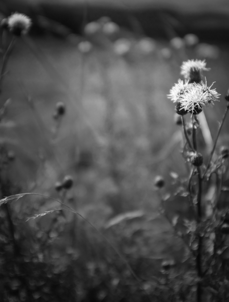
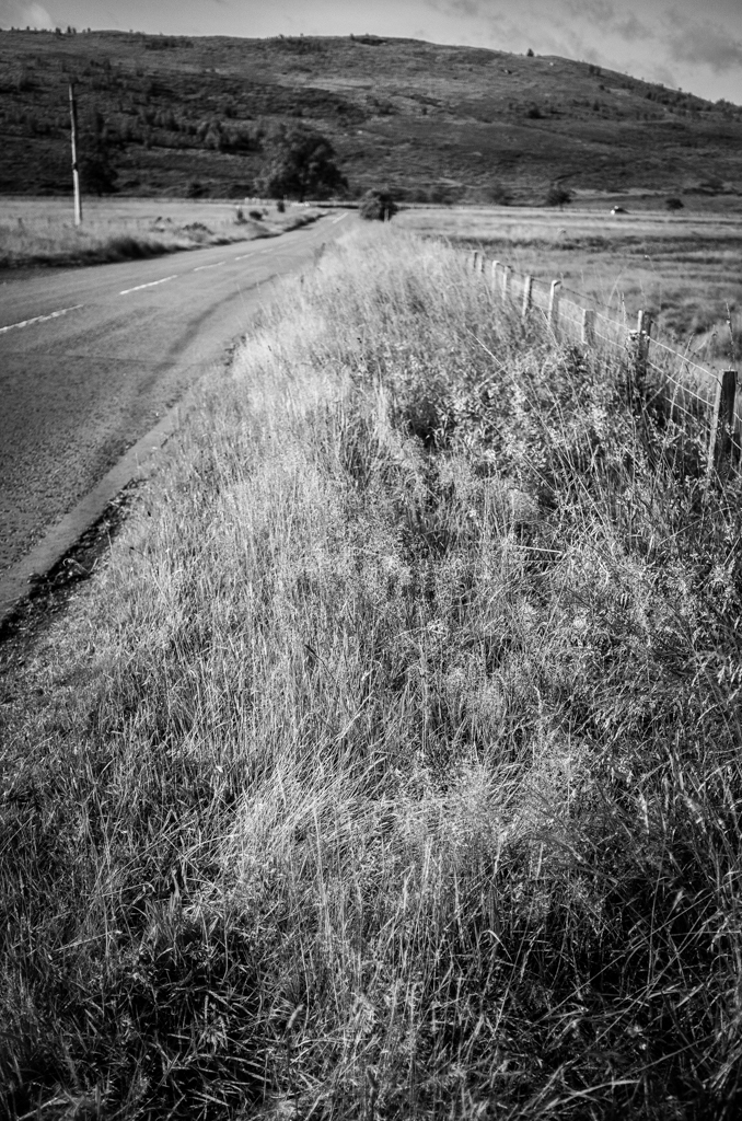
I’m a bloody fool. I made the stupidest of mistakes when shooting HP5 Plus 400 speed film at ISO 100.
I’d been intending to use 100 ASA film in my Nikon FE, so in preparation, I had set my camera’s ISO dial to 100. I loaded the HP5 and forgot to change this blasted setting. By the time I realised, I had already taken “some” photos. I didn’t want to wind the film on to change the setting because the sun was shining and I didn’t want to waste the light.
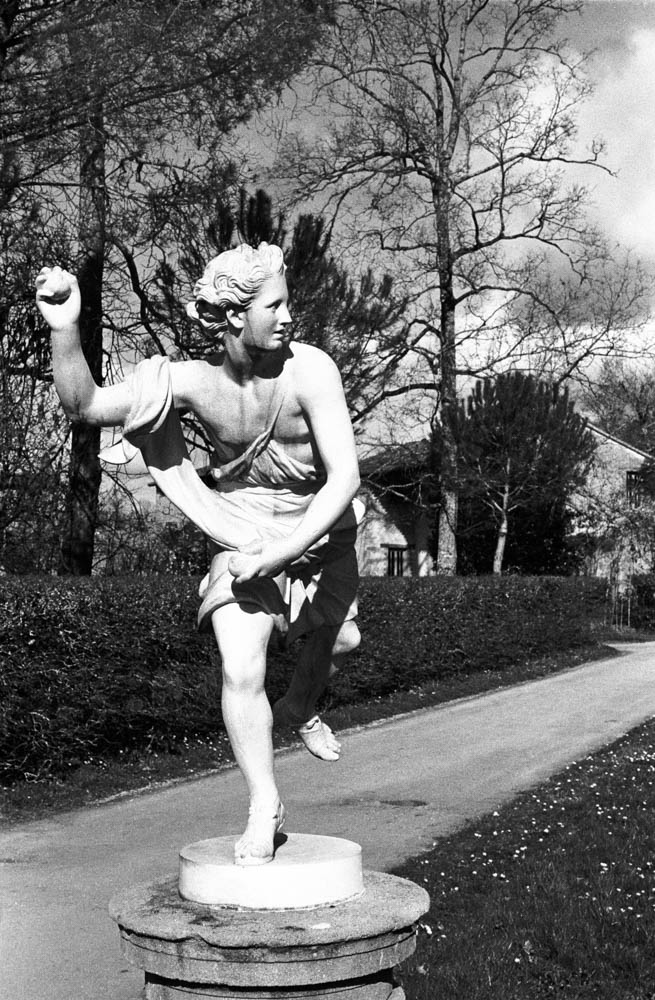
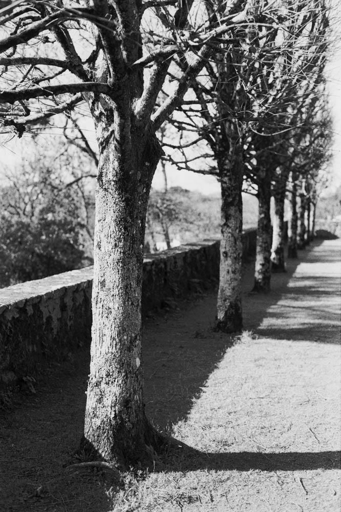
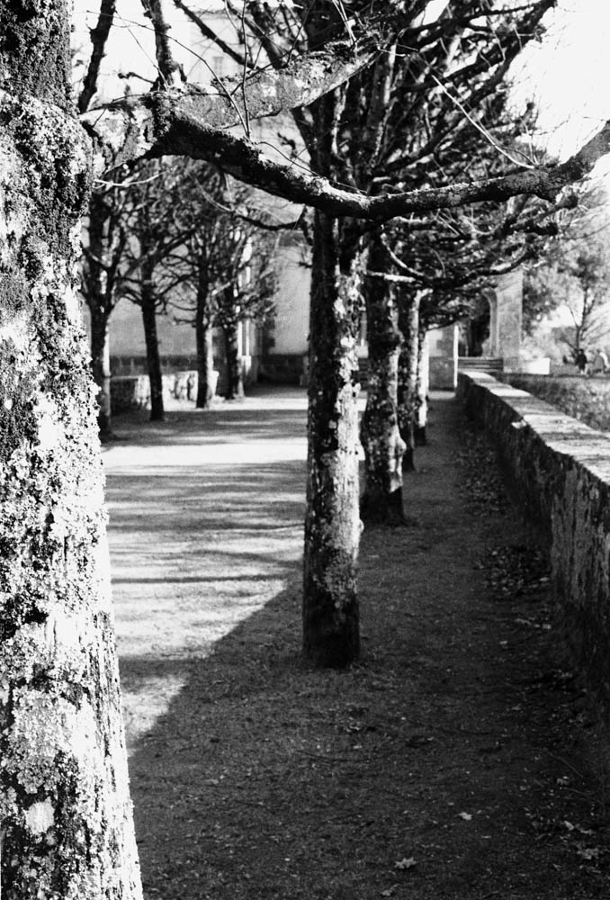
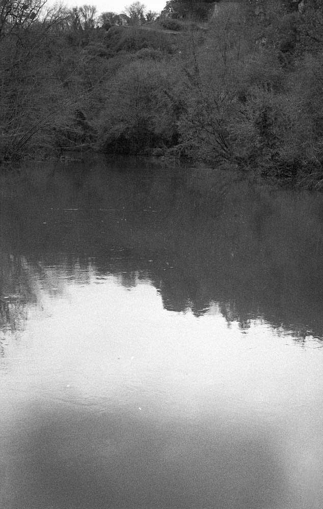
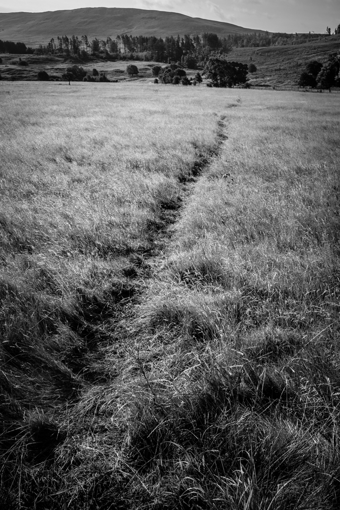
In for a penny, in for a pound. I thought, “What the heck?” They say you have all this “latitude” with film, so I went online to find out if I could salvage the roll. Here we go for a walk in the Parc Garenne Lemot in Clisson.
I developed the film in Ilfosil 3 (1:9) and used the development times for Kentmere 100, praying that I would have something usable…
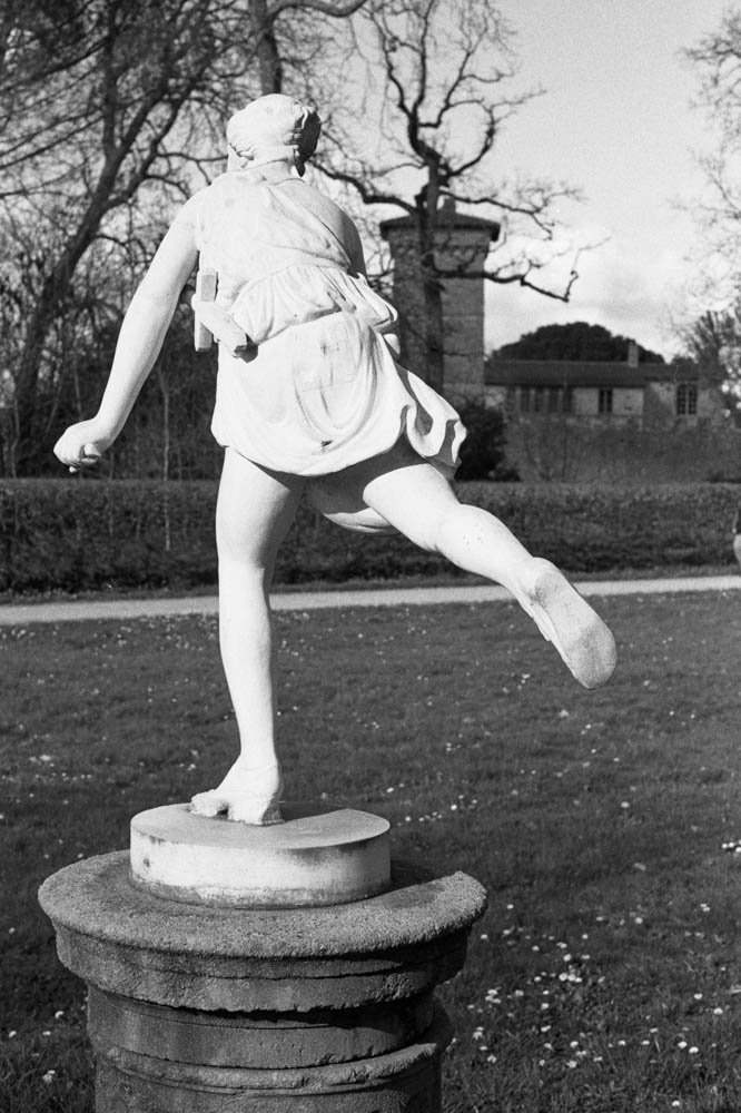
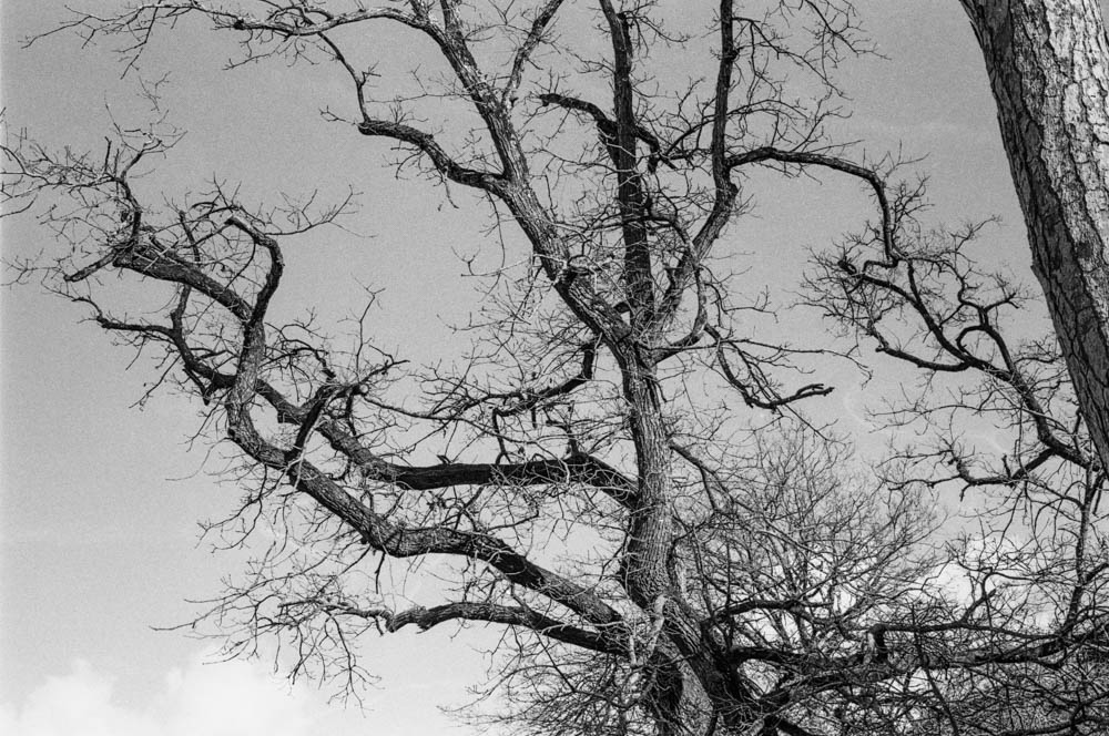
THE STATUE – Front view of classical statue on pedestal – This shot demonstrates the beautiful tonal range achieved through pull processing
The Theory: Pulling Two Stops
For those who aren’t deep in the film weeds, here is what I actually did. By setting my camera to 100 ISO while using 400 speed film, I was overexposing by two stops.
Now, common wisdom says that pulling HP5 to 200 ASA (one stop) is perfectly fine. But I thought I was pushing my luck pulling it two stops to 100 ASA. I thought I was taking the mickey with the film gods.
By giving it extra light and less development (pull processing), I was essentially asking the film to reduce contrast and grain significantly. I was testing just how much abuse it could take before the negatives turned into flat, grey mush.
I didn’t develop it for standard HP5 400 times. I treated the whole roll as if it were 100 ISO film from start to finish.
The Results
When I scanned the negatives, I was genuinely surprised. The negatives were dense, but not unmanageable. The scanner handled them well. Here is what the process actually looked like in practice.
1. Rich Shadow Detail
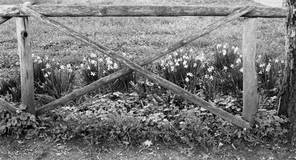
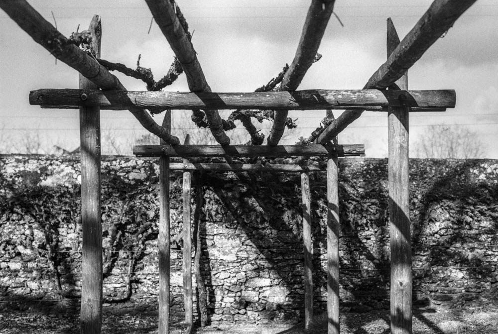
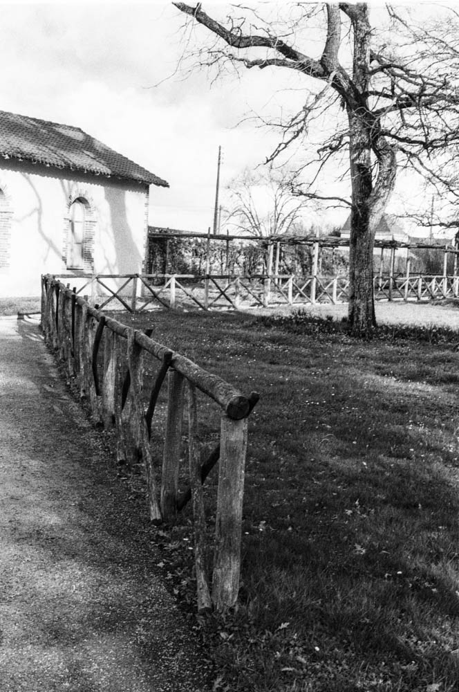
The first thing you notice is the lack of “muddy” shadows. Usually, HP5 can get a bit grainy in the dark areas. Here, the shadows under the pergola and the fence are deep, but they still hold detail.
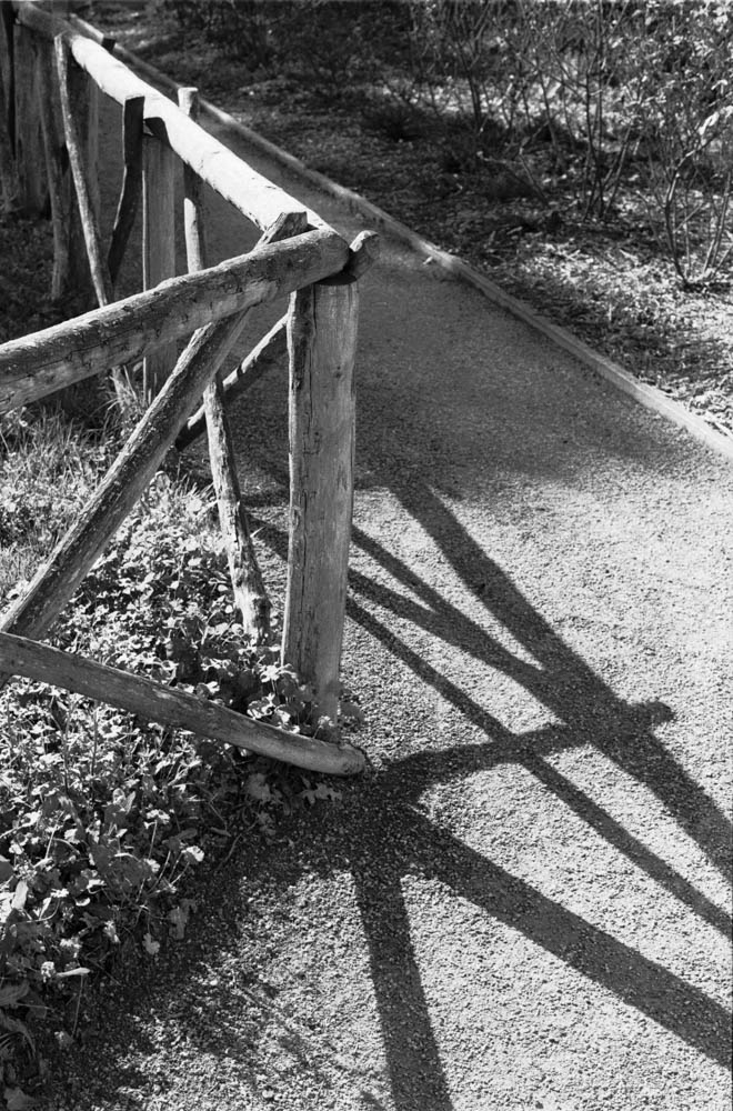
FENCE WITH LONG SHADOWS – Diagonal shadows cast across gravel path – Notice how the deep shadows still retain texture and detail in the gravel
2. Texture and Grain
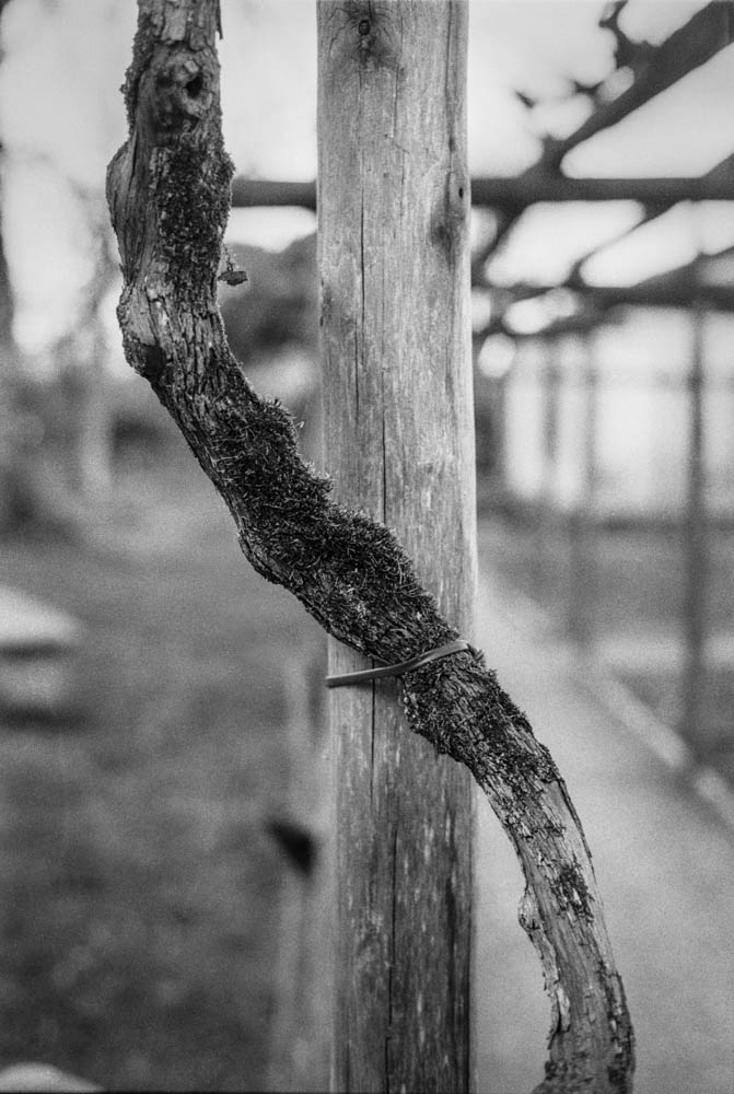
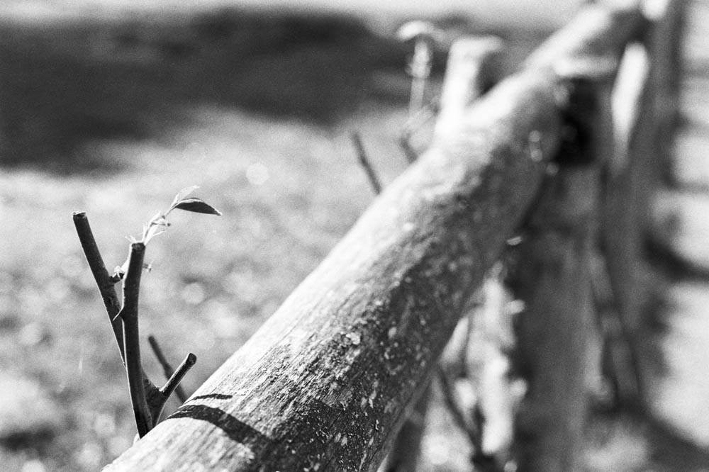
This is the real winner for me. Look at the texture on the wood in these shots. Because I gave the film extra light and reduced the development, the grain structure is much finer than usual. It looks almost like a slower film (like Delta 100) in the mid-tones.
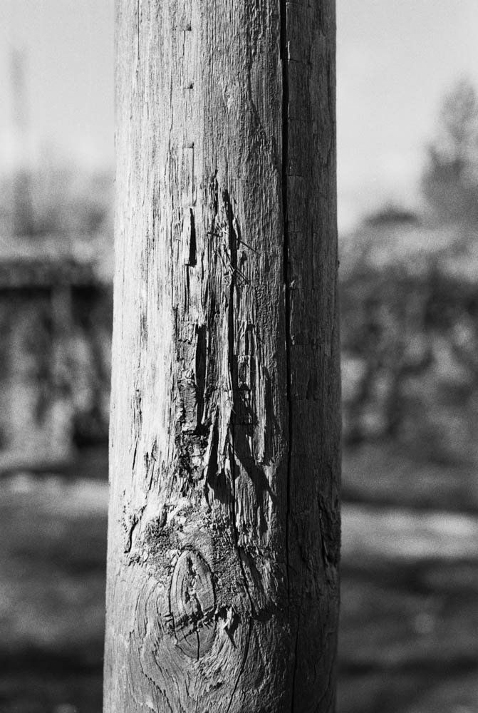
WEATHERED WOODEN POST – Close-up showing wood grain and texture – The fine grain structure is clearly visible in the wood texture
3. Highlight Control
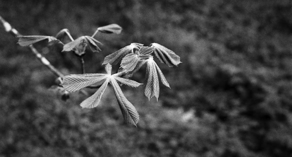
I was worried the bright spring sun would blow out the sky. Looking at these branches against the sky, you can see a beautiful grey gradient rather than a blown-out white. The reduced development time really helped keep those highlights in check, even with the two-stop overexposure.
BARE TREE BRANCHES AGAINST SKY – Intricate branch pattern with grey sky – This is the proof – the sky retains beautiful tonal gradation despite overexposure
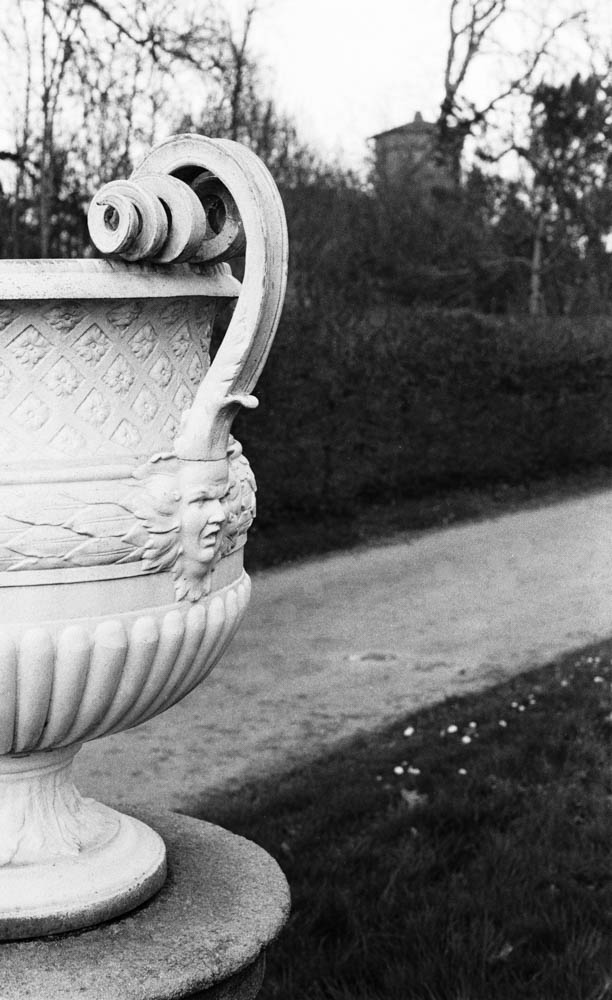
4. Tonal Range
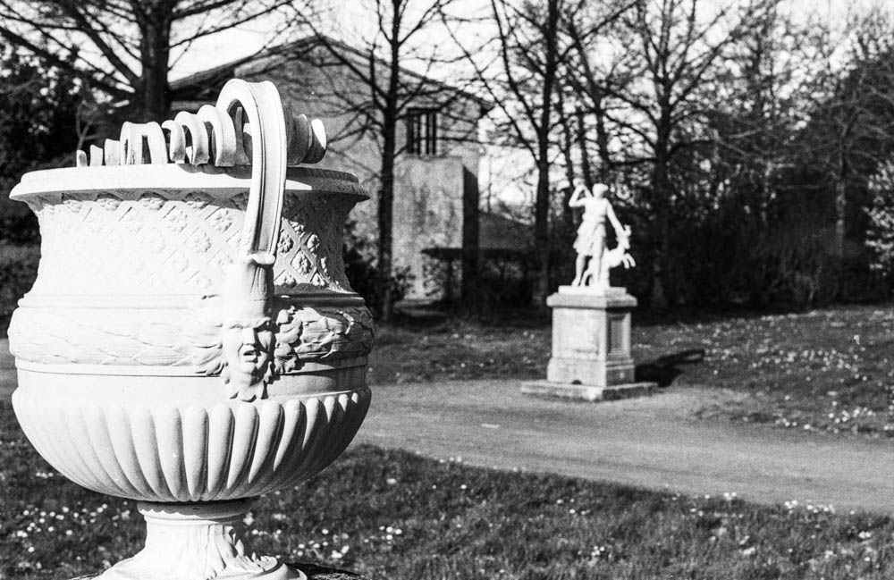
From the white marble of the statues to the dark foliage, the tonal separation is superb. The process gave me a creamy, classical look that I might not have achieved at box speed.
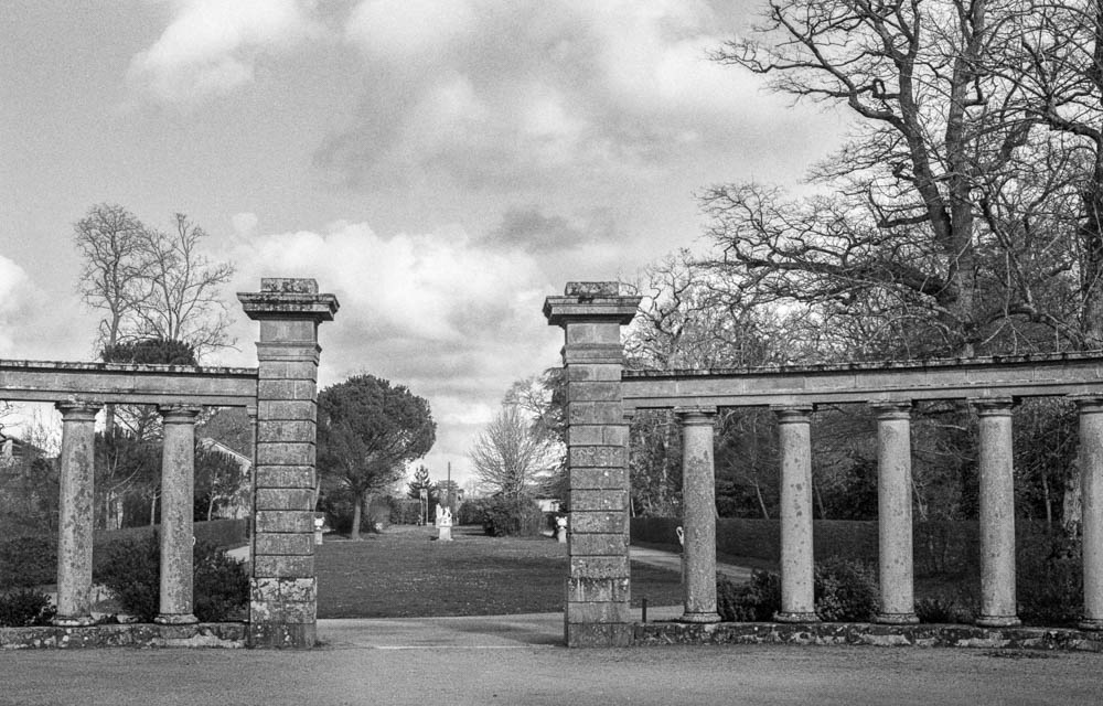
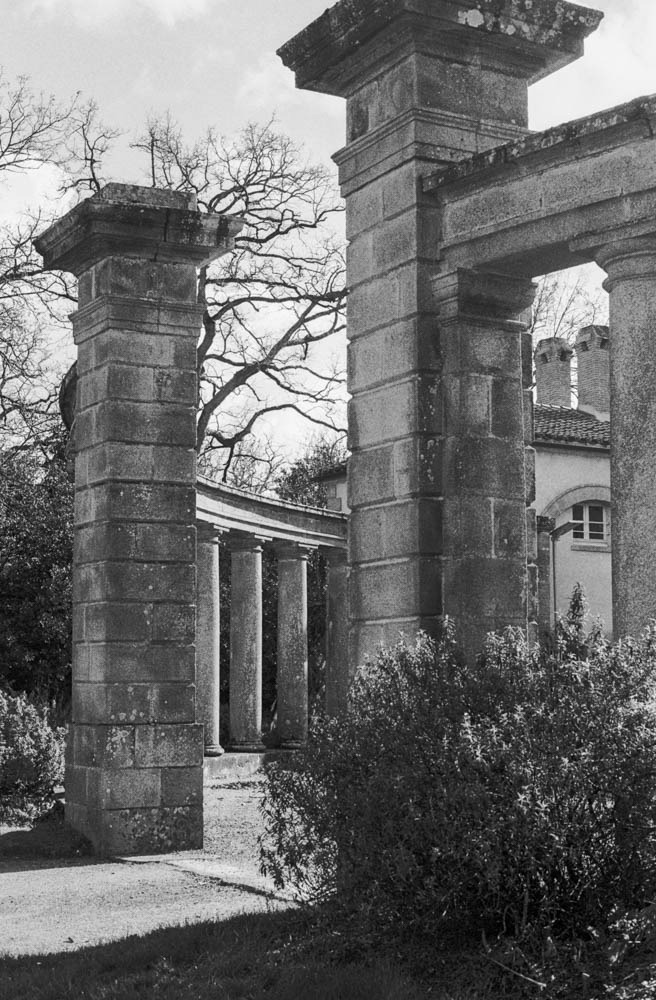
ORNATE URN WITH STATUE IN BACKGROUND – Layered composition – Foreground and background detail with smooth tonal transitions CLASSICAL COLONNADE – Stone pillars with cloudy sky – Weathered stone texture and cloud detail demonstrate the technique’s versatility
The Verdict
So, was this a disaster? Absolutely not.
In fact, I was pleasantly surprised. Because I gave the film so much light and reduced the development, the shadow detail is incredibly rich and the highlights are held back. There is virtually no grain in the dark areas. The contrast is lower than standard HP5, which gives it a very smooth, almost medium-format look.
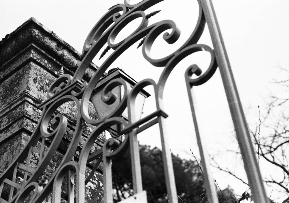
Ornate scrollwork detail – Razor-sharp detail and micro-contrast prove no sharpness was lost
It turns out, what I thought was a stupid mistake is actually a technique some photographers use on purpose! Pull processing HP5 (rating it at 100 or 200 ISO and developing accordingly) is known to produce finer grain and lower contrast. I thought I was pushing my luck going two stops, but the film handled it like a champion.
Would I Do It Again?
Would I deliberately shoot HP5 400 at 100 ASA again? No, probably not. If I want 100 ASA film, I’ll just use 100 ASA film. It’s cheaper and more straightforward.
But it’s damned good to know that at a push (sorry, pull), it could work. If you’re ever in a situation where you’ve loaded the wrong film, or you’re caught out by changing light conditions, HP5 Plus can take the abuse.
Have you ever accidentally shot film at the wrong ISO? Did you save the roll or bin it? Let me know in the comments below.
Continuing on from my last article about shooting in sub-par lighting, I’ll introduce my next roll of film—RPX 400 from Rollei. I usually like this film. This roll also marked the first time I really tried to use the Tone Curve tool in Lightroom. I’m still getting used to it. But I thought that with RPX 400, I might be able to make some ordinary prints somewhat less ordinary.
After forty years of doing this, you’d think I’d have it all figured out. You’d think I’d have a fixed workflow, a set of rules, a way of knowing exactly what the result will be. But this roll reminded me otherwise. There’s always something new to learn, or something old to look at differently. And I’ve started to wonder if there’s something honest in admitting that, rather than pretending the process is ever truly finished.
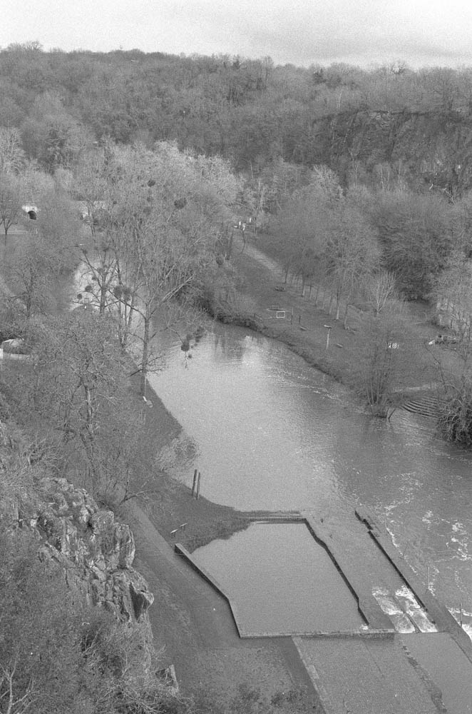
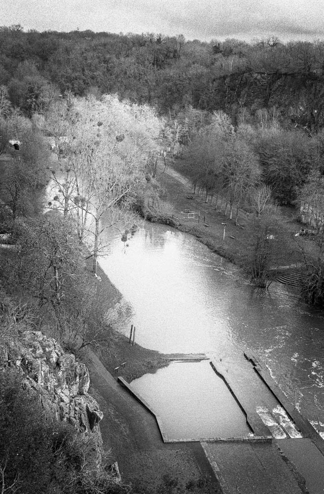
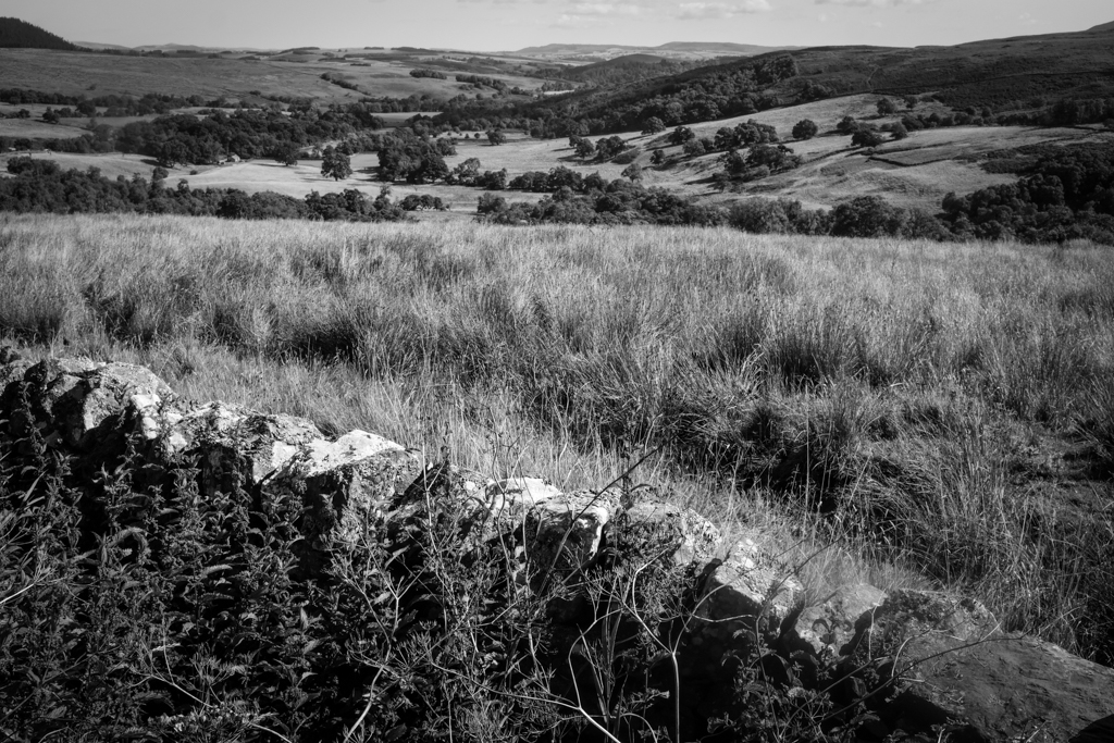
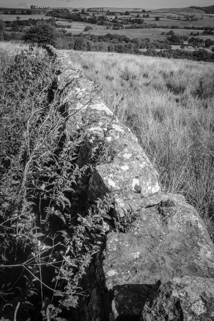
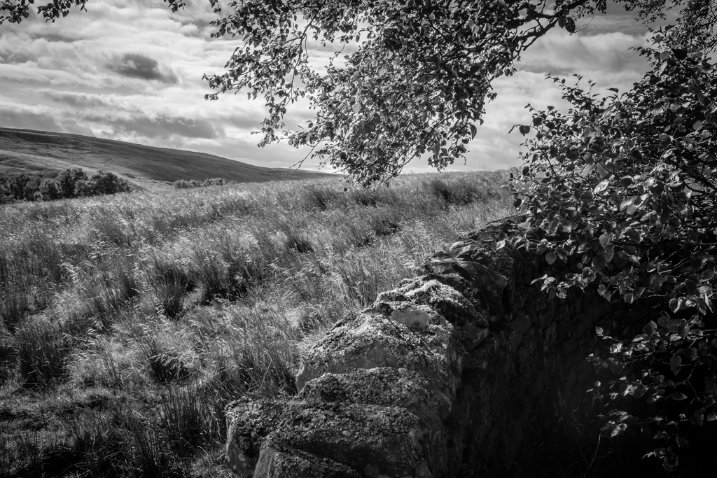
Pont Caffino on a February afternoon is exactly that kind of place. I’d never visited before, though I’d heard about it from other photographers. The sky was uniform. The light was flat. Nothing was going to jump out and grab me. So I loaded the Rollei, walked down to the river, and started looking.
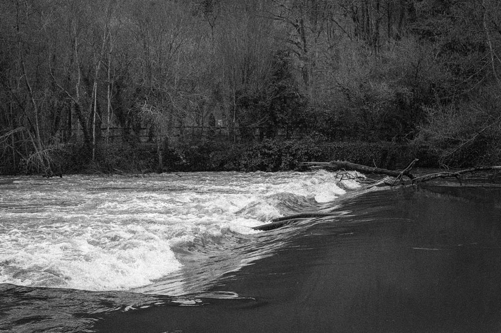
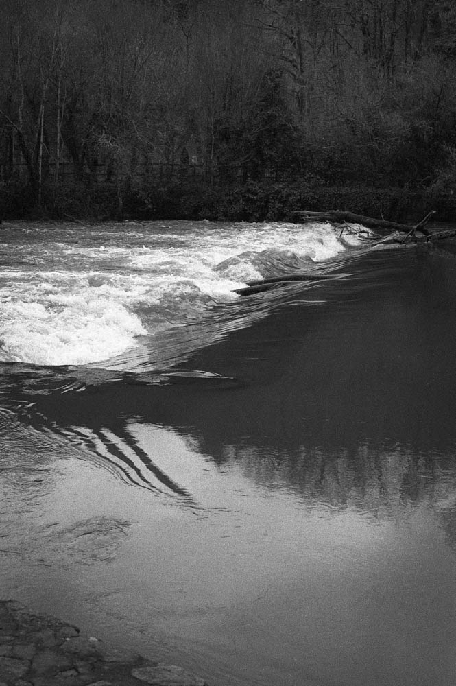
The River
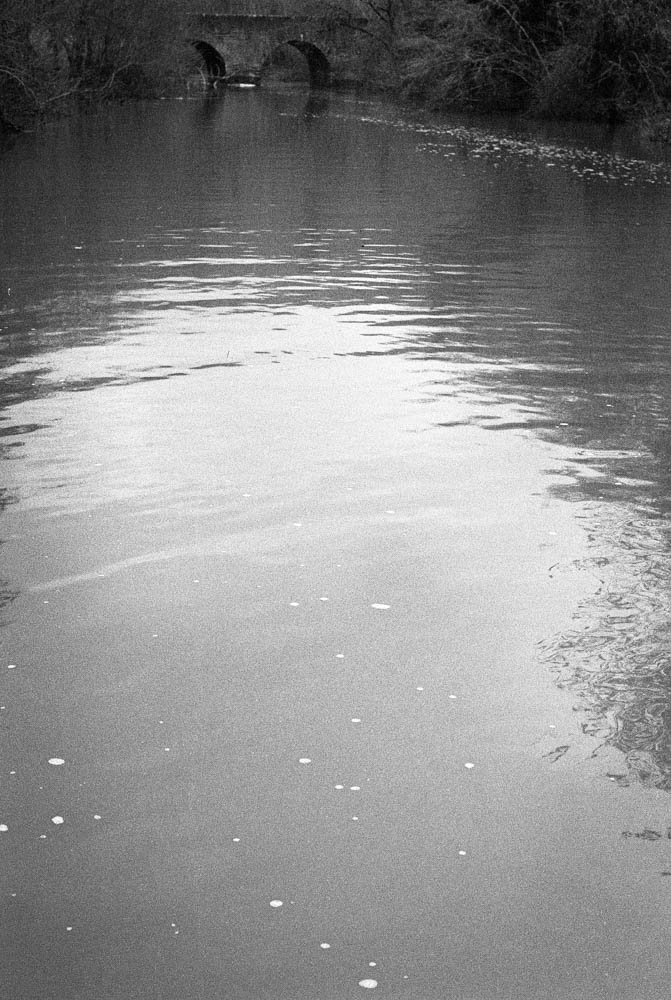
The water level was low—noticeably so. I knew this because not long before, I’d been at the Maine in St Hilaire de Loulay where the river had broken its banks completely. You couldn’t even see the weir there, just water spreading across the landscape. Here at Pont Caffino, the opposite was true. More of the granite banks showed through. More of the weir structure was exposed. The river looked different, and I found myself photographing it differently.
River surface with bridge in distance
When the light is flat, water becomes less about reflection and more about texture. You notice the foam patterns, the subtle ripples, the way debris catches on submerged rocks. RPX 400 handled this beautifully—there’s a softness to the water that feels accurate to how it looked that day, not how I wished it looked.
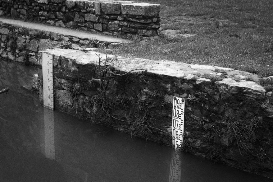
Water Level Gauges
The gauges became an unexpected focal point. They’re functional objects, not particularly beautiful on their own, but they tell the story of this place better than any dramatic landscape could. The reflection of the numbers in the still water added a compositional echo I didn’t plan but gladly kept.
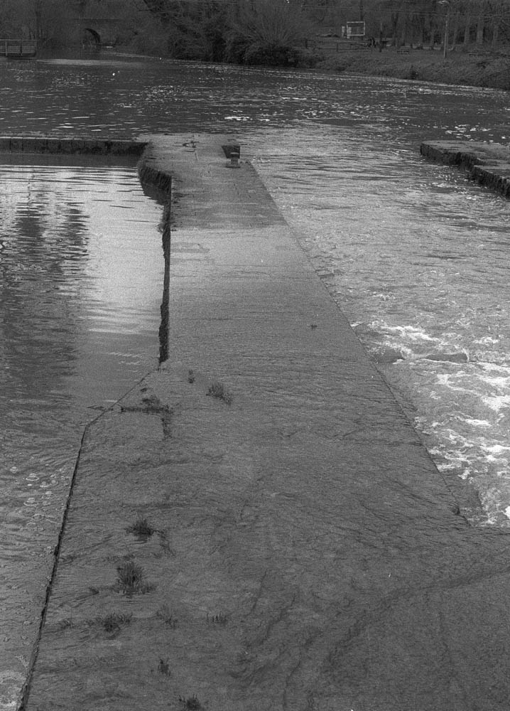
Weir Structure
Where the water quickened over the weir, I had to be careful with exposure. Film handles highlights more forgivingly than digital, but I still metered conservatively. The fallen branch caught my eye—it’s the kind of detail you miss when you’re looking for the big shot, but it adds a diagonal line that pulls the frame together.
On editing the water: The challenge here was separation. When both sky and water are grey, they tend to merge into one another. I used subtle dodging to lift the highlights on the water’s surface, just enough to ensure the reflections didn’t disappear. Nothing dramatic. Just enough to guide the eye.
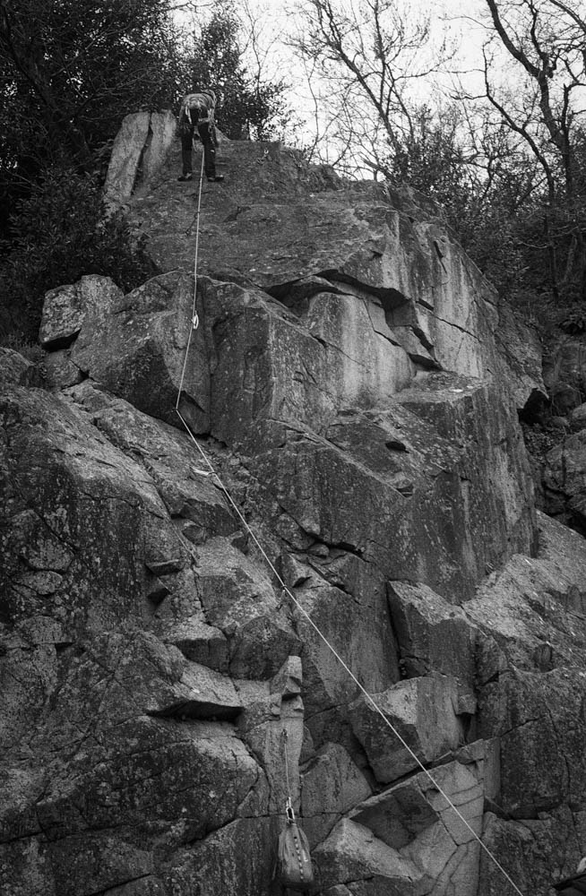
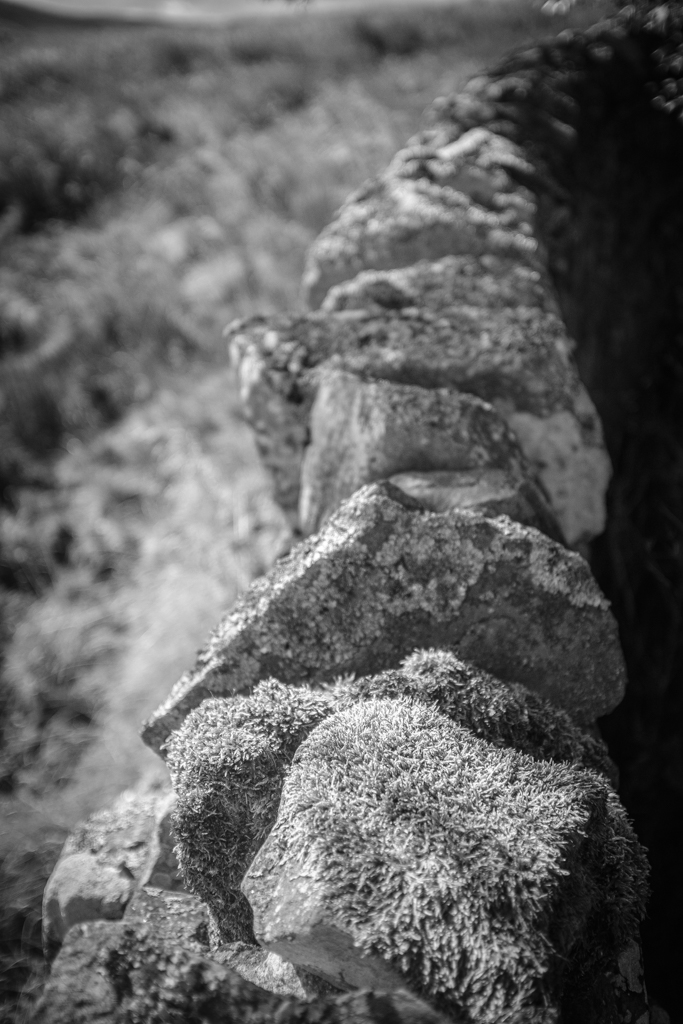
The Cliff Face
The granite cliffs that frame the Maine valley are dramatic even in bad light. They’re also popular with climbers, which adds a human element I hadn’t planned to capture but couldn’t ignore.
Climber on Granite Close-up
I haven’t shot rock faces like these on HP5+ before. The nearest I got to that was shooting in the Pyrenees mountains—different stone, different light, different everything. So I didn’t have a direct comparison to fall back on. What I noticed with RPX 400 is how it renders texture without aggression. Every crack and lichen patch comes through, but without the bite that HP5+ might have given. For this particular day, that suited the mood better.
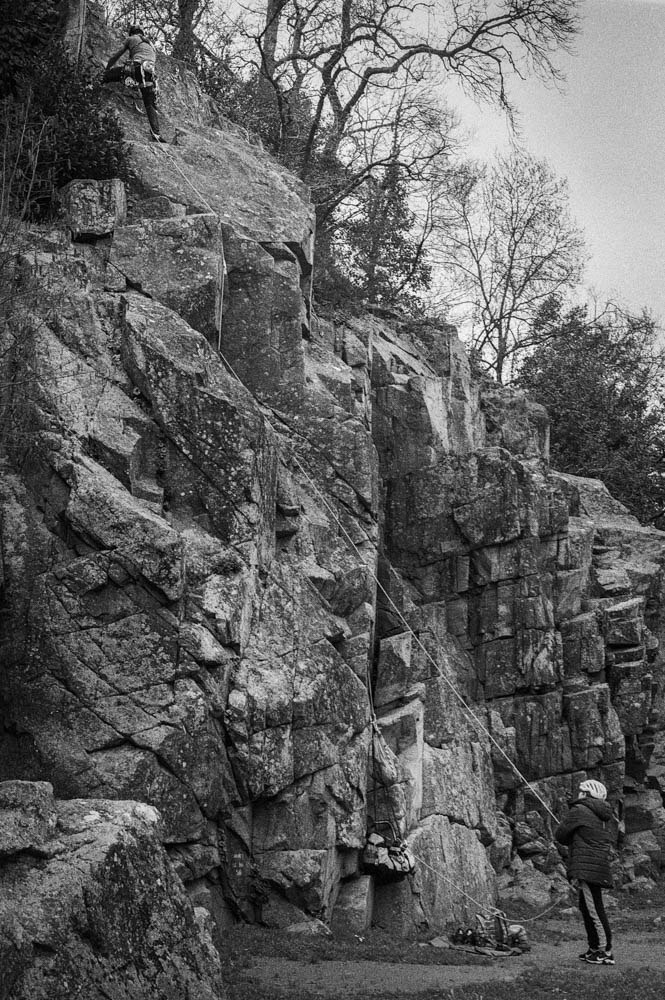
Climbing Scene Wider
Seeing the climber and belayer together reminded me that landscapes aren’t empty. They’re used. They’re lived in. The rope creates a diagonal line through the frame, and suddenly there’s narrative—someone is trusting someone else, and both are trusting the rock.
On editing the cliffs: This is where dodging and burning did the most work. Flat light makes rock faces look two-dimensional, like cardboard cutouts. I spent time burning in the crevices and dodging the raised surfaces, essentially repainting the light that wasn’t there when I pressed the shutter. It’s not about creating drama that didn’t exist. It’s about revealing the dimension that the light flattened.
Details
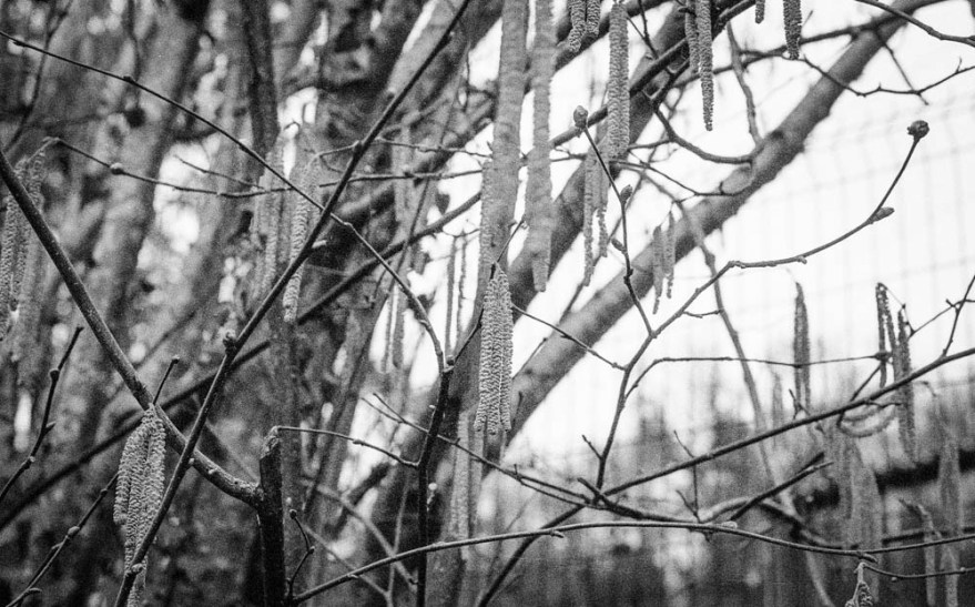
I’ve learned to slow down on days like this. When the big vistas aren’t cooperating, the small things start to speak.
Catkins/Branches
The catkins hanging from bare branches aren’t dramatic. They’re not even particularly interesting as a subject. But they caught the light in a way that felt worth capturing. The shallow depth of field creates a dreamy quality, and the grain—more noticeable here than in the landscapes—adds character rather than detracting from it.
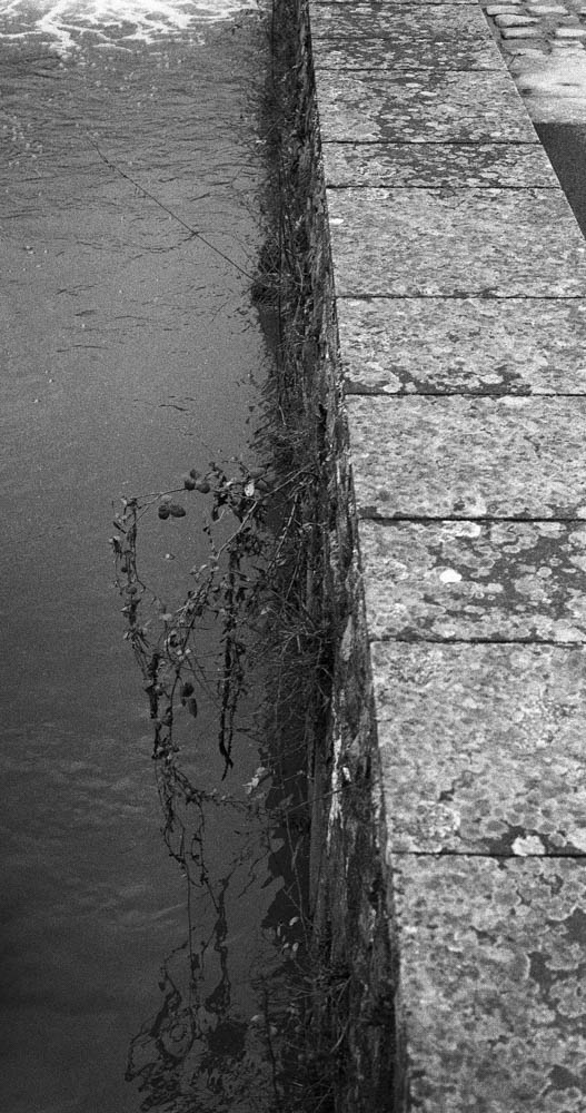
Water Edge Vegetation
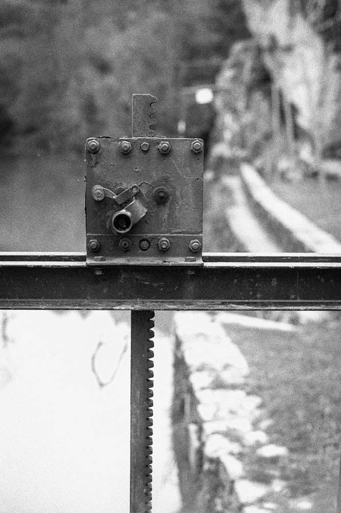
Mechanical Detail
The mechanical detail—the lock gate mechanism, I think—was almost accidental. I was walking back from the viewpoint and noticed the bolts, the geared rack, the weathered metal. It’s the industrial counterpoint to all the natural elements. Sometimes you just stop and shoot because something looks like it has a story.
On editing the details: I was careful not to over-sharpen these. The natural grain of RPX 400 provided enough texture without needing digital enhancement. If anything, I pulled back on clarity rather than adding it. These images work because they’re soft, not in spite of it.
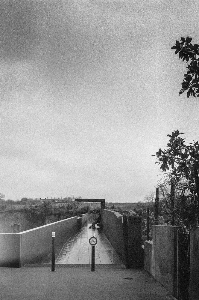
The Town & Viewing Platform
For the full perspective, I drove up to Château-Thébaud’s belvedere, “Le Porte-Vue.” It’s a striking piece of architecture—Corten steel extending 23 meters out at 45 meters above the river, designed by Emmanuel Ritz and inaugurated in 2020.
Walkway to Viewpoint
Walking out onto the platform, you feel the height. The steel underfoot, the railing at your side, the valley opening up below. There’s a figure in this shot—could be another photographer, could be anyone taking in the view. It adds scale and reminds you that you’re not alone in these places.
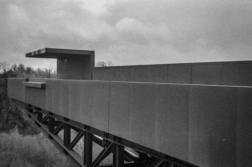
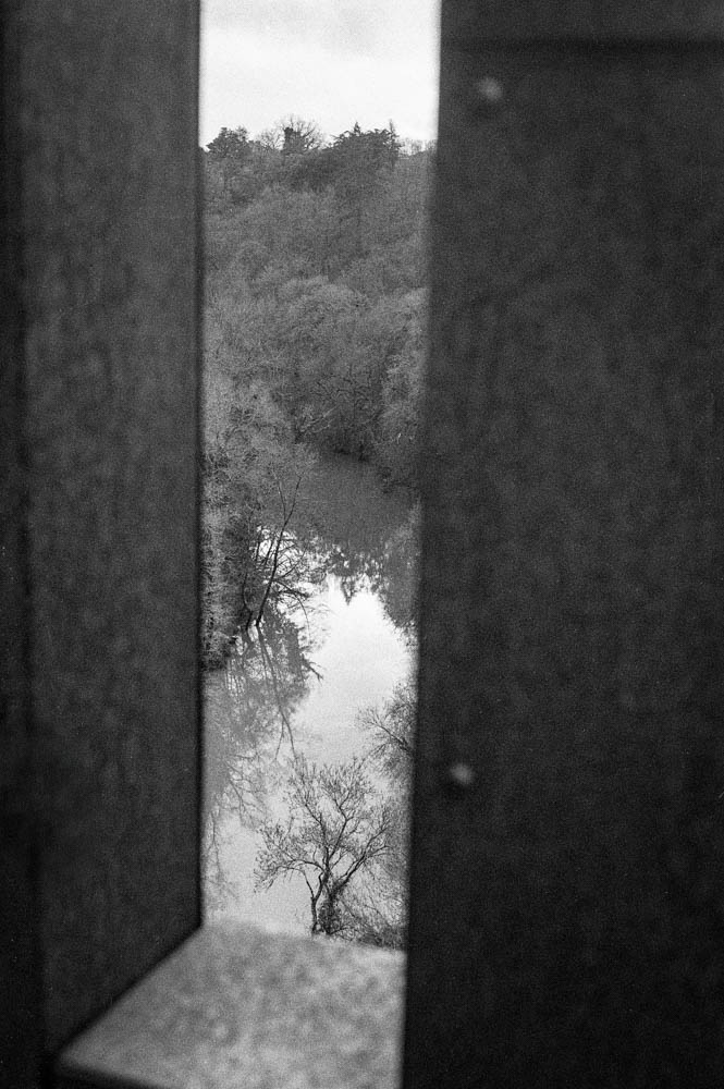
Le Porte-Vue Architecture
Framed View Through Steel
The Corten steel handled the flat light better than I expected. The weathered texture gave the film something to hold onto, and the geometric lines contrast nicely with the organic landscape beyond. The framed view through the steel structure became one of my favourite shots—it acknowledges that you’re looking from somewhere, not just capturing a scene.
River Valley Overview
This is the establishing shot. The full Maine valley from above, all the elements visible at once. You can see the weir, the cliffs, the tree line. After seeing the Maine at St Hilaire de Loulay with water everywhere, this view felt almost spare. The lower levels exposed more of the structure than I’d imagined possible. It’s the image that ties everything together.
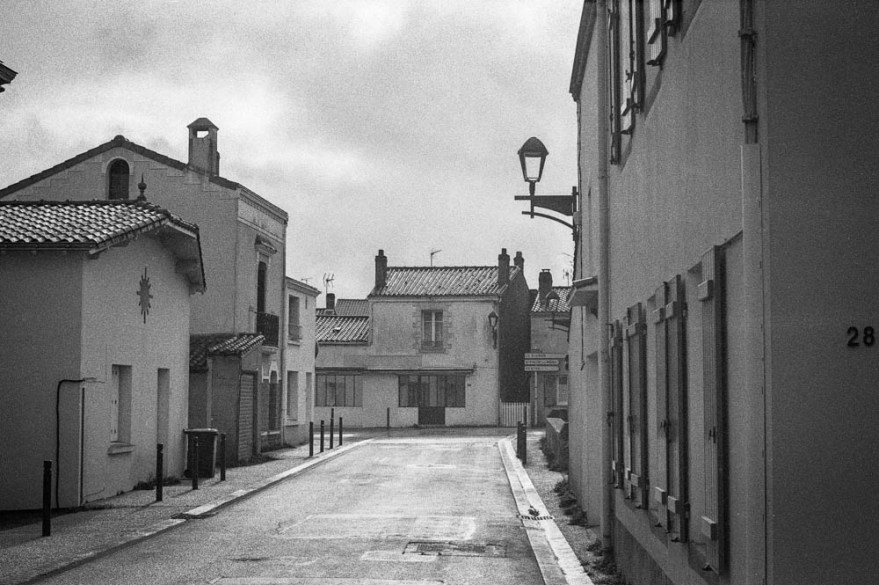
Church Steeple
Village Street
The village itself grounds the landscape. The church steeple adds a human landmark to the valley. The quiet street with its leading lines and the number “28” on the wall—these are accidental details that add authenticity. This isn’t a pristine wilderness. It’s a place where people live.
On editing the architecture: I focused on straightening lines and ensuring the steel texture didn’t look too smooth. The flat sky was retained intentionally. I could have blown it out or added artificial clouds, but that would have been dishonest. This is the light I had. This is the day I experienced.
On Making It Less Ordinary
Looking down at the river from Le Porte-Vue, I thought about what I was actually trying to do.
This was my first time at Pont Caffino, and I wasn’t sure what to expect. RPX 400 felt right for this quieter, more exposed version of the valley. But the film alone wasn’t enough. The scans came back flat—accurate, but lacking the dimension I remembered from being there. That’s where the work began.
In Lightroom, I used the Tone Curve to add a gentle S-shape, nothing aggressive. Just enough to add punch without crushing the blacks. I lifted the deepest shadows slightly to preserve the atmosphere. And then I spent time dodging and burning—manually painting light into the highlights of wet granite, holding back exposure in the shadows of riverbanks, guiding the viewer’s eye through texture and tone.
I’ve only started using the Tone Curve with this roll of film. I’m still getting used to it. But I’ve found it offers basic yet subtle controls, as does the dodging and burning. It’s easy to feel like this is cheating. Like you’re admitting the photograph wasn’t good enough straight from the scan. But I’ve started to think of it differently. Dodging and burning isn’t about fixing mistakes. It’s about translation. It’s about taking what you saw and felt and finding a way to communicate that to someone who wasn’t there.
There’s a danger in thinking you know everything. Usually, that’s when you stop seeing. When you assume the light will behave, or the film will respond the way it did last time, you miss what’s actually in front of you. I’d rather be the one still figuring out the Tone Curve after forty years than the one who thinks there’s nothing left to learn.
The result isn’t dramatic. It’s not the kind of image that stops you scrolling. But it felt honest—a quiet enhancement rather than a transformation. And on a grey February day at Pont Caffino, that’s exactly what I was after.
Technical Note
Film
Rollei RPX 400
ISO
Shot at 400
Camera
Nikon FE
Lens
50mm f/1.8 Nikkor
Development
Ilfosil 3 (1:9)
Scanning
Plustek OpticFilm 8100
Lightroom Adjustments:
Tone Curve: Gentle S-curve, highlights lifted slightly, shadows preserved (First serious use of this tool for me)
Local Adjustments: Radial filters for dodging/burning on rock textures and water surfaces
Grain: No reduction applied
Sharpening: Minimal, applied selectively on details
Thanks for reading. If you’ve shot RPX 400 in similar conditions, I’d love to hear how you approached it.
My usual approach to black and white photography is to shoot directly in black and white, either using black and white film or the Acros film simulation with my X100F. When using the X100F on this UK trip, my EVF displayed the black and white shot using Acros with a red filter—my go-to simulation. This method puts me in a black-and-white “frame of mind” from the outset.
However, this time I decided to break from my usual practice and experiment. I did something I normally advise against—starting with the intention to create color images and only considering black and white later. I chose the Classic Chrome film simulation instead of Acros, focusing on capturing the vibrant colors of the Northumbrian countryside. It was all about breaking free from my black-and-white routine. Both color and black-and-white photography have their place, but for this trip, I wanted to prioritize one over the other. Still, wouldn’t it be intriguing to compare both approaches?
Back in France, as I prepared the images for my black-and-white Instagram feed, I began to wonder if some of the colorful shots might also work in black and white. Initially hesitant—given my emphasis on shooting with intention and purpose—I decided to embrace the experiment. I was breaking one of my own rules, yet the idea intrigued me.
Reviewing the color shots, I considered which might translate well into black and white. I look for images with texture and varying tones rather than just color. My composition is usually solid since I’ve already edited my color images, including reframing and straightening as needed. With digital RAW files, converting to black and white and producing different versions is straightforward. As they say, the goal is to produce images that reflect how they made you feel, not just how you saw them. This is why I convert my images to black and white—they capture more of the emotional essence.
Opening Adobe Lightroom on my PC, I saw the familiar images on my screen. My editing approach may seem finicky, but it’s effective. While the simplest way to convert an image to black and white is to slide the “saturation” slider to the left, this often results in a flat, lifeless image. Instead, I use a more nuanced approach to control various color tones in the black-and-white image. This technique helps preserve depth and character, ensuring that each image maintains its visual impact even without color.
Here’s how I approach black-and-white conversion in Lightroom:
Black and White Profile: Sets the overall tone and mood of the image.
Clarity: Enhances texture and detail for a more dynamic appearance.
Contrast: Adjusts the range between light and dark areas, adding visual interest.
Color Sliders: Modifies the luminance of specific colors to bring out different tones in the black-and-white image.
Highlight Tool: Adds subtle vignetting and balances highlights for a polished finish.
So, why convert to black and white after shooting in color? For me, it offers a classic, timeless aesthetic, and challenges me to create a “better” image by focusing on composition and texture without the distraction of color. This approach pushes me to craft photographs that rely on fundamental elements, enhancing their overall impact.
Impact is at the heart of photography. While I cherish the colors of the Northumbrian countryside and am eager to learn how to use color more effectively, I also deeply value the strengths of black-and-white photography. It’s about transcending color to create images that resonate through composition and texture.
But there’s something more personal about these black-and-white conversions. Perhaps it’s because I broke my own rules this time around, allowing color to take center stage and letting the black-and-white images emerge later. These images weren’t planned with black and white in mind—yet, despite that, or perhaps because of it, they feel even more special to me. Sometimes, going against what you think you know leads to unexpected results. And, in this case, those results resonate even more deeply.
Isn’t impact what we strive for in our photography? Don’t get me wrong—I love the colors of the Northumbrian countryside and am on a quest to learn how to use color more effectively. But I do believe in the strength of the fundamentals offered by black-and-white photography. Sometimes, breaking your own routine brings surprising rewards.
As the title suggests, I will describe my workflow when out and about. While there are surely other ways to do it, this is my method. It works and has stood the test of time. I usually wander around taking photos, then find a café to sit down and transfer my images to my phone. Everything is better with a nice cup of tea (or coffee) and a piece of cake.
Downloading Photos to Your Phone
Most cameras today can connect to phones via Bluetooth or Wi-Fi. My two Fujis (X100F and XT2) and my Canon (6D Mark II) certainly can. I enable Wi-Fi on my camera and connect it directly to my phone. Next, I open the corresponding app—Canon Camera Connect for my Canon and Fujifilm Camera Remote for my Fujis. Each manufacturer provides its own app for Android or Apple devices. Once the camera is connected to my phone, I can import my photographs, selecting the images I prefer.
Sorting Photos
Now comes the fun bit: sorting through all those wonderful shots you took and deciding which ones are worth working on and editing. When I transfer my images from my camera to my phone, the phone creates a folder for the imported photos. Different apps will put them in different places, so I’ll leave that to you to manage. As a rule of thumb, you will see them in the gallery app, which will show you your latest photos.
In the gallery app, you can sort your photos by date taken, favourite images, or the place where the photo was taken.
I will assume you have read my last few articles on Photography 101, composition, and the types of lenses available and how to use them, or at least how I use them. If you haven’t had that pleasure, then go and have a read…
Is the photo worthy of publication, and are you happy with it representing your talent as a photographer? Is the image in focus? Is the image well exposed? Does it fulfil its storytelling role? Will it add to your narrative? Or simply, do you like it enough to want to share it?
Let’s assume that you answered yes. You then get to share your image to Snapseed.
Editing in Snapseed
Starting with Styles:
I like to begin by using the “Portrait” style. It is a preset that gives the photo a subtle glow and some vignette. I just seem to like it, and when you have something you like that flatters your image, you are tempted to stick with it. Most times, this will work a treat on well-exposed images. But let’s imagine that you have exposed for the highlights and that your shadows are “too dark” and you want to bring them up a bit. Then I would go to the “Tools” section and use the Tune Image.
En aparté:
When exposing in digital photography, we expose for the highlights, as it is easy to lighten, or “bring up” the shadows, and we don’t want to “blow out” our highlights and just turn it into a mass of white. In film photography, it’s the opposite. We expose for the shadows, as film has more difficulties capturing details in the shadows especially in a photo with lots of light.
Using the Tools
As I inferred in the title, this is my workflow, and shows the way I use Snapseed. There’s a whole load of tools to stylise your image and to completely change the look of it, but I’m more of a “less is more” disciple when editing. Also most apps out there will have similar tools, so you can carry this knowledge with you across the board.
Crop Tool:
One thing I learnt early one is to KISS, i.e. Keep it simple stupid. Sometimes I will have an element in my photo that distracts from my subject. With the crop tool I can just crop the image and make it disappear. I can also use the crop tool to format the image to fit certain social media post settings. I’m thinking about you Instagram and Facebook. Try searching google for social medi formats and you will be inundated with results.
Healing Tool:
Sometimes the crop isn’t enough to take away distracting elements from our photo. You might have a beautiful shy and want to get rid of that Jumbo Jet in the sky. One way of doing that is to wait until the Jumbo Jet has flown away, but let’s say that it’s too late… Using the healing tool will clone part of the image and replace the Jumbo Jet that just wants to noticed and validated man! To get the best results it’s better to zoom into the image and have a smaller area to work on.
Tune Image:
This is where I do the basic edits, bringing up the shadows or bringing down the highlights. I usually keep it to that. At a push, I will bring up the brightness if the photo has been underexposed. Somtimes I will add a little contrast but I tend not to use the other tools. I don’t want to denautre the photograph.
Rotate Tool:
We should always try and keep our horizons straight, except when making the conscious decision not to. The rotation tool tries to straighten what it thinks should be straight. It generally works quite well, but you do have total control as well as a grid to check the lines in your photo.
Brush Tool:
This is where we can do our burning and dodging. You can choose to highlight a certain area and darken others to emphasise your subject. This brings the photo to life. There are tutorials galore on YouTube that go into more detail than I will in this “basics” article.
Black and White Tool:
Welcome to the world of black and white conversion. It’s a process that a majority of my photography goes through. You can, of course, just use the saturation tool in the “Tune Image” section, and you will get a monochrome image. But you can do so much more.
So, let’s do so much more. The black and white tool offers you some presets which might correspond to your taste. I tend to leave them alone and instead press on the circle that will give a series of colour filters to choose from. This is a direct link back to black and white film photography, and you know how much I love that. I love using the red filter, which, as in film photography, will make your blues darker. This is beautiful for those landscape photos where you want a dark sky to complement those fluffy white clouds. It’s also my default film simulation on the X100F that I use for all my street photography. It’s just a look that I fell in love with years ago. The other common filters are all covered too.
Orange: Orange filters give stronger effects than yellow filters but are not as bold and dramatic as a red. It is therefore an ideal choice to span the effects given by both these filters. Blue skies will be recorded in very dark tones on the print, giving bold contrast between the sky and clouds. An orange filter will also penetrate haze and fog. Most flowers will be recorded with a significant difference in tone from the surrounding foliage giving impact and effect.
Yellow, the general purpose black and white filter,
Green: When photographing foliage in black and white, a green filter is used almost exclusively. It lightens green foliage, which is particularly important with dark green leaves which can record very dark without a filter. It therefore gives a more natural, lighter feel to the photograph.
Blue: A blue filter is not often associated with black & white photography however, it can really add “mood” to a photograph by increasing the effect of haze or fog. It also lightens blues and darkens yellows, oranges and reds which helps separation in scenes containing a mix of colours.
Export
You have two options. You can either press on “done” and Snapseed will record your image in the Snapseed folder and in your gallery in the Album neamed Snapseed, or you you can press “share “and you will be presented with various options on how to share your image, to Instagram, via gmail etc.
Before you do that you can press on settings where you can change the resolution of the image that will be exported. This can help if you need to reduce the image to take up less space on your phone, or if you’re loading the photo up to a website and you require a “lighter” image.
Conclusion
You now have an idea about how I edit my images on the go, and the more time goes on, the more I do it this way. Is it the same as Lightroom on my computer? No. I can’t have as much control as in Lightroom. I can’t batch edit, I can’t do this or that, but I can manage without, especially on the go. There are of course other options for photo editing on the go like Lightroom mobile,VSCO, your native photo editor app on your phone. As I said at the beginning of the article this is how “I” do things. It works for me. Try it out and it might just work for you too!
Twenty-two years ago, I was fired from the job that took me away from Paris to the French countryside where I now live. In hindsight, it was one of the best things that ever happened to me. Sometimes we need that shove beyond our control to nudge us in a different direction.
At the time, I was already into this new thing called the internet that was becoming more and more mainstream. I wanted to learn all I could before my children would teach me. So, I learnt. I even trained to be an “infographiste,” which is similar to a webmaster, now known as a web developer.
AN ENGLISHMAN IN VENDÉE
I learned how to use QuarkXpress, Indesign, Dreamweaver, Photoshop, and Illustrator. I also learned how not to be afraid of opening up a computer and getting in there with a screwdriver. I had this amazing idea of creating a website called “An Englishman in Vendée” to showcase outings with my young son around the area. I took photos with a “webcam” which was about the size of a GoPro but compared to what we have twenty years on, was anything but pro. At the time, I dreamt of having portable internet, portable editing software, and a means of sharing those pictures online.
I would have to wait a while. In 2024, I have a Samsung S20 FE and I now have all I need to do that, on the go! I can even transfer the photos from my high-end digital camera to my phone, edit the images on my phone, and publish them either on my website (no longer Geocities) or on social media.
WELCOME TO SNAPSEED
Now I use “Snapseed” for editing my photos, WordPress for writing my articles, and Chat GPT to give my articles structure and a writing plan. All this in a device that fits into my pocket.
So, what is Snapseed? It’s an app that I recommend to anyone who needs to edit pictures on the go. It is available for Android and Apple devices, so you’re all covered. But why Snapseed? Well, it’s free, simple to use, and has all the tools you need for editing. It’s intuitive and comprehensive. I particularly like the Tune Image section, where I find all the tools I use for basic edits in Lightroom on my PC. The Rotate tool helps me check horizons, and the Black and White tool gives me full control over the conversion process.
Snapseed is a non-destructive editing programme (app) that uses your original file, whether RAW or JPEG, and allows you to edit to your heart’s content. Can it do everything Lightroom can? No. Is it trying to? Still no. It adds some nice “style filters” in the tool section that allow you to have fun. The more serious photo editor will probably stick to the basic tools that still allow them to get the results they need “on the go.” I use it during shoots to give sitters an idea of what their shots will look like. These first “draft” images are perfect for sharing on social media.
KEEP IT SIMPLE WITH SNAPSEED
I’ve talked about KISS in the past, and I’m going to mention it today too. KISS – Keep it Simple Stupid! Snapseed is deceivingly simple when you look at the user interface, but it has a range of tools that help you achieve the look you want.
It starts by offering you three basic options: Styles (similar to presets), Tools (where you can fine-tune everything), and Export (where you go to export your edited photo).
STYLES
Styles are essentially presets in other software, and Snapseed offers a variety of styles:
OriginalPortraitSmoothPopAccentuateFaded GlowMorningBrightFine ArtPushStructureSilhouetteI have a preference for “Portrait,” but feel free to explore and find your favourite.
In the next article, we’ll talk about the various tools Snapseed offers to help you edit on the go. I will walk you through my basic editing process, showing you which tools I use and how I use them. Remember the 80/20 rule: 80% of your editing can be done with 20% of the available tools. So be patient, and you will be rewarded for your patience. See you in the next one!
You might have caught on to the fact that I’m a little bit the photography enthusiast. I even have a “few” different cameras, most of which are manual film cameras, with a few digital ones thrown into the mix. Over 40 years of learning have gone into getting the results you, Dear Reader, might just have seen on this blog.
Democratisation of photography
How many times have I heard people say, “Oh, I just use my phone,” or worse, “Oh, I could just do that with the camera on my phone?” These statements can really get on my wick! Don’t they just toss aside all the work I’ve put into photography with “real cameras?”
But after a lovely cup of tea and a slice of cake, my nerves have settled, and I’ve had time to reflect on the brashness of my emotions, and come back down to earth. Yes, some people do use the camera on their phone, and maybe, just maybe, unlike the microwave in the tea-making process, it might have a role in photography. Ooooooh, haven’t I just gotten controversial!
A little historical context
Just a quick interlude to remind myself of the democratisisation of photography that came with the Box Brownie in the 1920 and the purists were up in arms! Then the shock and horror of those same purists when colour photography came out with those dastardly Kodak Instamatics, and making photography even more egalitarian. Maybe the phone is just the extension of this and I should remove my own head from my arse and just chill!
The best camera?
“The best camera is the one that’s with you.” — Chase Jarvis.
While this statement might be true in absolute terms, it pains me to admit that for most of the hoi polloi, that camera might just be the one on our ever-intrusive phone. Does that mean I’d choose my phone over a film camera? Hell no! But it does remind me that photography is about capturing the decisive moment in time. I’ve often talked about balance in the photographic process, where you might have to sacrifice grain or digital noise (grains rather disgraced cousin from an inbred family, where somebody knew somebody in the family), to get more light to expose a shot. Or where I might have to sacrifice a certain amount of bokeh, in order to use a longer lens to “bring me nearer to my subject… The eternal give and take, if you will.
I think we might just have to have a little reality check here. Will a mobile phone, or even a very smart phone with a degree in smartness from the dashing and debonair university of Smartness upon Thames, ever be as good as a film camera, or a modern DSLR, even my beloved X100F? No. Sorry if I have just pissed on your bonfire. It will not. However, does that mean that it is completely useless? Far from it.
You still have to “think!”
As an avid reader of this wonderful and thoroughly informative blog, it will not have escaped your attention that I have written a couple of articles about the fundamentals of photography. Going from the very basics of the exposure triangle, through various rules of composition that come to us from the world of traditional art, and that have been transferred to photography. You will have found out and learnt about various lenses available for various cameras, and I have even touched upon the differences between medium format and 35mm film photography. I talked about the advice given for digital as well as film photography. I’ll let you into a secret, “It’s just as valid for smartphone photography!
Yes, I’ve said it. If you put in as much effort into getting the shot on a smartphone as you do with your “real” camera, then You will get good results. Can you have control over every aspect of the shot? No. But, and it’s a big but, “so you other brothers can’t deny,” there is a lot of technology in that little device that really helps you out.
Mindful always
What I’m trying to get at is that when you mindfully take photographs, even with your phone, it is always better than just snapping away like a small dog that knows it’s small. Just a tiny bit of effort towards composition will go a long way. Think about framing, and where the objects are in your image. Think about where the light is coming from. Try and get the best image that you can. So it’s not a Leica? You still have your kidneys and haven’t had to sell one yet. It might be a less formal way of taking a photograph, but I would really like you to respect yourself and put in the effort to take your phone photography beyond the bare minimum.
Conclusion
It would appear that smartphone despite my frist misgivings is here to stay. It is a logical progression of the democratisation of this art. I have been asked to contribute to the website Monochromia, and one of my future colleagues reminded me that one of their contributors uses only his Iphone, and has received all kinds of accolades and has been the subject of numerous Expositions. I have seen his work and it is clear that he is a most mindful photographer, and the only thing that separates us are the tools we use to capture the image. I must not be such a photgraphy snob and so dismissive.
What’s next
I might just have to go further into this subject and talk about editing images on your phone and giving you ways of sharing your images if you so wish. Maybe even some tips to help you get the results you want. I will talk about the features of the phone camera, how the AI within can help you not just in photography, but also in video production. Stick around to find out more!