A photography Philosophy – Part III – The Emotions of Photography


The Connection between Emotion and Image

I’m going to tell you a story about an essay that was given to us by the music master at the beginning of my Music A level course.  There were four of us studying music, and the lessons took place in his study, much like a tutorial at university.  The title of the essay was something like describe the perfect piece of music.  

Back then I described the Glenn Miller song, Moonlight Serenade.  One of my fellow pupils described the Planets from Holst.  In the following tutorial after our essays had been marked, I was criticised since the Master thought my piece was repetitive, had no particular musical merit, and was corny.  I, on the other hand, argued that it was the way the piece made me feel.

With hindsight I should have just handed in a clean sheet of paper saying that there is no such thing as a perfect piece of music, as taste is purely subjective and that he should take his essay question and possibly reconsider his stance!  I didn’t of course.  But it certainly got me thinking, even to this day!  

Subjectivity in Art

As in any art the appreciation of the viewer is purely subjective and we have to be so careful about reading an interpretation into a given work.  There are effectively themes that are explored in literature that could be described as obvious.  But in Photography, I maintain that any connection to a particular photograph is an emotional one first, before going any deeper.  

The Essence of Emotional Connection

But what makes this emotional connection possible? And how do I go about achieving this in photography.  I’m going to harken back to my musical training.  My horn teacher in France would say, your concerto is your text.  Your job is to recite that text to the audience.    That is all you have to concentrate on.  You’ve worked through your concerto, the techniques necessary to play it, and once the sound leaves the bell of the instrument, it is no longer yours.  It belongs to the audience.  They are the ones listening and they are the ones that will form the emotional connection.

Creating Meaningful Portraits

So how do I make this connection with my audience when it comes to photography?  Well, in portraiture they say to focus on the eyes of your model.  Eyes being the entrance to the soul. If I can capture that and have my model looking directly at my camera and therefore my audience then I’m well on the way to creating a meaningful portrait.

Kate, my daughter
The Art of Street Photography

In my street photography, it can be about catching a detail that everybody sees but that nobody notices until they look at your image.  You can go to my photography tutorials and look at the composition articles to learn about how we direct the audience to a particular point in our photograph by using leading lines, the rule of thirds, and emphasising our subject with our lighting, or by isolating our subject.

The Role of Colour in Evoking Emotion

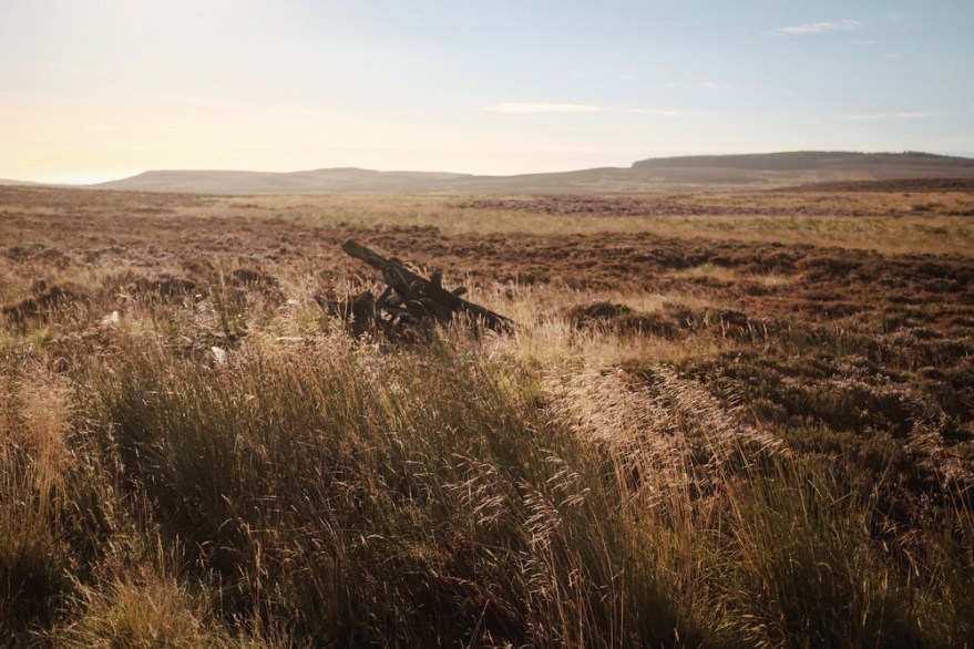
We also solicit emotion through the colors we choose. Warmer tones can infuse images with energy and happiness, while cooler tones can make them feel peaceful or introspective. For example, adding reds and oranges to a portrait can evoke warmth and approachability, while blues and greens can give a landscape a calm, reflective quality. Considering these colours “in camera” can make the entire process more intuitive, helping you set the mood before you even begin editing.

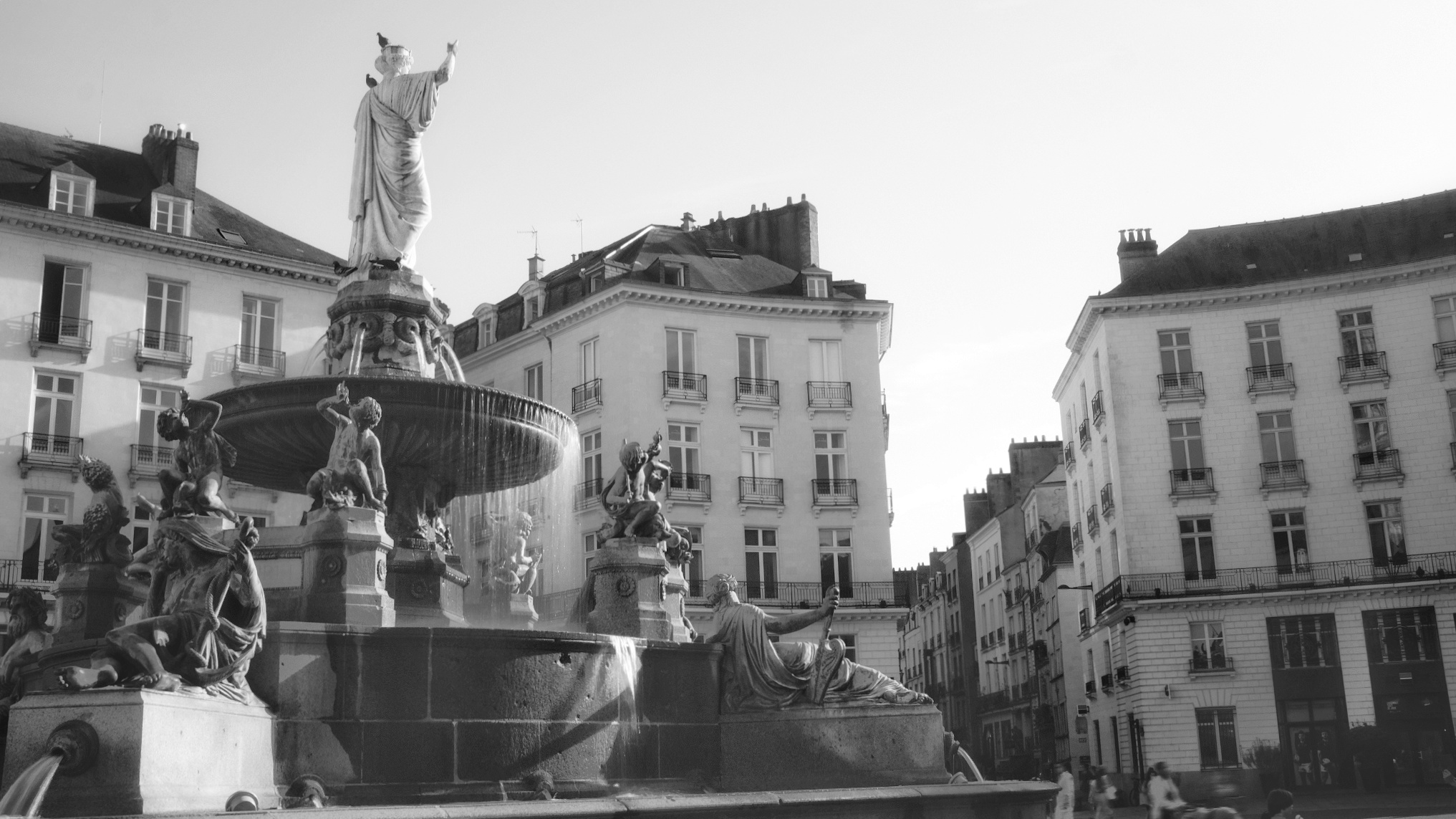
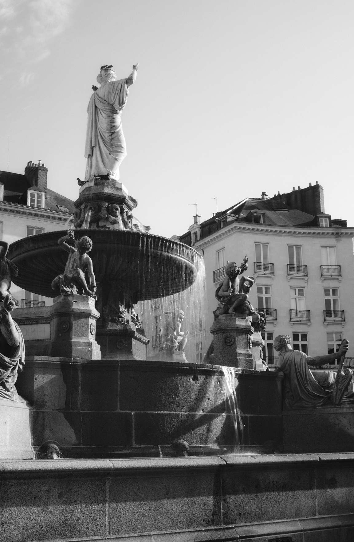
The Power of Black and White

Shooting in black and white, using only tones of light strips away the influence of colour and presents us with the “essence” of a scene, and it’s one of the reasons I love shooting in black and white, be that on film or digitally.  I aim for a timeless quality to my black and white images, and the emotion can be just as intense.  Without color, we focus on texture, shadow, and contrast—elements that can evoke nostalgia, solitude, or contemplation.

Mindfulness in the Photographic Process

What I think I’m getting at is that to evoke an emotion we need to be so mindful of our photographic process.  Sometimes taking that step backwards allows us to reflect before pressing the shutter button.

Conclusion

I don’t have all the answers of course, but in the end, capturing emotion in photography is as much about the heart as it is about the eyes behind the lens. Each photograph we create is a bridge between ourselves and our viewers—a connection forged in the moment but lasting beyond it. Just as a musician lets their notes drift into the silence, we photographers must let our images speak, leaving space for others to interpret, feel, and connect.

So, as you move forward in your own photography, remember to pause, to feel, and to let emotion guide your hand. Don’t be afraid to take a step back before pressing the shutter, and ask yourself: What do I want my viewer to feel?

I hope this reflection gives you a new perspective on how you approach your next shot. After all, photography, like any art, is a journey without fixed answers—one of constant discovery. Take time to explore, experiment, and, most importantly, to feel.

Frame It Right: The Art of Composition in Photography Part II


In my last article, we talked about three of the rules of composition, rule of thirds, leading lines, and symmetry.  We talked about the origins in classical art, as well of how to use them in our photography.  We also explored the implementation of these rules “or guides” and how we should practice each one, master it, and then move on to the next one.  You will still have your photos for the “Gram,” but more importantly, you will be growing as a photographer, gaining experience, and building a body of work.  You will, by definition start becoming more deliberate in capturing your shots, and will be more mindful than somebody just shooting blindly and praying that they get at least on shot!

In this article we will continue to explore certain concepts that be used to make our photographs even more engaging and interesting.  We will explore framing, i.e. using frames with in frames, and the use of negative space, used to isolate of emphasize our subject, and go minimalist.

Framing

When I say the word framing, I’m not talking about the gilded golden frame that you will use to frame your photography to give as gifts to your mother-in-law, but using visual frames inside your image to “frame” your subject…

These examples illustrate how framing can be a powerful tool in photography, guiding the viewer into the image and providing depth and context to the subject or scene being captured. A technique that can make your photos more engaging and immersive.  You can use trees, windows, element on the ground, buildings.  Go out and explore the world around you and try and “frame” your shots.

Negative space

Negative space is the space that surrounds our subject, this empty space or unoccupied space is almost as important as the subject itself.  It’s role is to create balance in the image and adds to the importance of the subject.

Key points

This negative “space” around the subject gives the subject room to breath, and takes away the clutter so we can concentrate on our subject.  It emphasizes the subject and leaves no doubt where the subject is to be found.  For those of you who want a “minimalist” approach to photography, it is one of the best ways to do this.  Less is more after all.  Think of simplicity, tranquillity, and elegance.  It can be used to create mood and atmosphere, and in landscape photography can portray ideas of solitude or freedom.  Think of a vast empty sky and rolling hills.  Negative space doesn’t have to be completely devoid of detail. It can be an area of uniform colour or texture that complements the subject and adds visual interest, or we can use depth of field to emphasize our subject

When using negative space, it’s essential to pay attention to the balance between the subject and the surrounding empty areas. The goal is to create a harmonious composition where the negative space complements and enhances the subject, rather than overpowering it. This technique can lead to powerful and emotionally resonant photographs, adding depth and impact to your work.

When you look at my photos of the girl against the colourful walls in Trentemoult in Nantes, think about how placing the model on the left or right of the frame makes you feel.  Looking forwards or looking backwords… 

Colour Theory

Colour theory is not just for those trendy designers in those advertising agencies.  If you go onto my Instagram feed, you will see that most of my work is predominantly black and white.  “So no colour,” I hear you say.  Well, yes and no.  Black and white photography concentrates on tones, but we can look at colour in the same way and seek balance in our colours.  So what’s this colour wheel then?  Well, it’s a way of looking at colours that go together, like green and red (think of Christmas cards), blue and orange, yellow and purple, all these colour are opposite on the colour wheel. Also, think about complimentary colours that are next to each other on the wheel, such as yellow, light green and dark green.  You will find yourself becoming aware of colours in nature and how they complement each other.  There will be some photographs that depend on this colour for their artistic value, and that won’t work in black and white photography.

Think about the portraits in the previous section and the natural colour in the photos in the country side.

Conclusion

We’ve continued our journey into composition by exploring how to use elements in our photos to frame our subjects. We’ve delved into the concept of negative space, emphasizing our subjects in our images. To conclude, we’ve begun to consider how colour can add harmony to our compositions. My advice is to incorporate these elements into your photography one step at a time. Don’t rush; there’s no need to feel overwhelmed. It’s a lot of information to take in, but as you explore each aspect mindfully, you’ll witness an evolution in your approach. Keep up the excellent work, and I look forward to our next session where we will talk about pattern and repetition, scale and proportion, and depth and layering.

Frame It Right: The Art of Composition in Photography Part I


In my last article we talked about exposure, and balancing the elements that form the “exposure triangle”, i.e. the sensitivity of the film that we’re using, of the ISO setting on our camera sensor, the shutter speed, i.e. how long we let the light hit the film, or camera sensor, and aperture, i.e. the size of the hole that light comes through measured in F-Stops.  When these elements are in perfect osmosis, we should get a decently exposed photograph. 

Introduction to composition principles

Now we shall take this knowledge and build upon it with notions of composition, i.e. how we will organise the elements in our photograph.  Sometimes we have control of where these elements are, for example when creating a still life image.  Other times we have no control whatsoever and just have to move ourselves instead.  The way we do this is by thinking about our “Composition.”

As humans we are all guided by rules, some universally moral, some defined by the country we live in (like in France where they seem to be forbidden to make a decent up of tea), and Art is no exception.  There are rules in Art that make an image pleasing naturally to the eye, and, believe it or not, these “rules” have been around for a long time.  Now I hear you little rebels sat at the back of the classroom near the radiator saying how you don’t live by rules, and that you break every rule in the book.  And I have no problem with that.  I would however suggest you learn the “rules of composition” first and then, and only then break them knowingly.

Photography is art made with light, and the first photographers were heavily influenced by the art and paintings in the local Art Galleries.  They therefore had a very “classical” notion of composition.  I want you to imagine those massive oil paintings in a gold frame showing a Victorian gentleman looking over the top of a waterfall, framed by the forests, and still looking so dapper.

The Rule of thirds

This is one the first things that people will talk about when talking about composition.  The idea, as the name suggests is to divide a photo equally into thirds horizontally and vertically, and put the point of interest (subject) where the lines intersect.  Or you could have a landscape photo where sky will take up two thirds of the photograph and the foreground the other third.  In editing software, when framing you shot they will put a three by three grid on your photo automatically.  Some digital cameras allow the use of this grid inside the viewfinder.  When taking a portrait you would ideally have the eye where the lines cross.  Yes Ian, but this has been done, done, and done again, and has become a cliché I hear you say.  Possibly, but it works mate!  Don’t knock it.  As I said earlier, learn the rule, master using the rule, and then you might consider breaking the rule, but it will be a conscious decision and above all, deliberate.  But it will permit a pleasing and natural result.

Leading Lines and Perspective

Leading lines are lines that lead the eye into the photograph, turning it into something dynamic.  The lines will converge on a certain point in the image, which, if you want, can be on the grid that I described in the last section.  This point is the vanishing point, and give geometrical forms to your image, and can lead to the subject of you photo.  When using straight lines,you can emphasis to shapes in architecture and acquire a very “graphic” image.  Using a wide angled lens or even a fish eye lens will emphasize these line even further and the distortion of these lenses will add even more interest to your image.  I will talk about the most common lenses in a future article.  We’re not there yet. The lines don’t have to be straight, they can be curved or S shaped.  Think of a winding road in the countryside.  Whichever version you use, there will be a feeling of being drawn in to the scene. 

In the first photograph of the original Pegasus Bridge all the lines converge to a central point with a person standing which gives us an idea of the scale of the bridge.  These straight geometrical lines give a feeling of stability and solidity. 

In the second photograph, we can see an image that uses an S curve, and as you can see, the effect is totally different.  More subtle, but they eye is still drawn in to the image.

 Leading lines can appear in nature and in the landscape.  Look at the way that the tree line and lines in the mountains converge on a specific part of the photograph and show the different layers of the photograph. 

I seem to use them in quite a few of my photos, and with time, you won’t even have to seek them out.  You will be lead…

Symmetry in photography

In last week’s article we talked about exposure and how it is a balancing act between the three elements: film sensitivity, aperture, and shutter speed. We can find this symmetry in our compositions too. 

Symmetry in photography is a fundamental principle that enhances the visual impact of images. It involves balancing elements on both sides of a central axis or point. There are various types of symmetry, including horizontal, vertical, radial, and bilateral, each offering unique opportunities for creating appealing compositions. Symmetry naturally draws the viewer’s eye, adds stability, and is particularly useful in architectural, landscape, and macro photography. However, breaking symmetry with a contrasting element can introduce tension and creativity. By framing subjects thoughtfully, adjusting camera angles, and recognizing symmetry in both natural and man-made subjects, photographers can master this powerful tool for captivating compositions.

In summary, symmetry in photography is about creating balance and harmony through the arrangement of elements within the frame. It provides a sense of order, highlights patterns, and engages viewers, while also allowing for creative deviations when necessary to convey a specific message or emotion.

Conclusion

Firstly let’s not be fixated by these rules. I was right to describe them as “guides” to composition.  Talking about them is fine, but we have to put them into action.  Don’t try to do them all at once.  Take one rule.  Look at it closely.  Think how can I use this one rule?  How can I master it, or at least take it on board.  When you think that is is engrained into your mind, then start using a different concept.  I can’t stress that when learning, take your time.  Let the concept become second nature.   

There will be occasions when you feel that you are no longer advancing in your composition, but stick at it.  You will not obtain mastery after just one outing.  I’ve been doing this for 40 years and am still learning something new each time I go out with my camera.  People talk about being on a photographic journey, and that is a very good way of looking at it.  You can’t run before you can walk.  Don’t let yourself be overwhelmed by what you might see on Instagram, or even on this blog.  We are all at different places on this path.

In next week’s episode we will explore framing, negative space, colour theory, texture.  There will be a third article to cover pattern and repetition, scale and proportion, depth and layering.  There are so many points to talk about in composition that we may even have a fourth article but we’re not there yet! 

See you next week.  Until then, keep shooting!

The Art of Visual Note-Taking in Photography: Lessons from a Reflective Portrait


A Glimpse into Visual Note-Taking

Photography is more than just capturing perfect portfolio shots. It’s a journey of exploration, experimentation, and personal growth. In this article, we’ll delve into the world of visual note-taking with your camera, drawing inspiration from a poignant black and white portrait capturing a moment shared between a father and his son.

The photograph that serves as our muse in this exploration is a black and white portrait taken within the confines of an elevator. It’s a seemingly ordinary setting, yet it holds within it the essence of visual note-taking. In the center of the frame, my son stands, gazing intently into the elevator’s mirror.

This image isn’t just about following the rule of thirds, although it does so with remarkable precision. What truly sets it apart is the subtle yet profoundly impactful detail: my own reflection, almost ethereal, lingers in the mirror behind my son. It’s a moment frozen in time, a visual note that encapsulates a father’s perspective and a son’s curiosity.

Lessons Learned Through the Lens

This visual note, seemingly unassuming, has been a source of profound lessons in my photographic journey:

1. The Dance of Composition: The deliberate use of the rule of thirds here isn’t just about aesthetics; it’s about orchestrating a visual symphony. The composition invites viewers to explore the depths of the image, guiding their eyes from my son’s contemplative gaze to the faint presence of my reflection. It’s a testament to the power of composition in storytelling.

2. The Narrative Thread: Photography is storytelling with light, and this image narrates a journey. It’s not merely a reflection in a mirror; it’s a snapshot of our journey from the subterranean depths of an underground carpark to the bustling life of the city streets above. It captures the transient nature of existence, reminding us that every moment is a story waiting to be told.

3. The Reflective Element: The mirror within the elevator introduces an intriguing layer of reflection and perspective. It turns an ordinary scene into a canvas for creativity, showcasing the hidden depths within seemingly confined spaces. It’s a reminder that as photographers, we should always be attuned to the opportunities around us, even in the most mundane settings.

4. Emotion Unveiled: Portraits are vessels of emotion and connection. My son’s expression, captured in this visual note, reflects a myriad of feelings—contemplation, curiosity, or perhaps a touch of wonder. These emotions breathe life into the photograph, making it relatable and evocative.

The Journey Continues

This visual note is more than just a photograph; it’s a reflection of my evolving perspective as a photographer and a father. It’s a testament to the idea that within the ordinary, we can find the extraordinary. It speaks to the profound lessons we can draw from visual note-taking in photography.

As you embark on your own photographic journey, remember that each click of the shutter is a note in the symphony of your experience. Visual notes may not always be destined for your portfolio, but they are the heartbeats of your creative exploration. They are reminders of where you’ve been and stepping stones to where you’re going.

Capture the journey, one visual note at a time. Your next revelation may be just a click away.

The following photos, or should I say visual notes, we’re taken over two September Saturdays with my Fujifilm X100f. What did you take away from these visual notes?