Thank you for being here. If you’re reading this, you’ve been following my work for a while — and that means more to me than I can easily say.
I wanted to share something with you before anyone else.
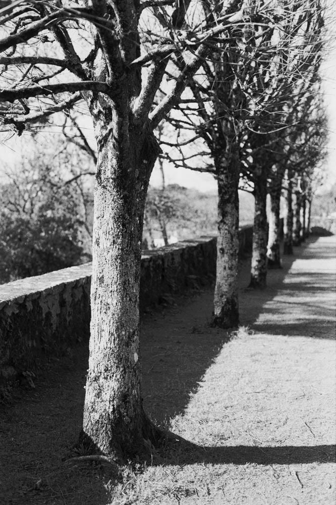
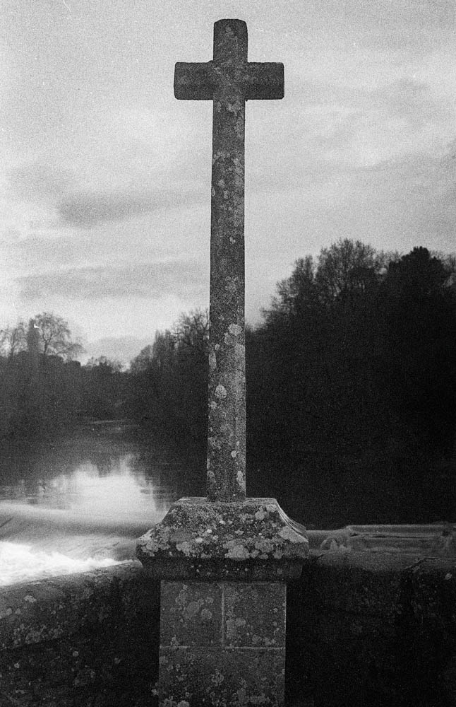
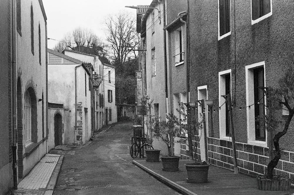
Over the past months I’ve been quietly building a small print shop — seven photographs that have stayed with me long after the shutter closed. A path in Huizhou. A canal in Shaoxing. A Vespa in the Quartier Bouffay. A tiny wooden shed in Northumberland that stopped me in my tracks.
Each print comes with the story behind it — because a photograph without its story is only half the picture.
If one of them speaks to you — I’d be genuinely honoured to have it on your wall.
Thank you for six years of reading, liking, commenting, and quietly being there.
Let’s Connect: Mentorship, Prints & Collaborations
A brief and practical note.
After six years of writing here, I’m formalising something that has been happening informally for a while — people getting in touch to ask about prints, about learning, about working together. Which is lovely, and I’d like to make it easier.
So here’s where things stand:
Mentorship — I’m happy to work with photographers who want to develop their practice, whether that’s film, digital, or somewhere in between. One-to-one, remote or in person if you’re near the Vendée. We work on what you actually need, not a fixed curriculum.
Prints — A selection of black-and-white work from the Nantes series and elsewhere is available as archival prints. If something on the blog has caught your eye, get in touch and we’ll talk.
Collaborations — Photo walks, workshops, joint projects — I’m open to conversations. No guarantees, but I’m listening.
Article suggestions — If there’s something you’d like me to write about, say so. Reader questions have produced some of my better pieces.
The best way to reach me is ian@ijmphotography.net. I aim to reply within a couple of days. French is fine too — n’hésitez pas.
That’s it really. No agenda beyond making good work and occasionally sharing it with people who care about the same things.
I’m a bloody fool. I made the stupidest of mistakes when shooting HP5 Plus 400 speed film at ISO 100.
I’d been intending to use 100 ASA film in my Nikon FE, so in preparation, I had set my camera’s ISO dial to 100. I loaded the HP5 and forgot to change this blasted setting. By the time I realised, I had already taken “some” photos. I didn’t want to wind the film on to change the setting because the sun was shining and I didn’t want to waste the light.
In for a penny, in for a pound. I thought, “What the heck?” They say you have all this “latitude” with film, so I went online to find out if I could salvage the roll. Here we go for a walk in the Parc Garenne Lemot in Clisson.
I developed the film in Ilfosil 3 (1:9) and used the development times for Kentmere 100, praying that I would have something usable…
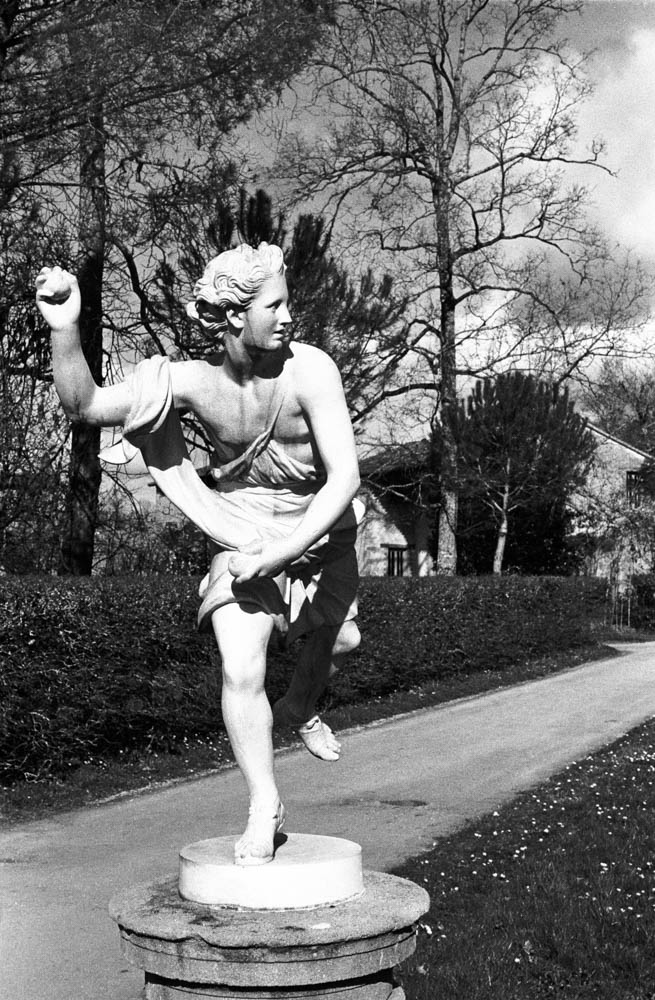
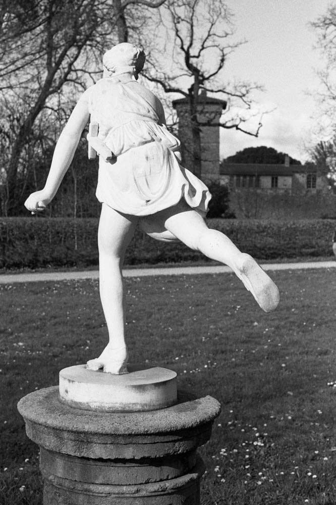
THE STATUE – Front view of classical statue on pedestal – This shot demonstrates the beautiful tonal range achieved through pull processing
The Theory: Pulling Two Stops
For those who aren’t deep in the film weeds, here is what I actually did. By setting my camera to 100 ISO while using 400 speed film, I was overexposing by two stops.
Now, common wisdom says that pulling HP5 to 200 ASA (one stop) is perfectly fine. But I thought I was pushing my luck pulling it two stops to 100 ASA. I thought I was taking the mickey with the film gods.
By giving it extra light and less development (pull processing), I was essentially asking the film to reduce contrast and grain significantly. I was testing just how much abuse it could take before the negatives turned into flat, grey mush.
I didn’t develop it for standard HP5 400 times. I treated the whole roll as if it were 100 ISO film from start to finish.
The Results
When I scanned the negatives, I was genuinely surprised. The negatives were dense, but not unmanageable. The scanner handled them well. Here is what the process actually looked like in practice.
1. Rich Shadow Detail
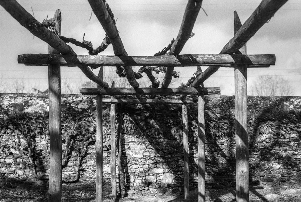
The first thing you notice is the lack of “muddy” shadows. Usually, HP5 can get a bit grainy in the dark areas. Here, the shadows under the pergola and the fence are deep, but they still hold detail.
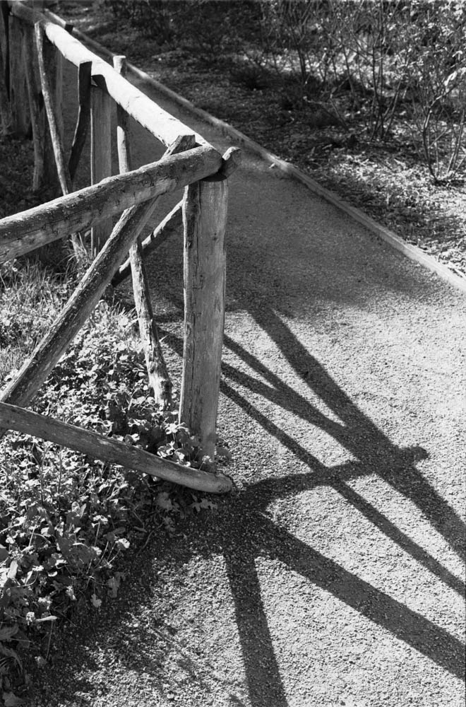
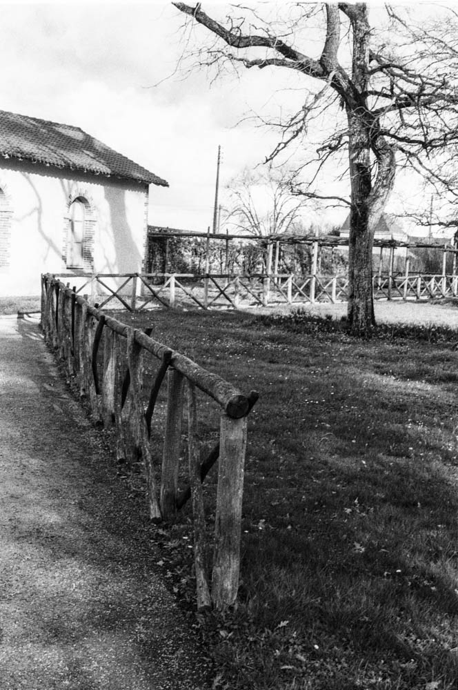
FENCE WITH LONG SHADOWS – Diagonal shadows cast across gravel path – Notice how the deep shadows still retain texture and detail in the gravel
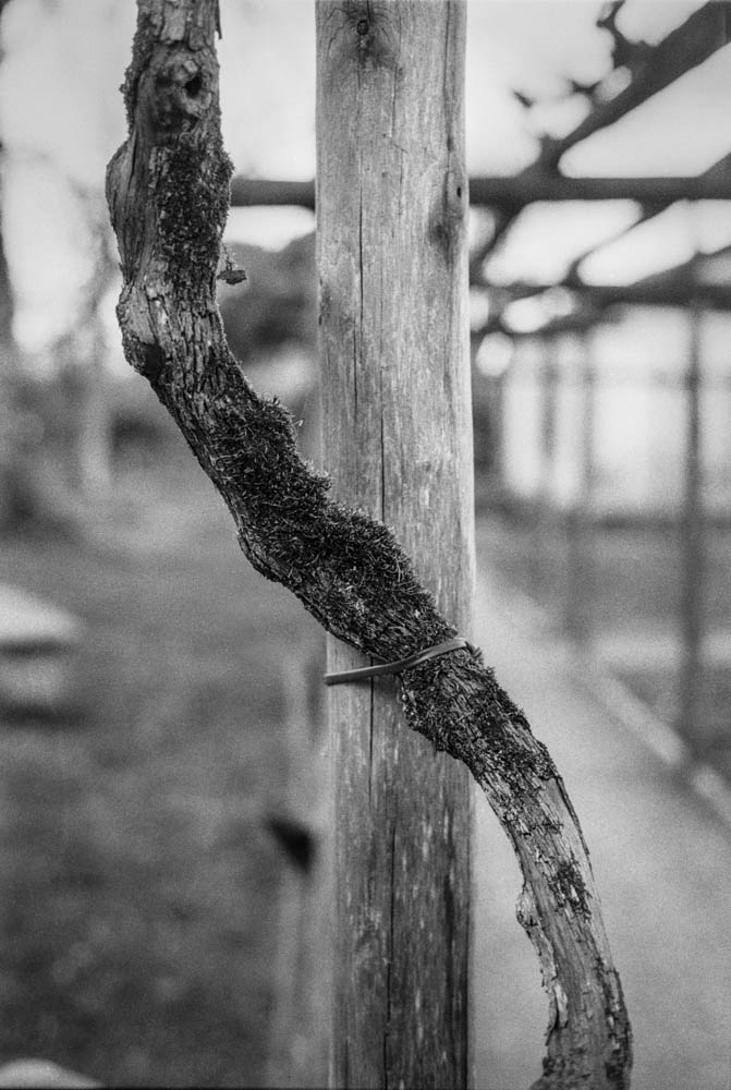
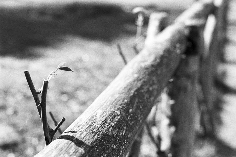
2. Texture and Grain
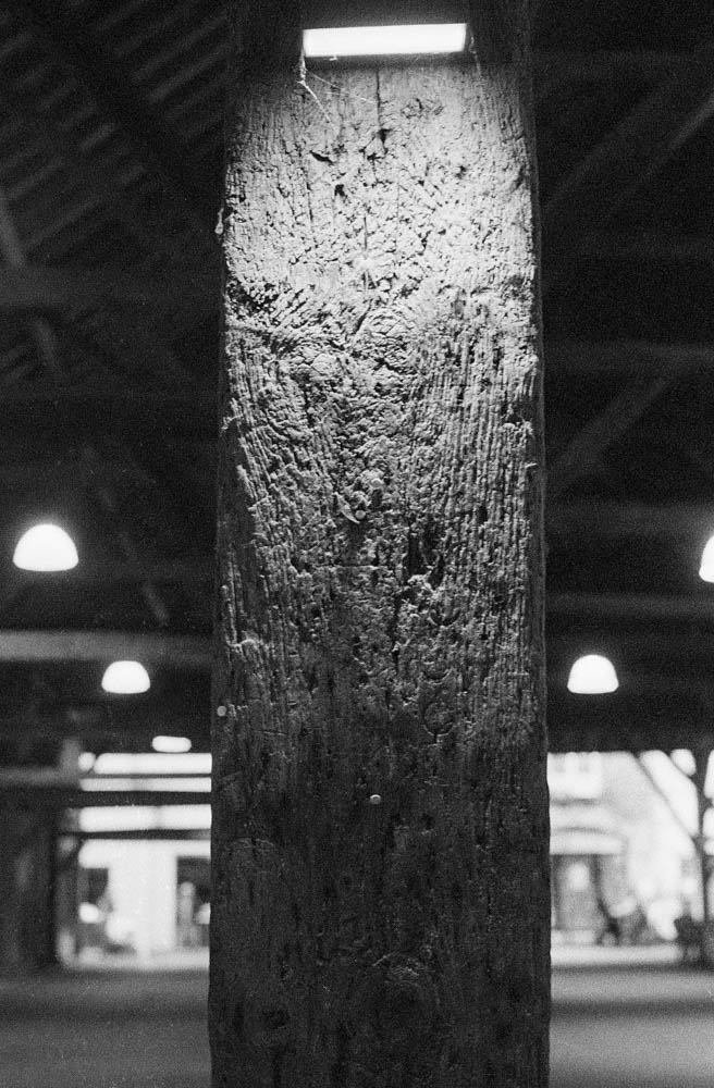
This is the real winner for me. Look at the texture on the wood in these shots. Because I gave the film extra light and reduced the development, the grain structure is much finer than usual. It looks almost like a slower film (like Delta 100) in the mid-tones.
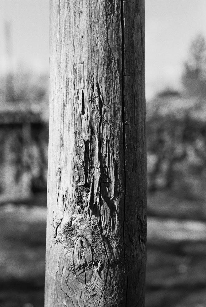
WEATHERED WOODEN POST – Close-up showing wood grain and texture – The fine grain structure is clearly visible in the wood texture
3. Highlight Control
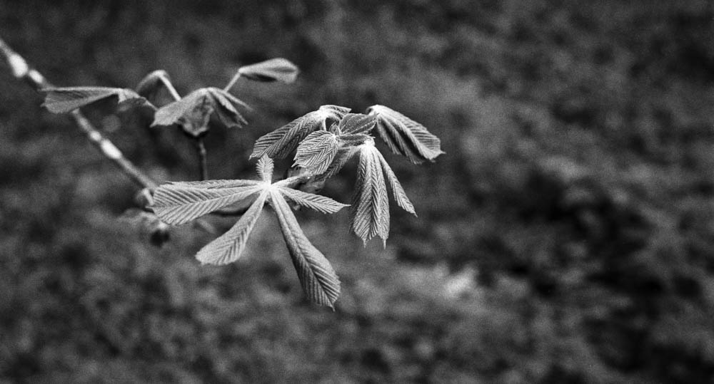
I was worried the bright spring sun would blow out the sky. Looking at these branches against the sky, you can see a beautiful grey gradient rather than a blown-out white. The reduced development time really helped keep those highlights in check, even with the two-stop overexposure.
BARE TREE BRANCHES AGAINST SKY – Intricate branch pattern with grey sky – This is the proof – the sky retains beautiful tonal gradation despite overexposure
4. Tonal Range
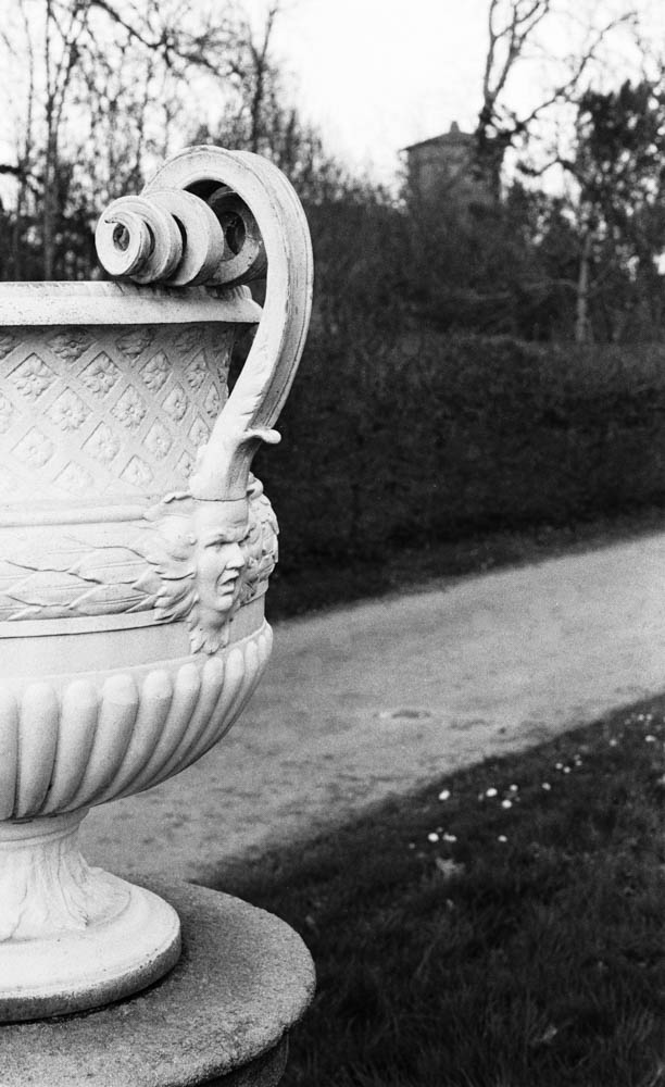
From the white marble of the statues to the dark foliage, the tonal separation is superb. The process gave me a creamy, classical look that I might not have achieved at box speed.
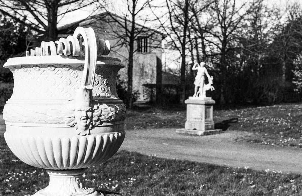
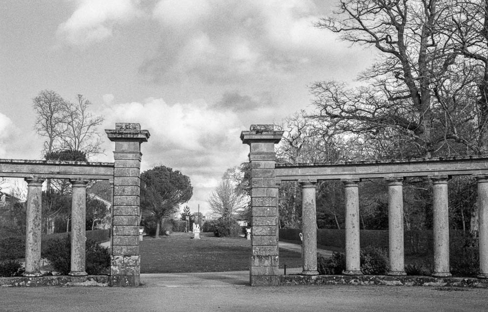
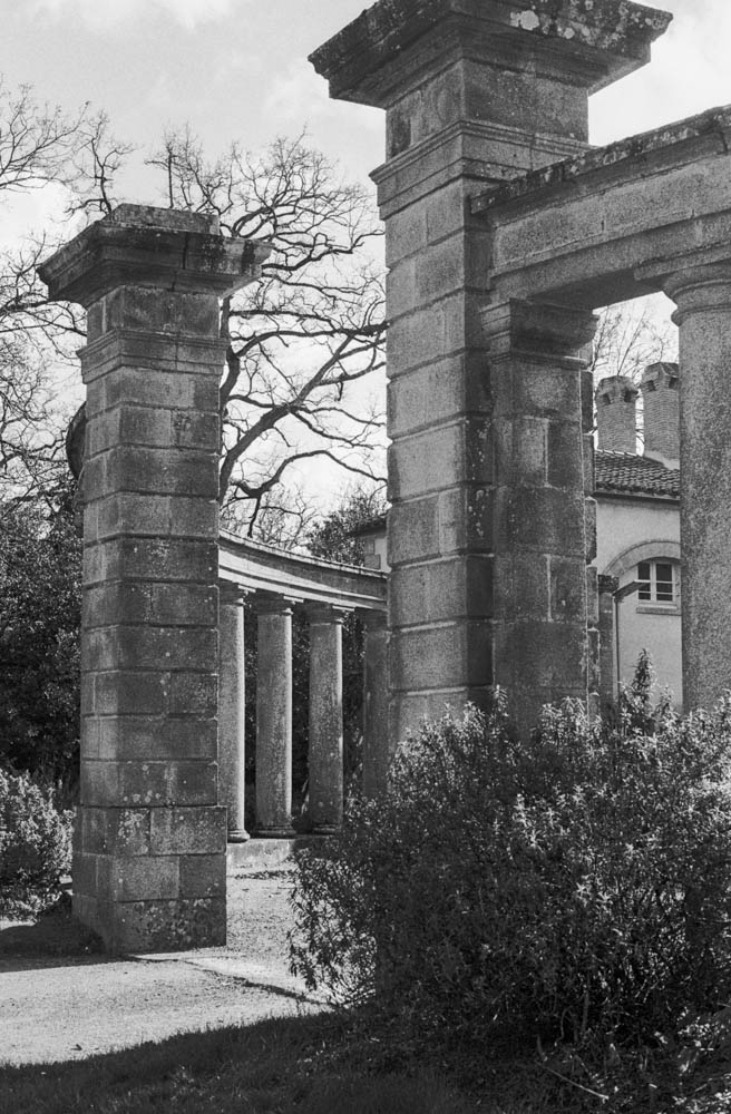
ORNATE URN WITH STATUE IN BACKGROUND – Layered composition – Foreground and background detail with smooth tonal transitions CLASSICAL COLONNADE – Stone pillars with cloudy sky – Weathered stone texture and cloud detail demonstrate the technique’s versatility
The Verdict
So, was this a disaster? Absolutely not.
In fact, I was pleasantly surprised. Because I gave the film so much light and reduced the development, the shadow detail is incredibly rich and the highlights are held back. There is virtually no grain in the dark areas. The contrast is lower than standard HP5, which gives it a very smooth, almost medium-format look.
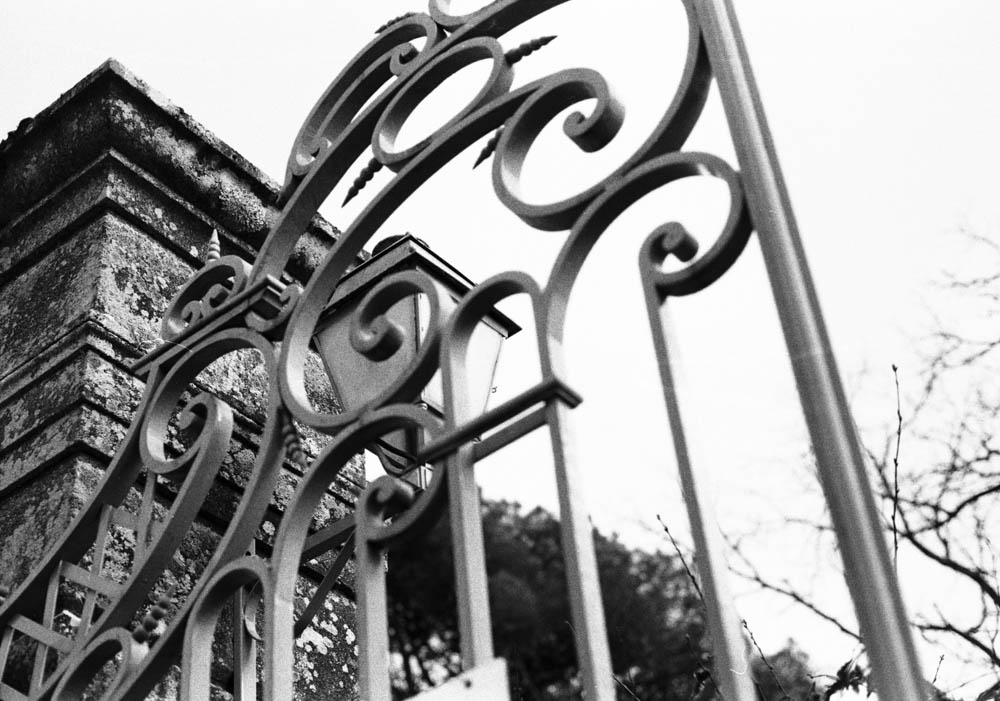
Ornate scrollwork detail – Razor-sharp detail and micro-contrast prove no sharpness was lost
It turns out, what I thought was a stupid mistake is actually a technique some photographers use on purpose! Pull processing HP5 (rating it at 100 or 200 ISO and developing accordingly) is known to produce finer grain and lower contrast. I thought I was pushing my luck going two stops, but the film handled it like a champion.
Would I Do It Again?
Would I deliberately shoot HP5 400 at 100 ASA again? No, probably not. If I want 100 ASA film, I’ll just use 100 ASA film. It’s cheaper and more straightforward.
But it’s damned good to know that at a push (sorry, pull), it could work. If you’re ever in a situation where you’ve loaded the wrong film, or you’re caught out by changing light conditions, HP5 Plus can take the abuse.
Have you ever accidentally shot film at the wrong ISO? Did you save the roll or bin it? Let me know in the comments below.
Continuing on from my last article about shooting in sub-par lighting, I’ll introduce my next roll of film—RPX 400 from Rollei. I usually like this film. This roll also marked the first time I really tried to use the Tone Curve tool in Lightroom. I’m still getting used to it. But I thought that with RPX 400, I might be able to make some ordinary prints somewhat less ordinary.
After forty years of doing this, you’d think I’d have it all figured out. You’d think I’d have a fixed workflow, a set of rules, a way of knowing exactly what the result will be. But this roll reminded me otherwise. There’s always something new to learn, or something old to look at differently. And I’ve started to wonder if there’s something honest in admitting that, rather than pretending the process is ever truly finished.
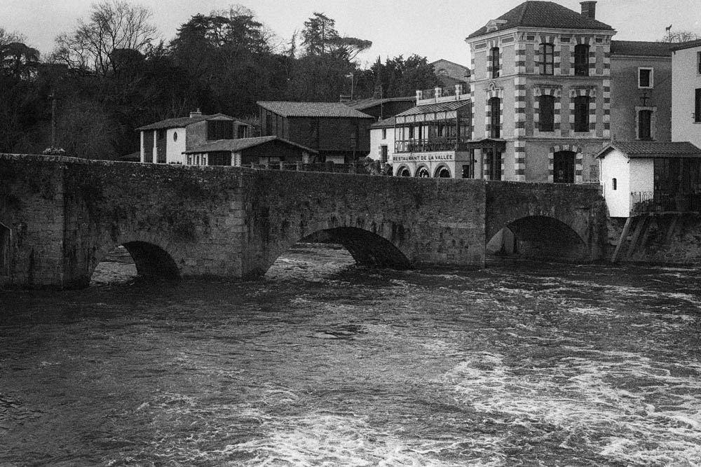
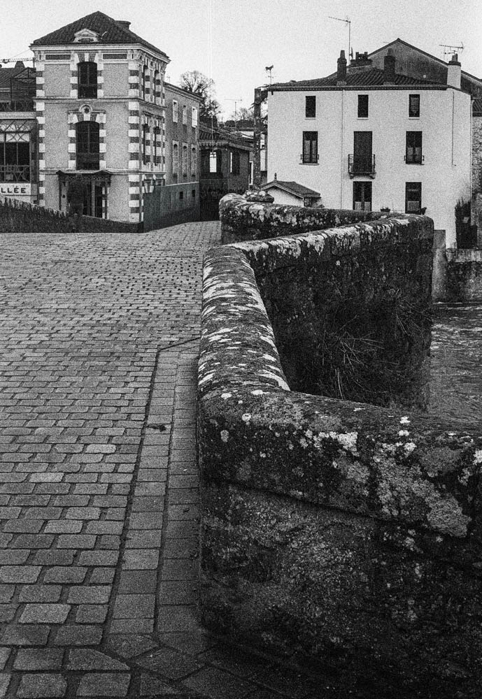
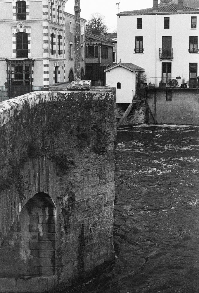
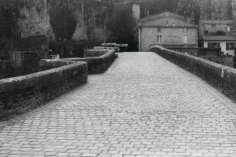
Pont Caffino on a February afternoon is exactly that kind of place. I’d never visited before, though I’d heard about it from other photographers. The sky was uniform. The light was flat. Nothing was going to jump out and grab me. So I loaded the Rollei, walked down to the river, and started looking.
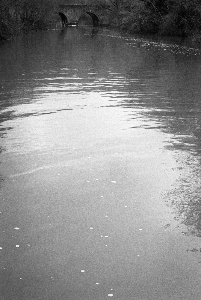
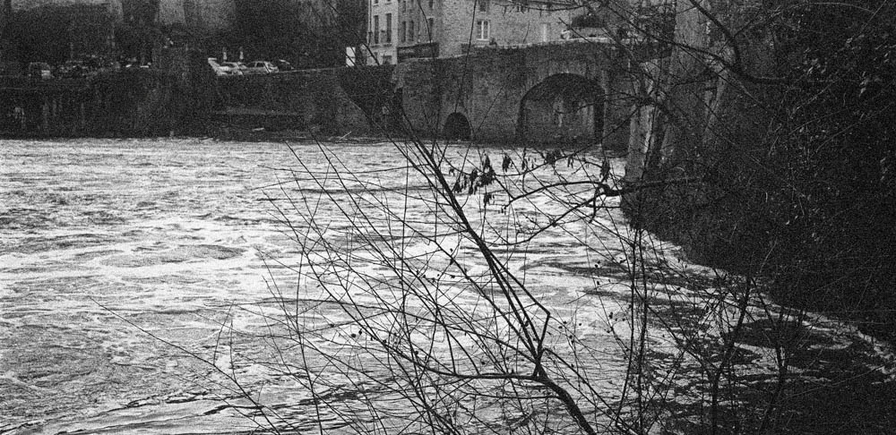
The River
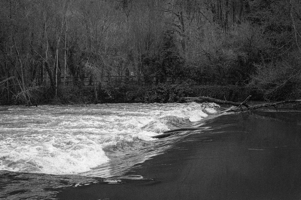
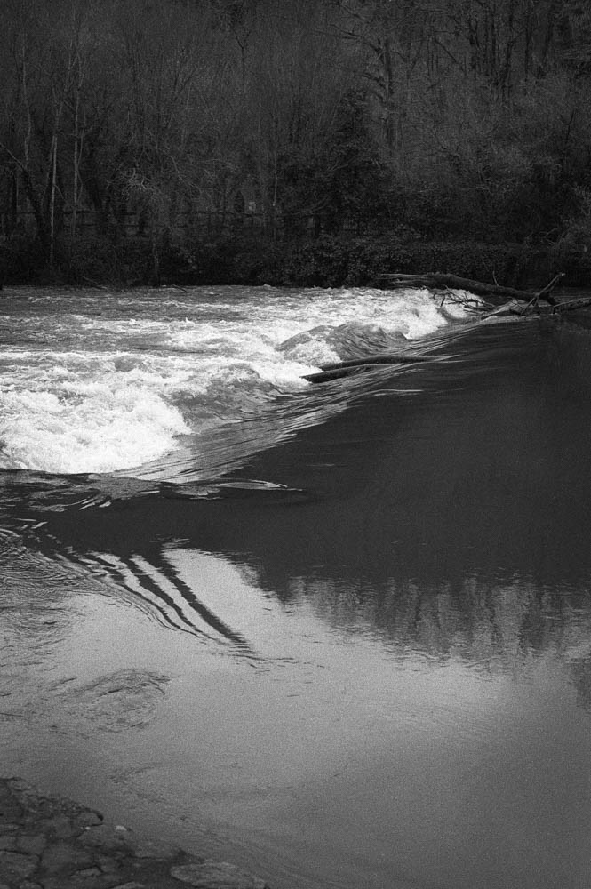
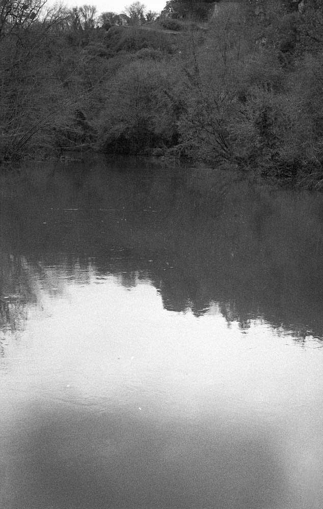
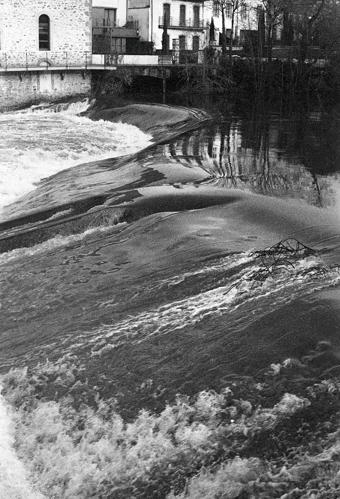
The water level was low—noticeably so. I knew this because not long before, I’d been at the Maine in St Hilaire de Loulay where the river had broken its banks completely. You couldn’t even see the weir there, just water spreading across the landscape. Here at Pont Caffino, the opposite was true. More of the granite banks showed through. More of the weir structure was exposed. The river looked different, and I found myself photographing it differently.
River surface with bridge in distance
When the light is flat, water becomes less about reflection and more about texture. You notice the foam patterns, the subtle ripples, the way debris catches on submerged rocks. RPX 400 handled this beautifully—there’s a softness to the water that feels accurate to how it looked that day, not how I wished it looked.
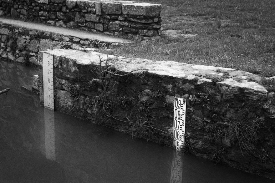
Water Level Gauges
The gauges became an unexpected focal point. They’re functional objects, not particularly beautiful on their own, but they tell the story of this place better than any dramatic landscape could. The reflection of the numbers in the still water added a compositional echo I didn’t plan but gladly kept.
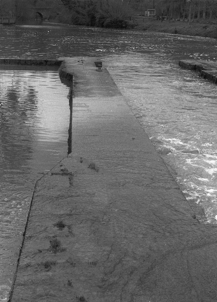
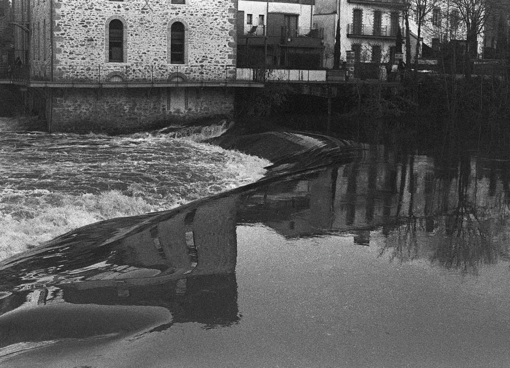
Weir Structure
Where the water quickened over the weir, I had to be careful with exposure. Film handles highlights more forgivingly than digital, but I still metered conservatively. The fallen branch caught my eye—it’s the kind of detail you miss when you’re looking for the big shot, but it adds a diagonal line that pulls the frame together.
On editing the water: The challenge here was separation. When both sky and water are grey, they tend to merge into one another. I used subtle dodging to lift the highlights on the water’s surface, just enough to ensure the reflections didn’t disappear. Nothing dramatic. Just enough to guide the eye.
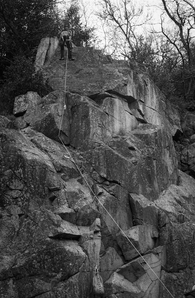
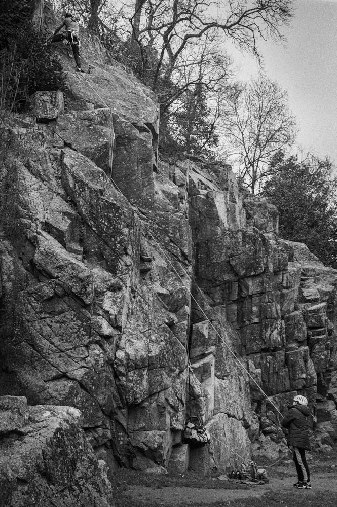
The Cliff Face
The granite cliffs that frame the Maine valley are dramatic even in bad light. They’re also popular with climbers, which adds a human element I hadn’t planned to capture but couldn’t ignore.
Climber on Granite Close-up
I haven’t shot rock faces like these on HP5+ before. The nearest I got to that was shooting in the Pyrenees mountains—different stone, different light, different everything. So I didn’t have a direct comparison to fall back on. What I noticed with RPX 400 is how it renders texture without aggression. Every crack and lichen patch comes through, but without the bite that HP5+ might have given. For this particular day, that suited the mood better.
Climbing Scene Wider
Seeing the climber and belayer together reminded me that landscapes aren’t empty. They’re used. They’re lived in. The rope creates a diagonal line through the frame, and suddenly there’s narrative—someone is trusting someone else, and both are trusting the rock.
On editing the cliffs: This is where dodging and burning did the most work. Flat light makes rock faces look two-dimensional, like cardboard cutouts. I spent time burning in the crevices and dodging the raised surfaces, essentially repainting the light that wasn’t there when I pressed the shutter. It’s not about creating drama that didn’t exist. It’s about revealing the dimension that the light flattened.
Details
I’ve learned to slow down on days like this. When the big vistas aren’t cooperating, the small things start to speak.
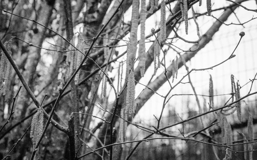
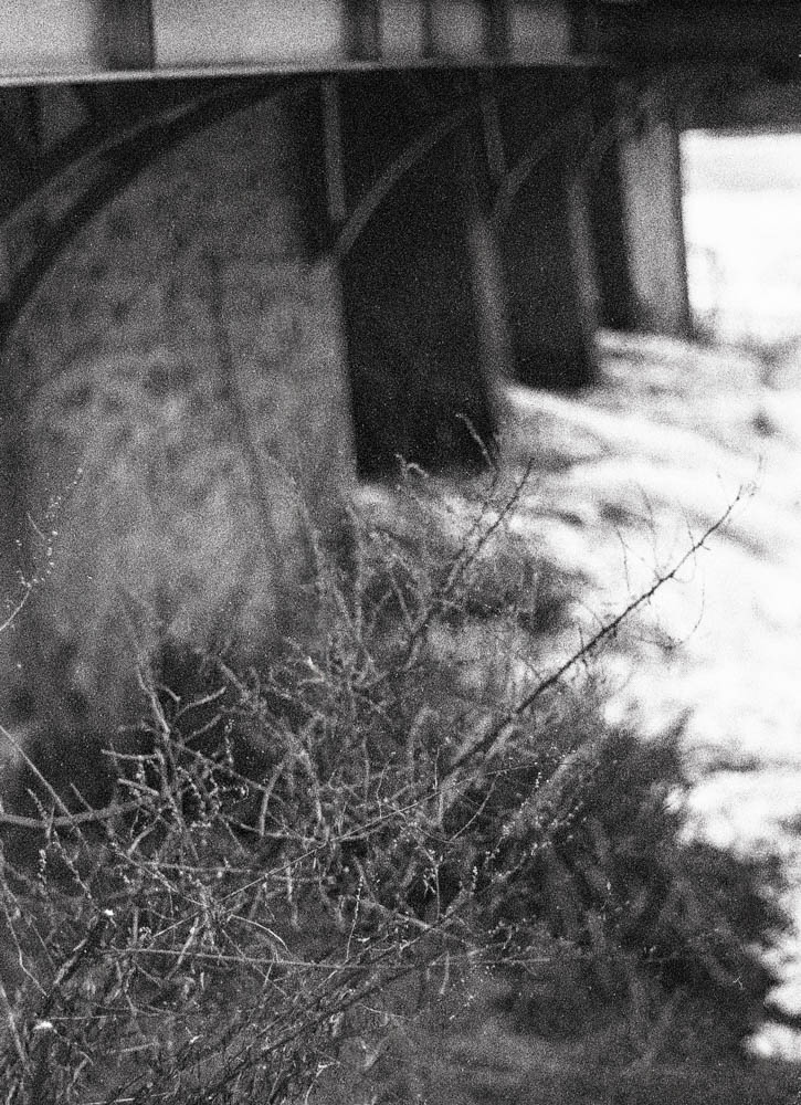
Catkins/Branches
The catkins hanging from bare branches aren’t dramatic. They’re not even particularly interesting as a subject. But they caught the light in a way that felt worth capturing. The shallow depth of field creates a dreamy quality, and the grain—more noticeable here than in the landscapes—adds character rather than detracting from it.
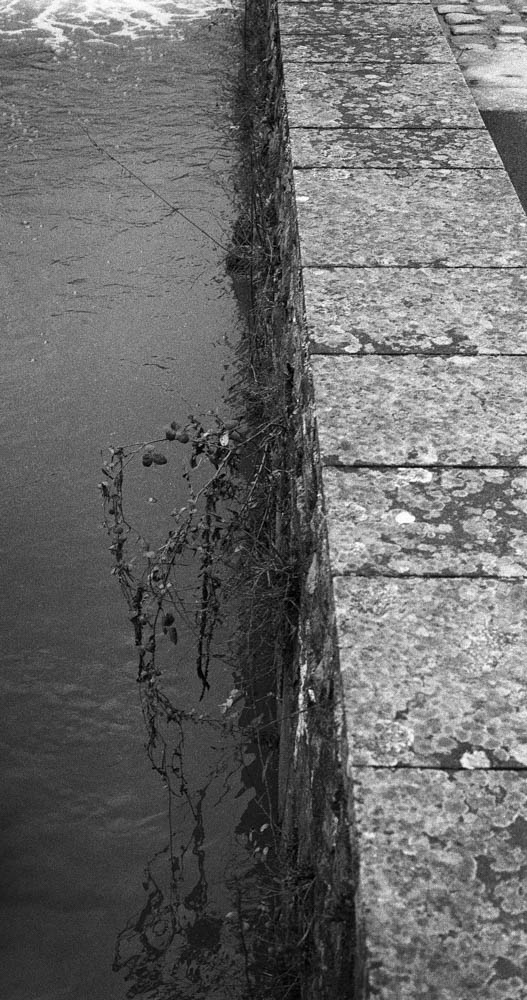
Water Edge Vegetation
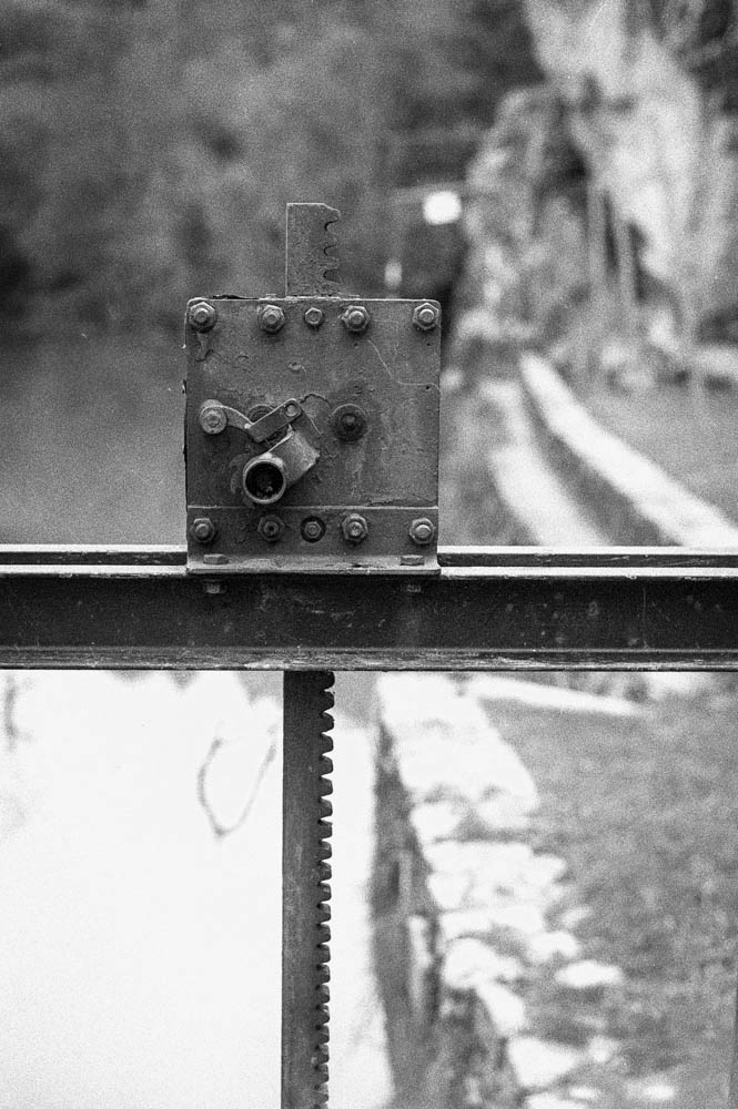
Mechanical Detail
The mechanical detail—the lock gate mechanism, I think—was almost accidental. I was walking back from the viewpoint and noticed the bolts, the geared rack, the weathered metal. It’s the industrial counterpoint to all the natural elements. Sometimes you just stop and shoot because something looks like it has a story.
On editing the details: I was careful not to over-sharpen these. The natural grain of RPX 400 provided enough texture without needing digital enhancement. If anything, I pulled back on clarity rather than adding it. These images work because they’re soft, not in spite of it.
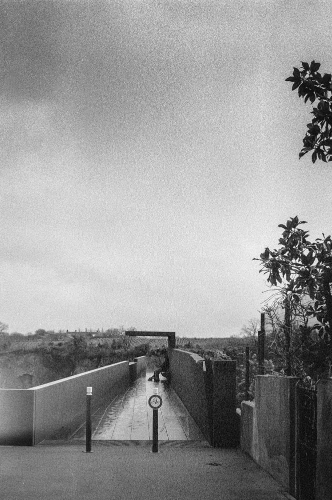
The Town & Viewing Platform
For the full perspective, I drove up to Château-Thébaud’s belvedere, “Le Porte-Vue.” It’s a striking piece of architecture—Corten steel extending 23 meters out at 45 meters above the river, designed by Emmanuel Ritz and inaugurated in 2020.
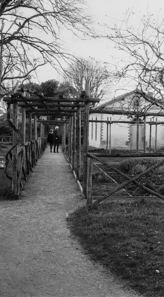
Walkway to Viewpoint
Walking out onto the platform, you feel the height. The steel underfoot, the railing at your side, the valley opening up below. There’s a figure in this shot—could be another photographer, could be anyone taking in the view. It adds scale and reminds you that you’re not alone in these places.
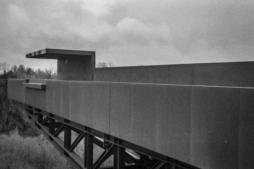
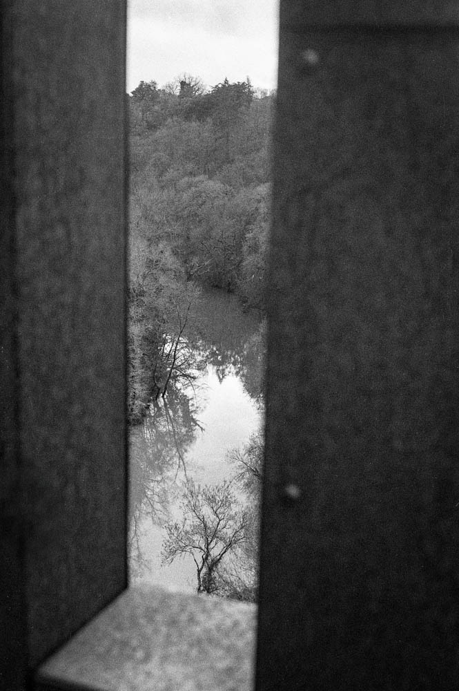
Le Porte-Vue Architecture
Framed View Through Steel
The Corten steel handled the flat light better than I expected. The weathered texture gave the film something to hold onto, and the geometric lines contrast nicely with the organic landscape beyond. The framed view through the steel structure became one of my favourite shots—it acknowledges that you’re looking from somewhere, not just capturing a scene.
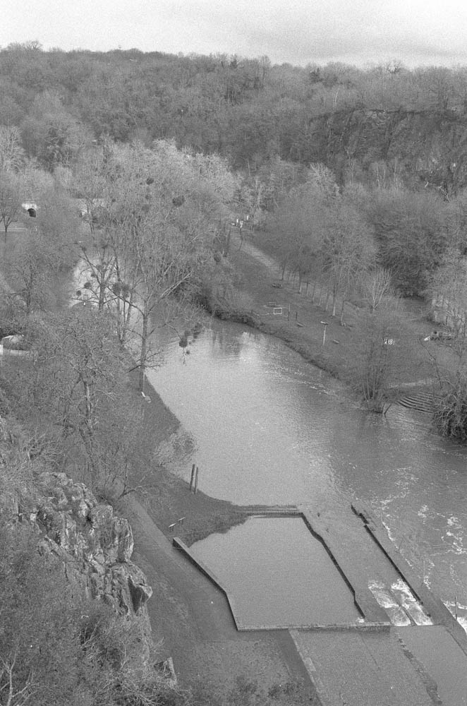
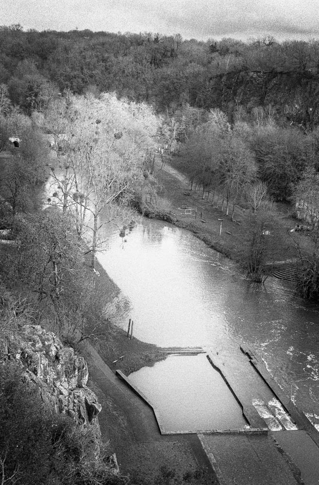
River Valley Overview
This is the establishing shot. The full Maine valley from above, all the elements visible at once. You can see the weir, the cliffs, the tree line. After seeing the Maine at St Hilaire de Loulay with water everywhere, this view felt almost spare. The lower levels exposed more of the structure than I’d imagined possible. It’s the image that ties everything together.
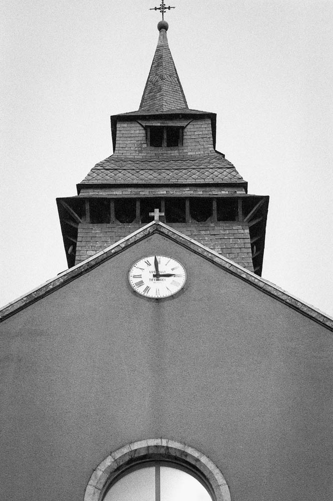
Church Steeple
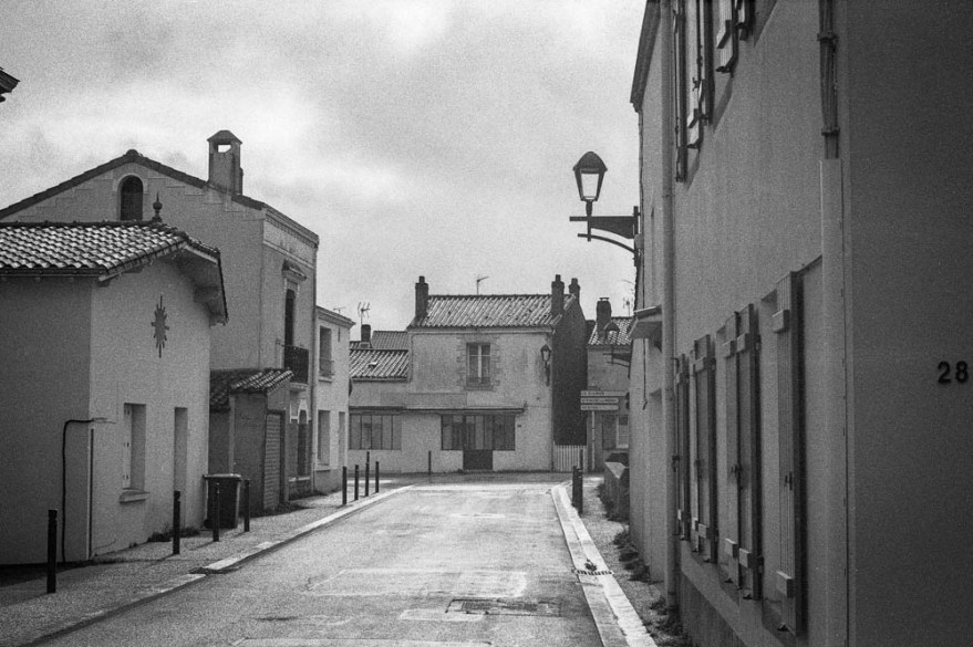
Village Street
The village itself grounds the landscape. The church steeple adds a human landmark to the valley. The quiet street with its leading lines and the number “28” on the wall—these are accidental details that add authenticity. This isn’t a pristine wilderness. It’s a place where people live.
On editing the architecture: I focused on straightening lines and ensuring the steel texture didn’t look too smooth. The flat sky was retained intentionally. I could have blown it out or added artificial clouds, but that would have been dishonest. This is the light I had. This is the day I experienced.
On Making It Less Ordinary
Looking down at the river from Le Porte-Vue, I thought about what I was actually trying to do.
This was my first time at Pont Caffino, and I wasn’t sure what to expect. RPX 400 felt right for this quieter, more exposed version of the valley. But the film alone wasn’t enough. The scans came back flat—accurate, but lacking the dimension I remembered from being there. That’s where the work began.
In Lightroom, I used the Tone Curve to add a gentle S-shape, nothing aggressive. Just enough to add punch without crushing the blacks. I lifted the deepest shadows slightly to preserve the atmosphere. And then I spent time dodging and burning—manually painting light into the highlights of wet granite, holding back exposure in the shadows of riverbanks, guiding the viewer’s eye through texture and tone.
I’ve only started using the Tone Curve with this roll of film. I’m still getting used to it. But I’ve found it offers basic yet subtle controls, as does the dodging and burning. It’s easy to feel like this is cheating. Like you’re admitting the photograph wasn’t good enough straight from the scan. But I’ve started to think of it differently. Dodging and burning isn’t about fixing mistakes. It’s about translation. It’s about taking what you saw and felt and finding a way to communicate that to someone who wasn’t there.
There’s a danger in thinking you know everything. Usually, that’s when you stop seeing. When you assume the light will behave, or the film will respond the way it did last time, you miss what’s actually in front of you. I’d rather be the one still figuring out the Tone Curve after forty years than the one who thinks there’s nothing left to learn.
The result isn’t dramatic. It’s not the kind of image that stops you scrolling. But it felt honest—a quiet enhancement rather than a transformation. And on a grey February day at Pont Caffino, that’s exactly what I was after.
Technical Note
Film
Rollei RPX 400
ISO
Shot at 400
Camera
Nikon FE
Lens
50mm f/1.8 Nikkor
Development
Ilfosil 3 (1:9)
Scanning
Plustek OpticFilm 8100
Lightroom Adjustments:
Tone Curve: Gentle S-curve, highlights lifted slightly, shadows preserved (First serious use of this tool for me)
Local Adjustments: Radial filters for dodging/burning on rock textures and water surfaces
Grain: No reduction applied
Sharpening: Minimal, applied selectively on details
Thanks for reading. If you’ve shot RPX 400 in similar conditions, I’d love to hear how you approached it.
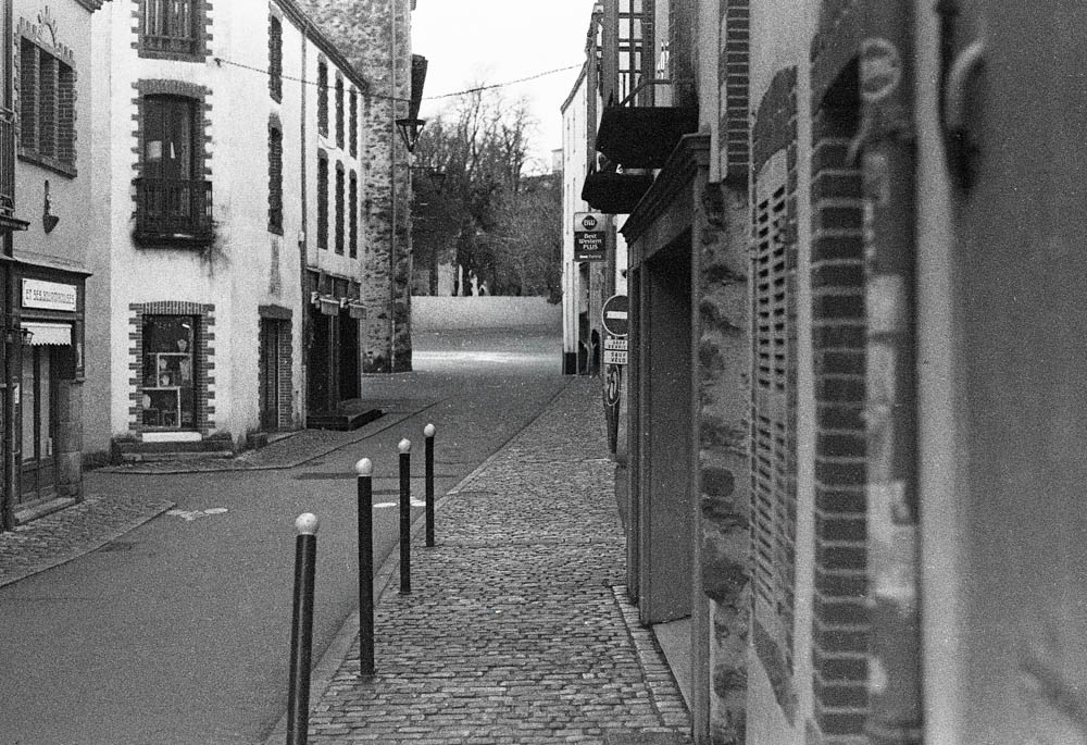
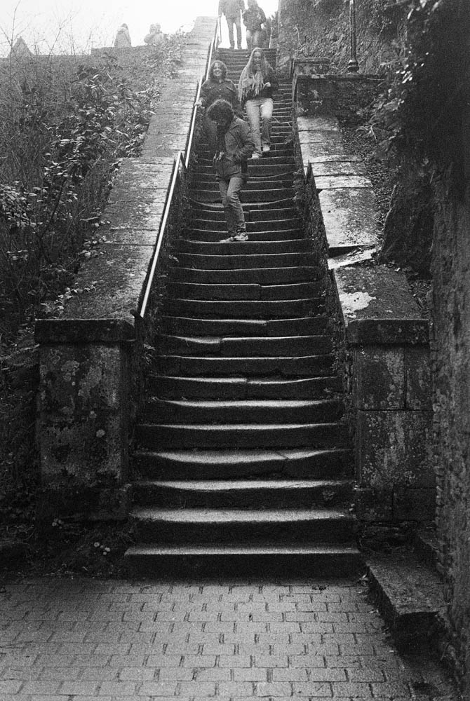
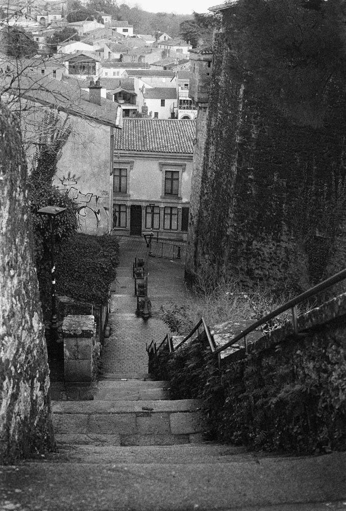
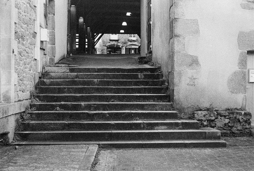
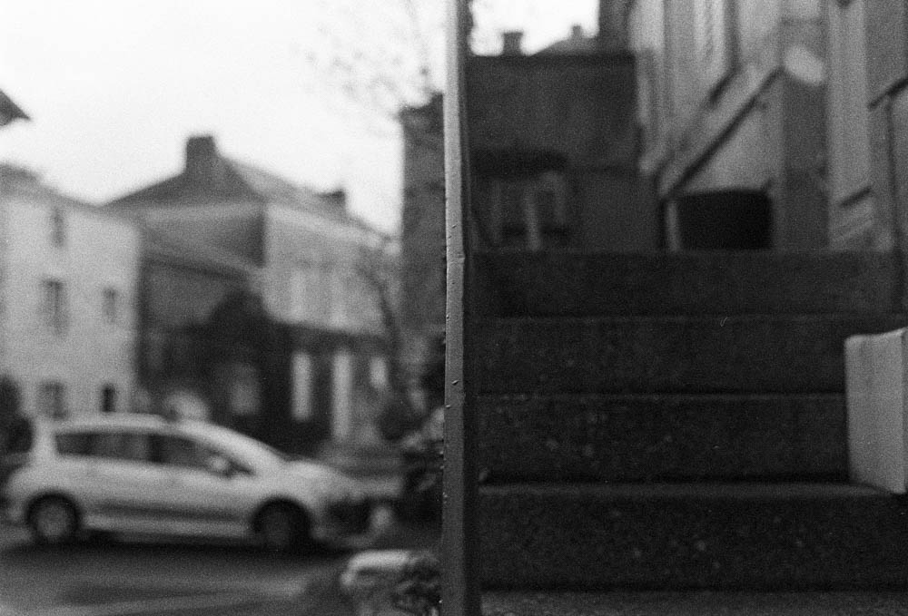
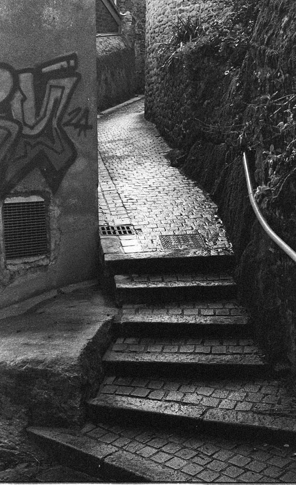
Maybe I’m a little stubborn, just maybe, but I’m insisting on using my Nikon FE and for my health I have to get out. I had some Tri-X that needed using, and some HP5+ left over, so time to use it. And it does my mental health good too—getting out of the house despite the horrible light and rain.
“They” always say to go out in good light and use golden hour. We haven’t been blessed with good weather lately (understatement of the year contender 2026), and I always say just go out anyway and do it.
I shot two rolls that afternoon—72 frames total. Tri-X and HP5+, both at box speed. No pushing. I developed them in Fomadon LQN because it handles flat light cleanly: shadows stay defined, grain doesn’t get muddy even when the sky gives you nothing. When I scanned them, about half were ok enough to keep—36 frames that worked. Of those, maybe half a dozen were real keepers. That’s how it goes. Not every frame needs to be a masterpiece. Some just need to exist.
In Lightroom I only used the curves tool to pull a bit of separation between the wet stone and the grey sky. I wasn’t trying to manufacture contrast that wasn’t there. The rain had already done part of the work: cobblestones held texture because the light was even, puddles on the stairs created accidental reflections, and the streets were empty enough that I didn’t have to wait for tourists to clear the frame.
I won’t pretend I enjoyed standing in the damp. My shoes got wet. My hands were cold. But I needed to leave the house, and the camera gave me a reason to do it. The film was a deadline. The weather was irrelevant.
As you can see in the following photos, the light wasn’t fabulous, so we adapt. There are still interesting things to be seen.
Shot on Nikon FE with 50mm f/1.8. Kodak Tri-X 400 and Ilford HP5+ rated at box speed, developed in Fomadon LQN. Edited in Lightroom: curves adjusted for shadow separation only.
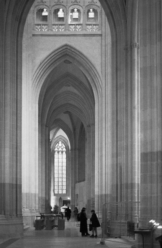
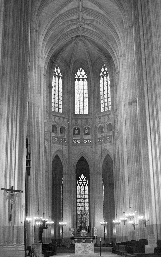
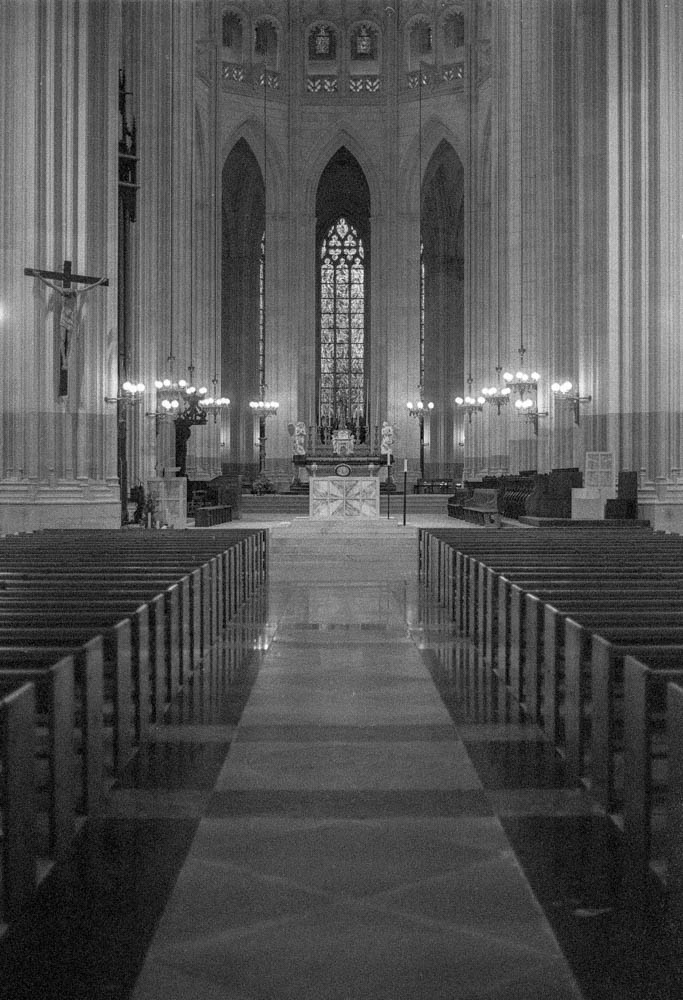
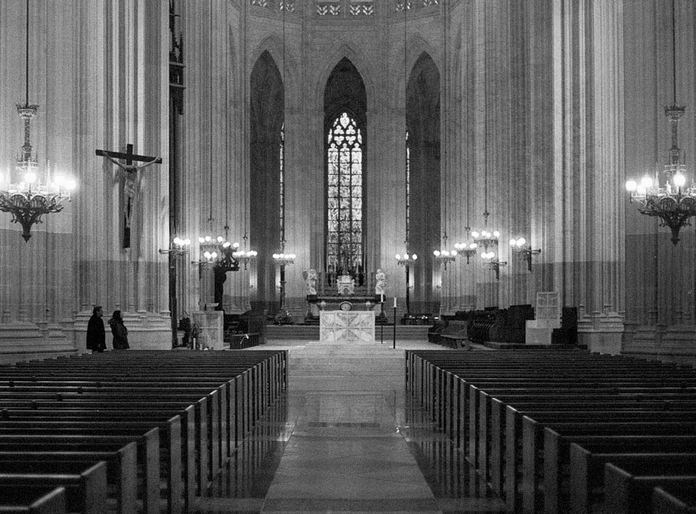
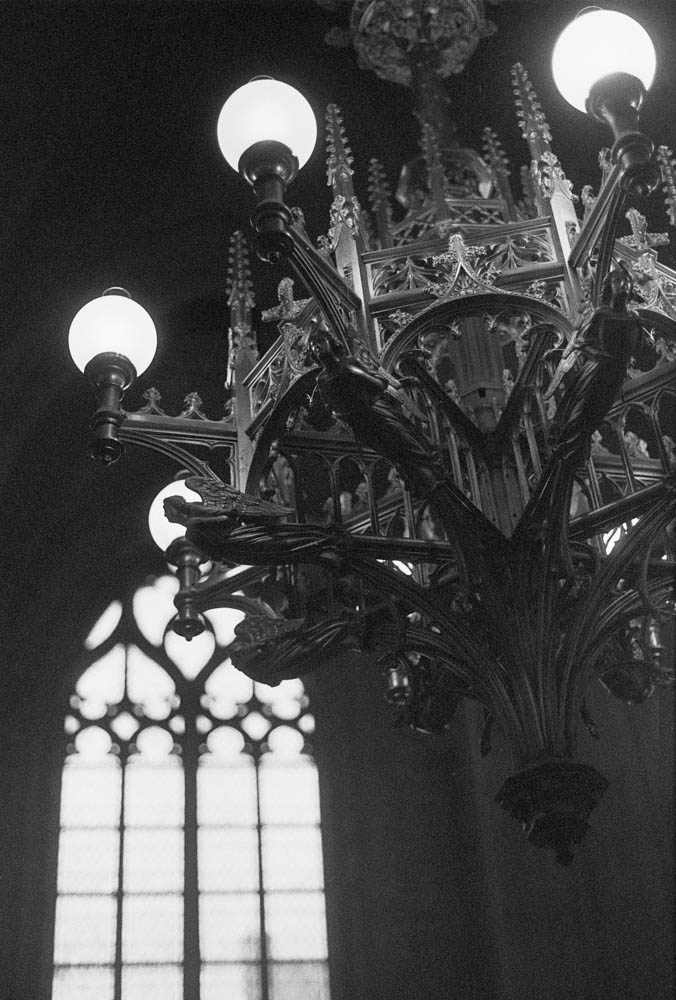
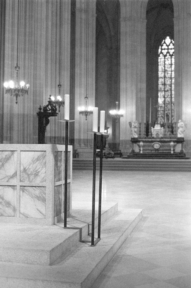
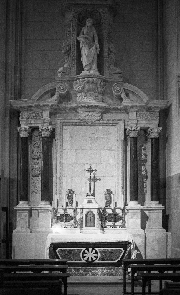
I didn’t set foot in the cathedral while Voyage en hiver draped its silence in municipal spectacle. Not out of protest—I simply couldn’t bear to see sacred space turned into a backdrop. So I waited. And when the banners finally came down in December, I loaded a roll of Ilford HP5 into my Nikon FE and walked back in—not as a tourist, not as a patient, but as someone hoping to find the light exactly where I’d left it.
I’ve always abhorred political recuperation. The Voyage en Hiver had no place in the cathedral’s reopening. This was about worship. About returning to God in a space that had been quiet for too long—not about municipal branding or winter tourism. “Give unto Caesar what belongs to Caesar, and unto God what belongs to God.” (Matthew 22:21)
That day, I chose God’s silence over their spectacle.
My hands were cold when I raised the camera. December light in a stone cathedral is a quiet thing—more absence than presence. I wondered, honestly, if 400 ASA would be enough. But I wanted authenticity: more grain than digital noise, more truth than polish. So I trusted the FE’s metering, opened up my aperture, and let the film do what it does best. No second-guessing. No LCD screen. Just the click of the shutter and the hope that the light would hold.
And it did.
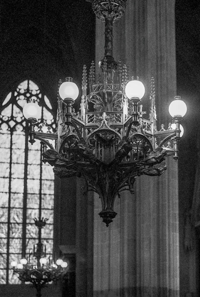
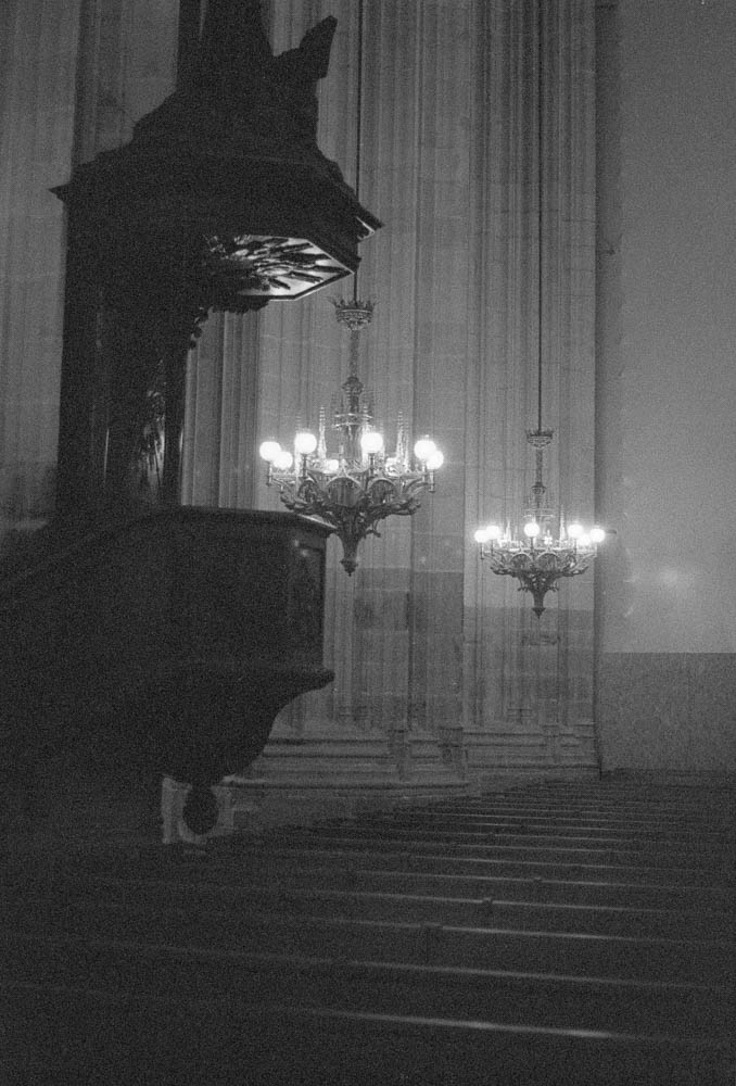
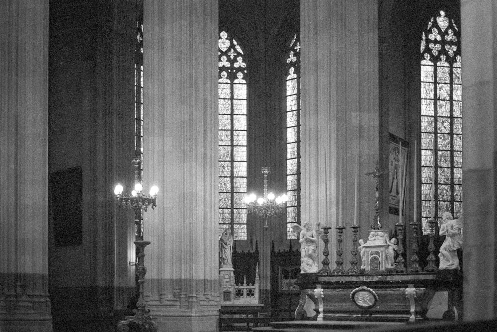
The frames that emerged are darker than summer would allow—but this was December, after all. And in that darkness, something gentle remains: the grain cradling the texture of worn wooden pews, shadows tracing the ribs of vaulted stone, candlelight bleeding softly into halos where no banner now hangs. Black and white stripped away every distraction—the logos, the seasonal clutter, the noise—until only what mattered remained: light on stone, silence between pillars, the architecture of reverence.
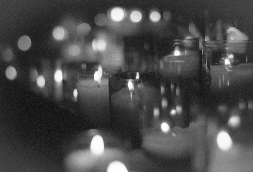
One frame in particular stays with me: the candles. Shot at 1/30s, my hands unsteady not from illness but from the simple weight of the moment. The focus slipped slightly. The flames blurred into one another. And instead of frustration, I felt a quiet relief—the film hadn’t captured perfection. It had captured presence. Grain became breath. Blur became prayer.
I didn’t go to “get out of the house.” I went because the space was clean again—just stone, silence, and the stubborn glow of candlelight. And for a few minutes, with the FE cold against my palm and the smell of incense in the air, I remembered why I love film photography: it doesn’t lie. It holds what’s there—shadows and all—and asks only that you trust the process.
They sold a spectacle. I took back the light. And the grain—warm, imperfect, alive—proved which one will last. My small act of reparation…