In my last article we talked about exposure, and balancing the elements that form the “exposure triangle”, i.e. the sensitivity of the film that we’re using, of the ISO setting on our camera sensor, the shutter speed, i.e. how long we let the light hit the film, or camera sensor, and aperture, i.e. the size of the hole that light comes through measured in F-Stops. When these elements are in perfect osmosis, we should get a decently exposed photograph.
Introduction to composition principles
Now we shall take this knowledge and build upon it with notions of composition, i.e. how we will organise the elements in our photograph. Sometimes we have control of where these elements are, for example when creating a still life image. Other times we have no control whatsoever and just have to move ourselves instead. The way we do this is by thinking about our “Composition.”
As humans we are all guided by rules, some universally moral, some defined by the country we live in (like in France where they seem to be forbidden to make a decent up of tea), and Art is no exception. There are rules in Art that make an image pleasing naturally to the eye, and, believe it or not, these “rules” have been around for a long time. Now I hear you little rebels sat at the back of the classroom near the radiator saying how you don’t live by rules, and that you break every rule in the book. And I have no problem with that. I would however suggest you learn the “rules of composition” first and then, and only then break them knowingly.
Photography is art made with light, and the first photographers were heavily influenced by the art and paintings in the local Art Galleries. They therefore had a very “classical” notion of composition. I want you to imagine those massive oil paintings in a gold frame showing a Victorian gentleman looking over the top of a waterfall, framed by the forests, and still looking so dapper.
The Rule of thirds
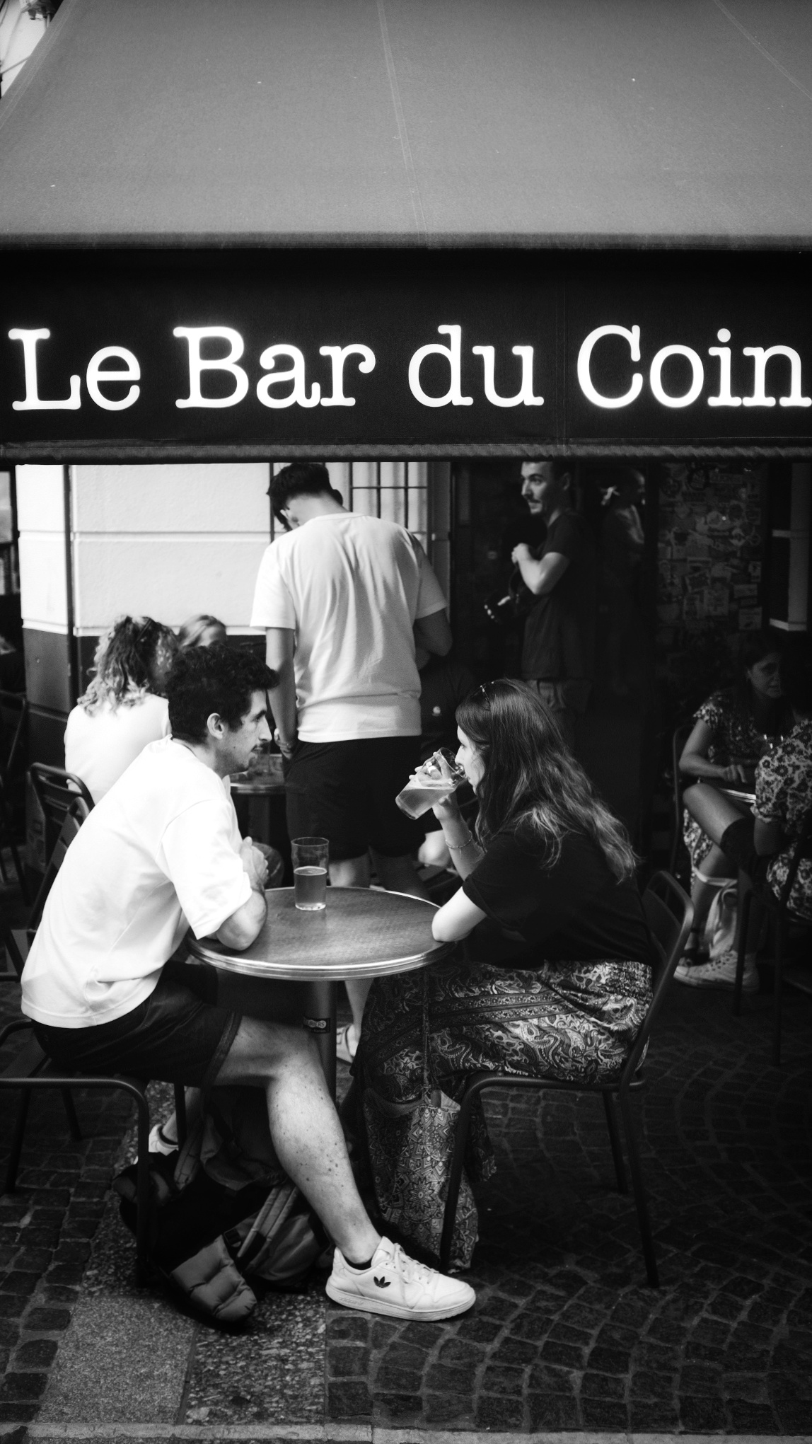
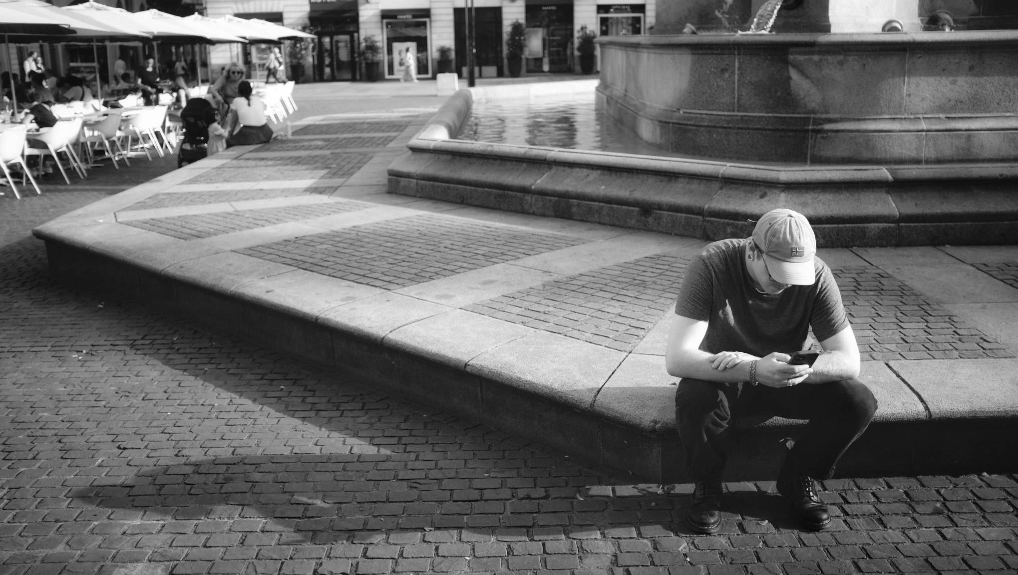
This is one the first things that people will talk about when talking about composition. The idea, as the name suggests is to divide a photo equally into thirds horizontally and vertically, and put the point of interest (subject) where the lines intersect. Or you could have a landscape photo where sky will take up two thirds of the photograph and the foreground the other third. In editing software, when framing you shot they will put a three by three grid on your photo automatically. Some digital cameras allow the use of this grid inside the viewfinder. When taking a portrait you would ideally have the eye where the lines cross. Yes Ian, but this has been done, done, and done again, and has become a cliché I hear you say. Possibly, but it works mate! Don’t knock it. As I said earlier, learn the rule, master using the rule, and then you might consider breaking the rule, but it will be a conscious decision and above all, deliberate. But it will permit a pleasing and natural result.

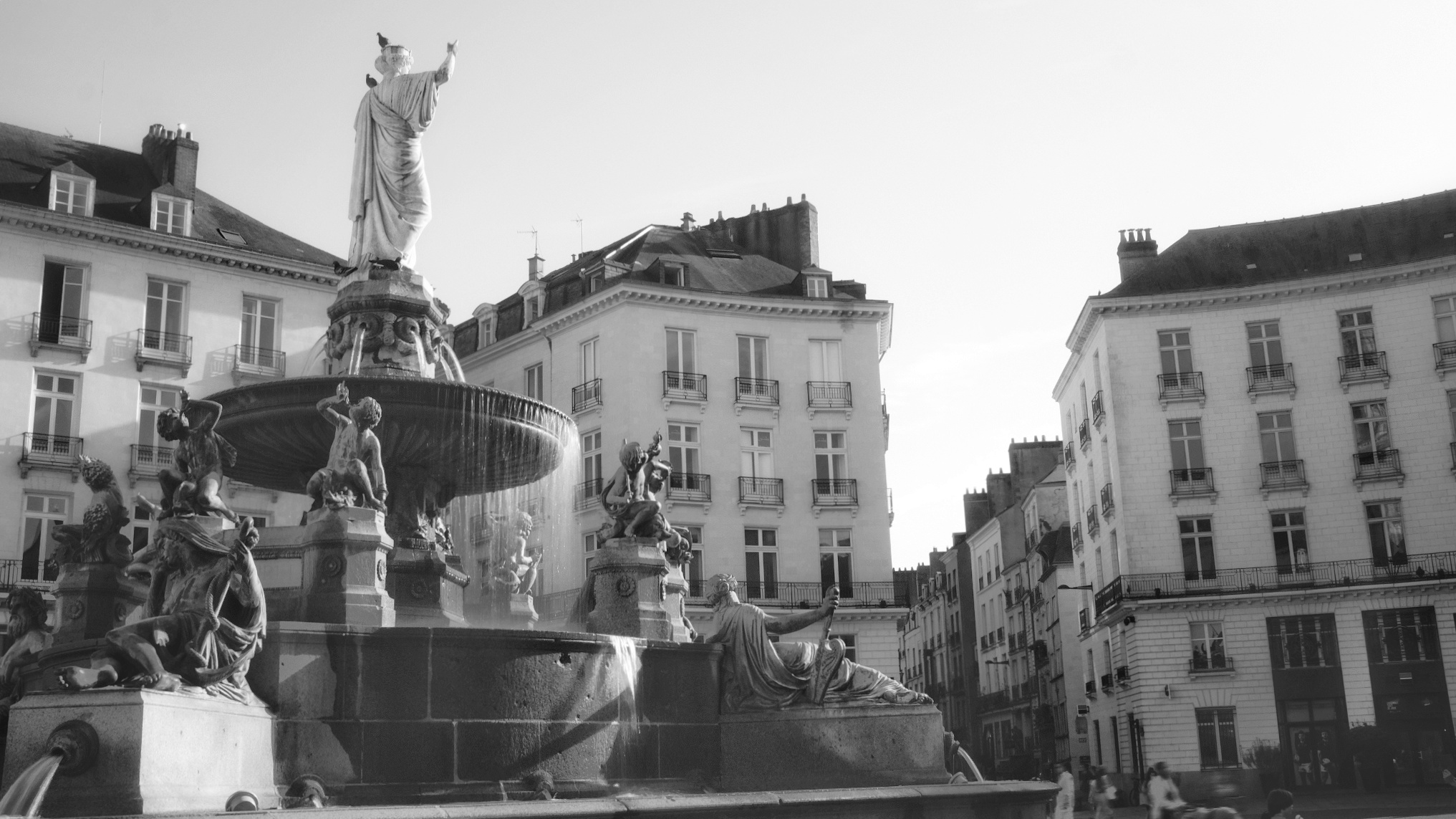
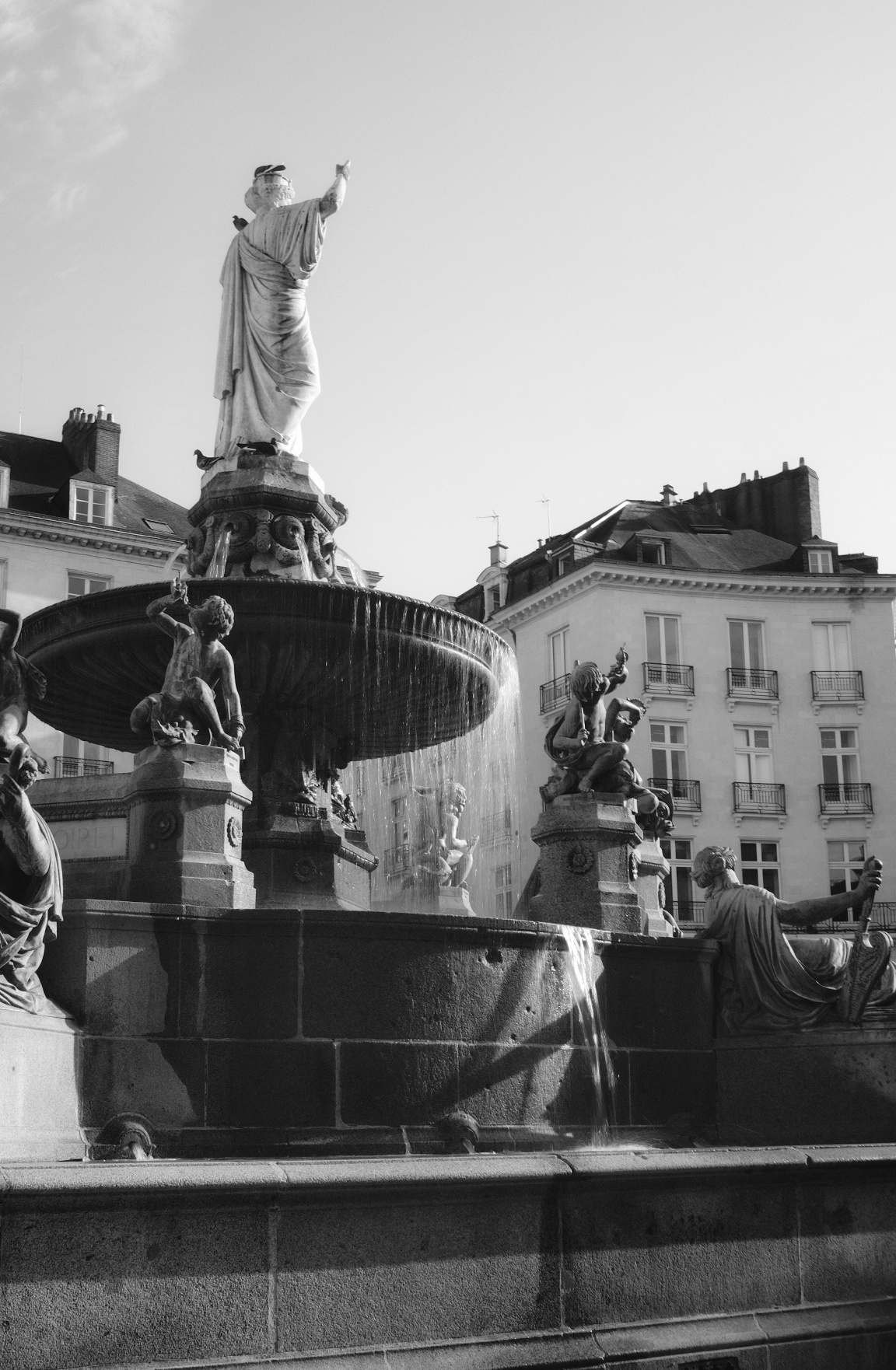
Leading Lines and Perspective
Leading lines are lines that lead the eye into the photograph, turning it into something dynamic. The lines will converge on a certain point in the image, which, if you want, can be on the grid that I described in the last section. This point is the vanishing point, and give geometrical forms to your image, and can lead to the subject of you photo. When using straight lines,you can emphasis to shapes in architecture and acquire a very “graphic” image. Using a wide angled lens or even a fish eye lens will emphasize these line even further and the distortion of these lenses will add even more interest to your image. I will talk about the most common lenses in a future article. We’re not there yet. The lines don’t have to be straight, they can be curved or S shaped. Think of a winding road in the countryside. Whichever version you use, there will be a feeling of being drawn in to the scene.
In the first photograph of the original Pegasus Bridge all the lines converge to a central point with a person standing which gives us an idea of the scale of the bridge. These straight geometrical lines give a feeling of stability and solidity.


In the second photograph, we can see an image that uses an S curve, and as you can see, the effect is totally different. More subtle, but they eye is still drawn in to the image.
Leading lines can appear in nature and in the landscape. Look at the way that the tree line and lines in the mountains converge on a specific part of the photograph and show the different layers of the photograph.

I seem to use them in quite a few of my photos, and with time, you won’t even have to seek them out. You will be lead…
Symmetry in photography
In last week’s article we talked about exposure and how it is a balancing act between the three elements: film sensitivity, aperture, and shutter speed. We can find this symmetry in our compositions too.
Symmetry in photography is a fundamental principle that enhances the visual impact of images. It involves balancing elements on both sides of a central axis or point. There are various types of symmetry, including horizontal, vertical, radial, and bilateral, each offering unique opportunities for creating appealing compositions. Symmetry naturally draws the viewer’s eye, adds stability, and is particularly useful in architectural, landscape, and macro photography. However, breaking symmetry with a contrasting element can introduce tension and creativity. By framing subjects thoughtfully, adjusting camera angles, and recognizing symmetry in both natural and man-made subjects, photographers can master this powerful tool for captivating compositions.


In summary, symmetry in photography is about creating balance and harmony through the arrangement of elements within the frame. It provides a sense of order, highlights patterns, and engages viewers, while also allowing for creative deviations when necessary to convey a specific message or emotion.
Conclusion
Firstly let’s not be fixated by these rules. I was right to describe them as “guides” to composition. Talking about them is fine, but we have to put them into action. Don’t try to do them all at once. Take one rule. Look at it closely. Think how can I use this one rule? How can I master it, or at least take it on board. When you think that is is engrained into your mind, then start using a different concept. I can’t stress that when learning, take your time. Let the concept become second nature.
There will be occasions when you feel that you are no longer advancing in your composition, but stick at it. You will not obtain mastery after just one outing. I’ve been doing this for 40 years and am still learning something new each time I go out with my camera. People talk about being on a photographic journey, and that is a very good way of looking at it. You can’t run before you can walk. Don’t let yourself be overwhelmed by what you might see on Instagram, or even on this blog. We are all at different places on this path.
In next week’s episode we will explore framing, negative space, colour theory, texture. There will be a third article to cover pattern and repetition, scale and proportion, depth and layering. There are so many points to talk about in composition that we may even have a fourth article but we’re not there yet!
See you next week. Until then, keep shooting!