The HP5 Plus 100 ASA Experiment: A Happy Accident?


Hello lovely people.

I’m a bloody fool. I made the stupidest of mistakes when shooting HP5 Plus 400 speed film at ISO 100.

I’d been intending to use 100 ASA film in my Nikon FE, so in preparation, I had set my camera’s ISO dial to 100. I loaded the HP5 and forgot to change this blasted setting. By the time I realised, I had already taken “some” photos. I didn’t want to wind the film on to change the setting because the sun was shining and I didn’t want to waste the light.

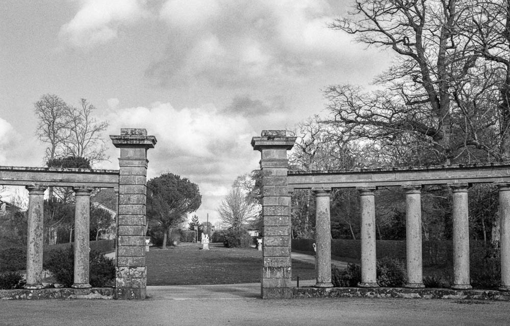
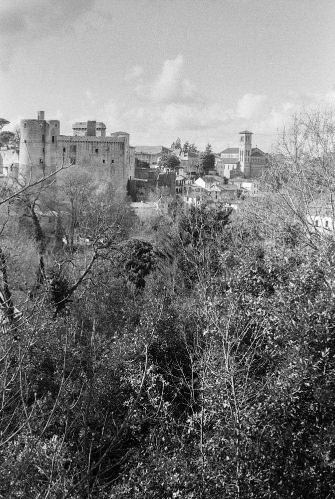
In for a penny, in for a pound. I thought, “What the heck?” They say you have all this “latitude” with film, so I went online to find out if I could salvage the roll. Here we go for a walk in the Parc Garenne Lemot in Clisson.

I developed the film in Ilfosil 3 (1:9) and used the development times for Kentmere 100, praying that I would have something usable…

ParameterDetails
FilmIlford HP5 Plus 400
ExposureRated at ISO 100 (2 stops overexposed)
DeveloperIlfosol 3 at 1:9
Development Time5 minutes 30 seconds (using Kentmere 100 time)
ResultLower contrast, smooth tonal transitions, fine-looking grain, excellent shadow detail
CameraNikon FE
LocationParc de la Garenne Lemot, Clisson

THE STATUE – Front view of classical statue on pedestalThis shot demonstrates the beautiful tonal range achieved through pull processing

The Theory: Pulling Two Stops

For those who aren’t deep in the film weeds, here is what I actually did. By setting my camera to 100 ISO while using 400 speed film, I was overexposing by two stops.

Now, common wisdom says that pulling HP5 to 200 ASA (one stop) is perfectly fine. But I thought I was pushing my luck pulling it two stops to 100 ASA. I thought I was taking the mickey with the film gods.

By giving it extra light and less development (pull processing), I was essentially asking the film to reduce contrast and grain significantly. I was testing just how much abuse it could take before the negatives turned into flat, grey mush.

I didn’t develop it for standard HP5 400 times. I treated the whole roll as if it were 100 ISO film from start to finish.

The Results

When I scanned the negatives, I was genuinely surprised. The negatives were dense, but not unmanageable. The scanner handled them well. Here is what the process actually looked like in practice.

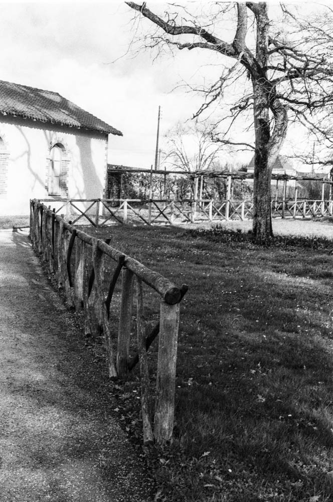
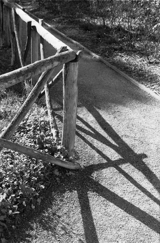
1. Rich Shadow Detail

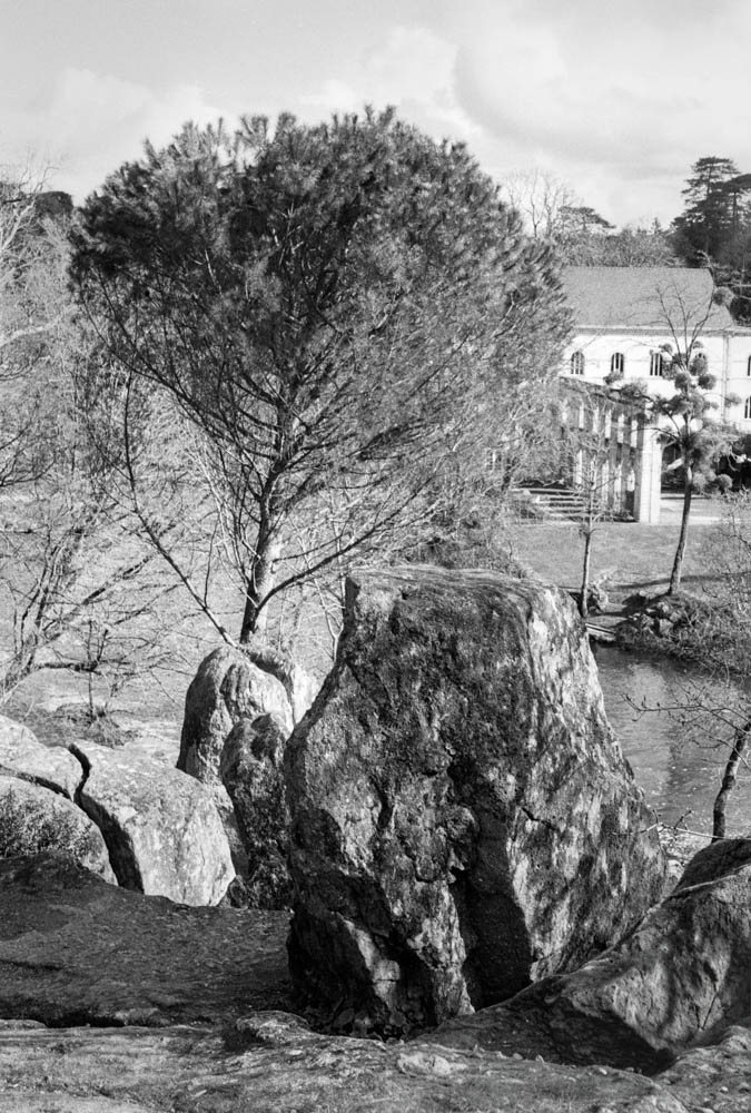
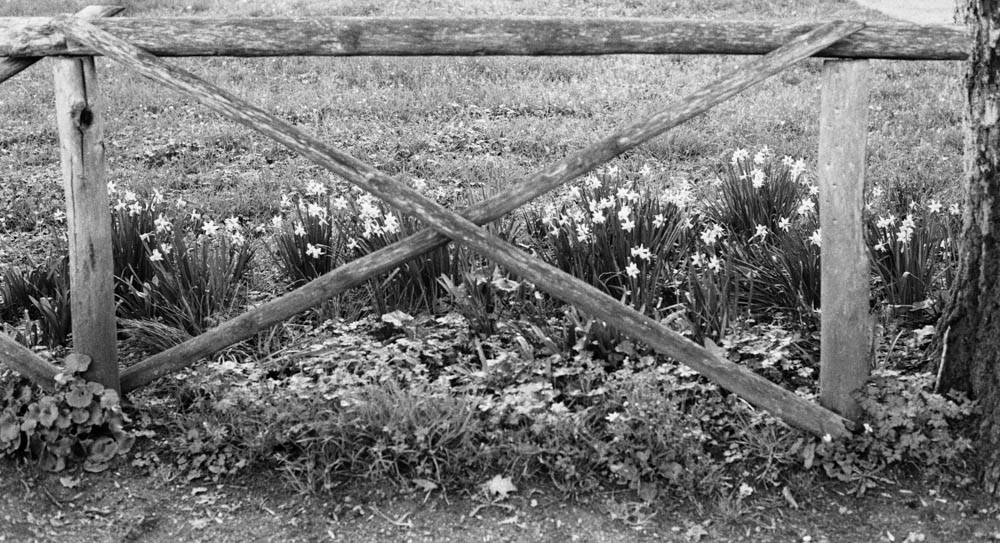
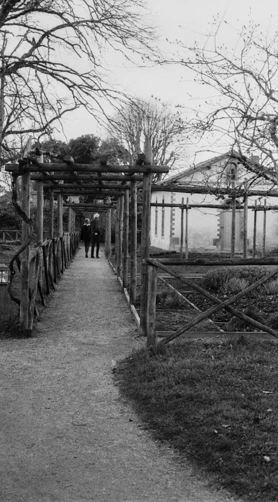
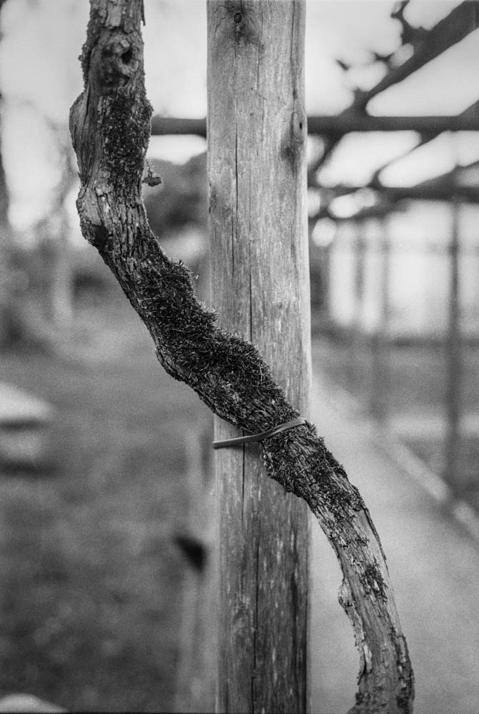
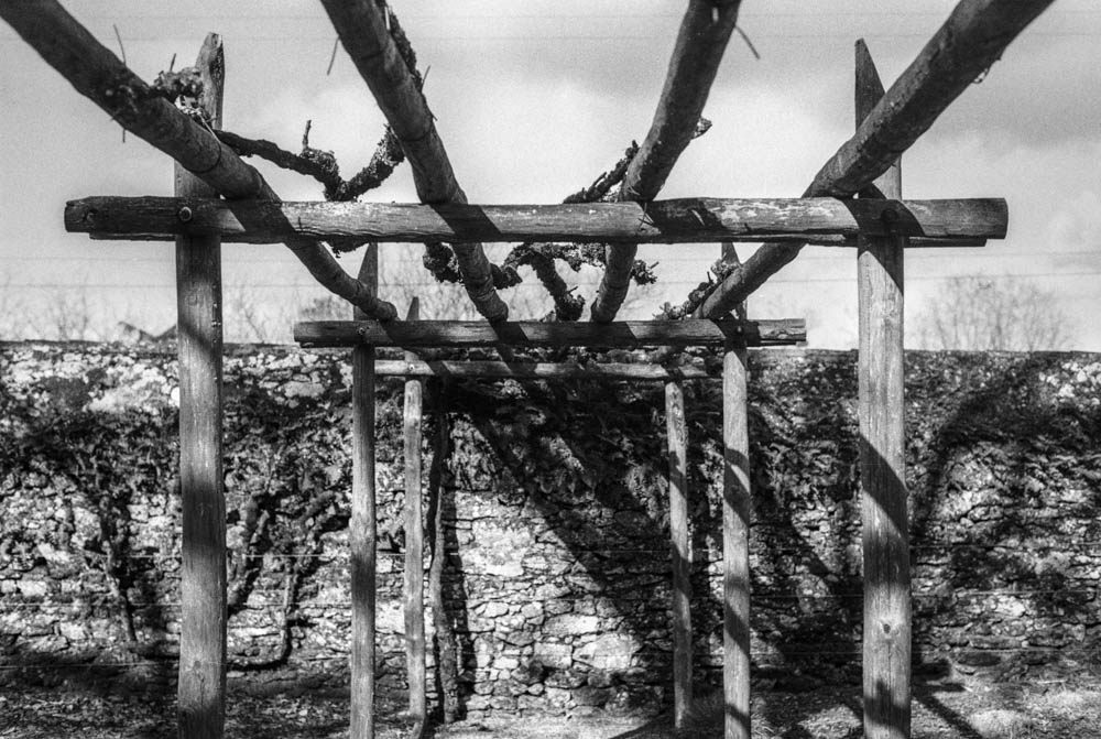
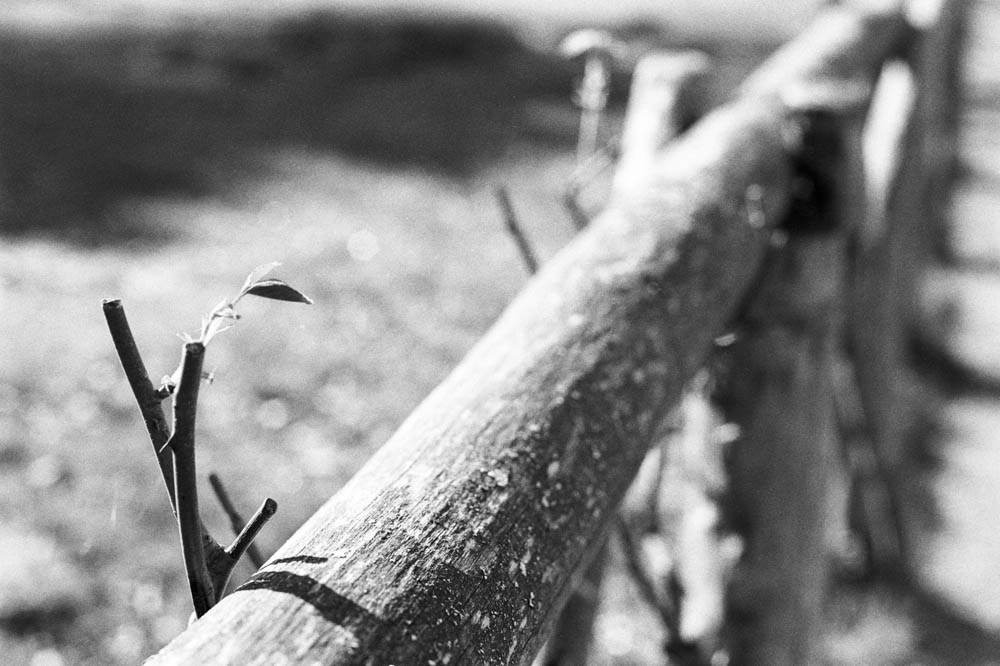
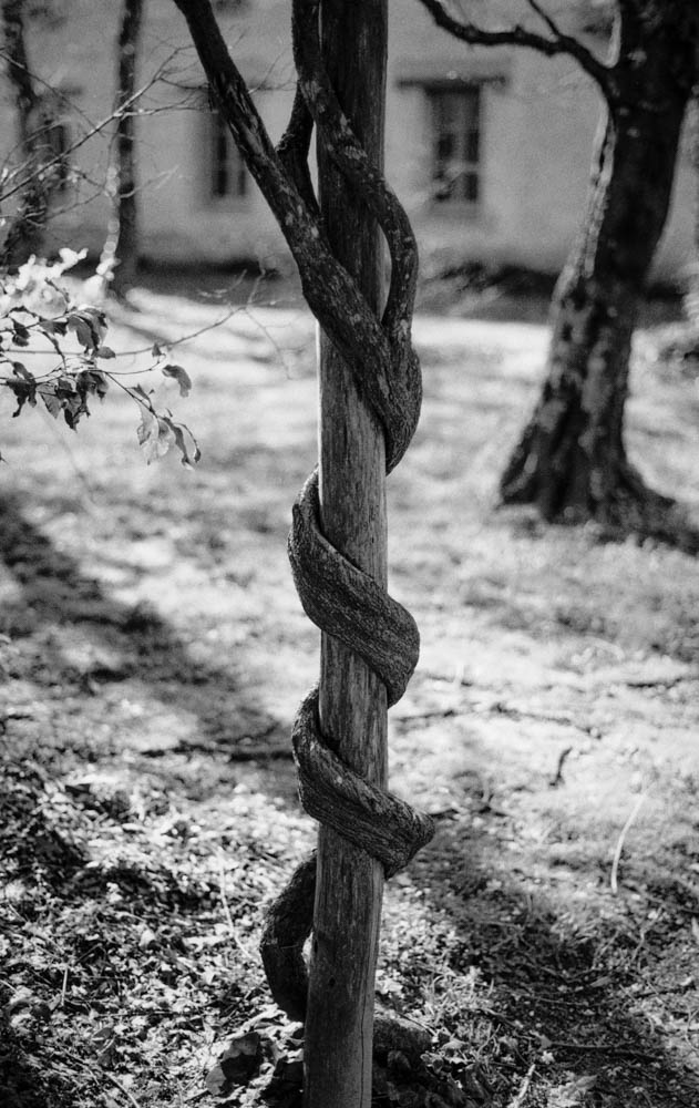
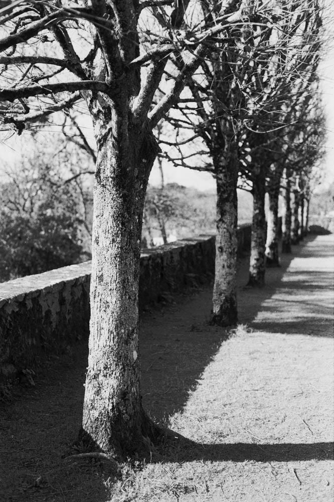
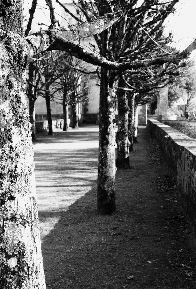
The first thing you notice is the lack of “muddy” shadows. Usually, HP5 can get a bit grainy in the dark areas. Here, the shadows under the pergola and the fence are deep, but they still hold detail.

FENCE WITH LONG SHADOWS – Diagonal shadows cast across gravel pathNotice how the deep shadows still retain texture and detail in the gravel

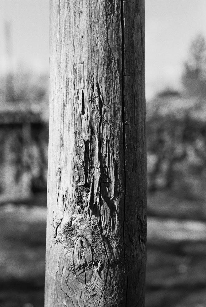
2. Texture and Grain

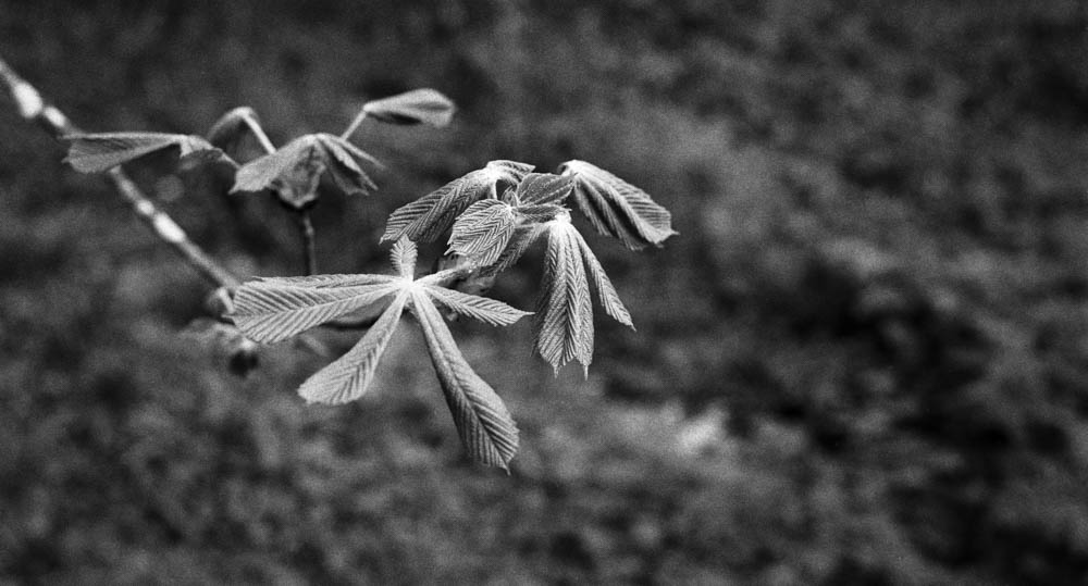
This is the real winner for me. Look at the texture on the wood in these shots. Because I gave the film extra light and reduced the development, the grain structure is much finer than usual. It looks almost like a slower film (like Delta 100) in the mid-tones.

WEATHERED WOODEN POST – Close-up showing wood grain and textureThe fine grain structure is clearly visible in the wood texture

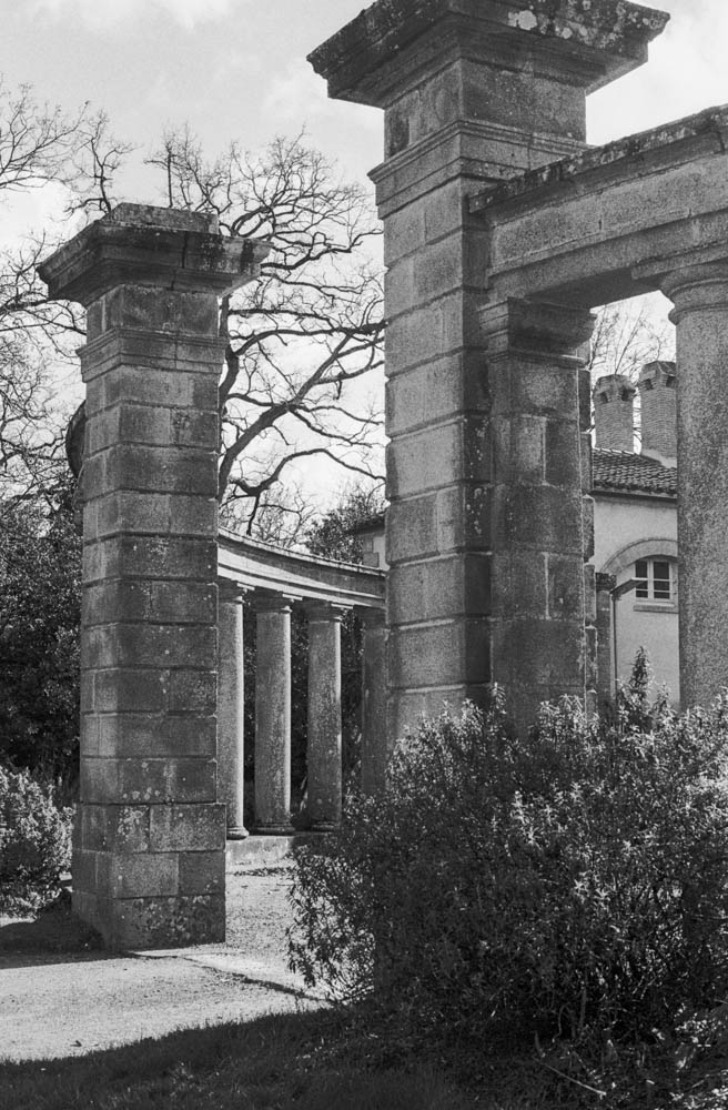
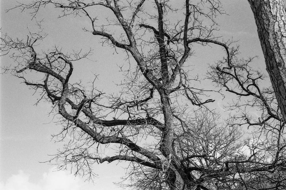
3. Highlight Control

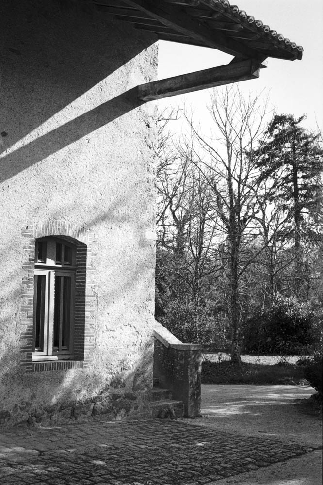
I was worried the bright spring sun would blow out the sky. Looking at these branches against the sky, you can see a beautiful grey gradient rather than a blown-out white. The reduced development time really helped keep those highlights in check, even with the two-stop overexposure.
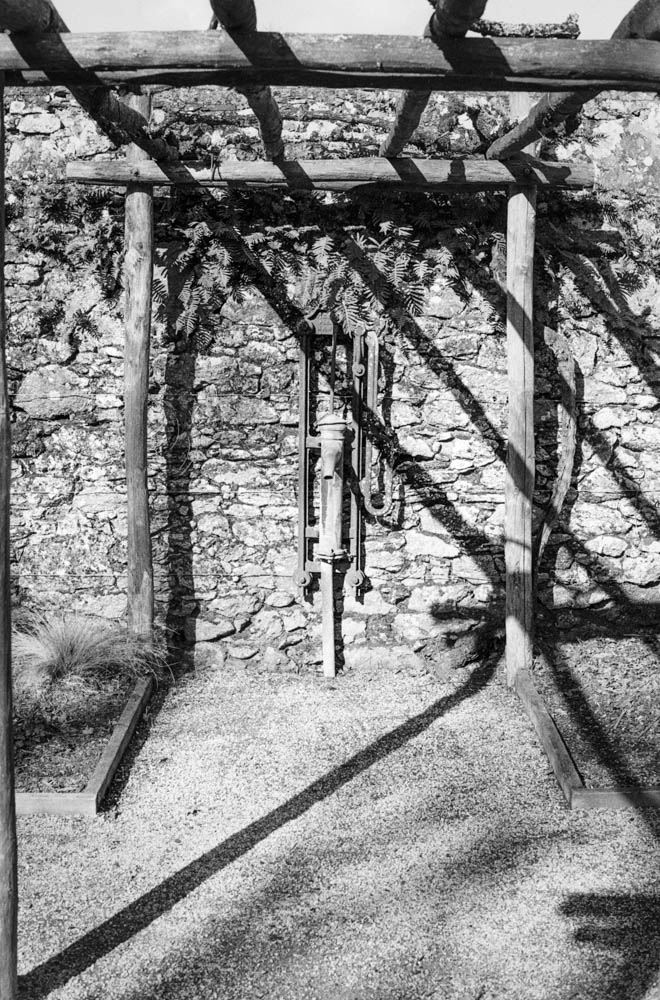
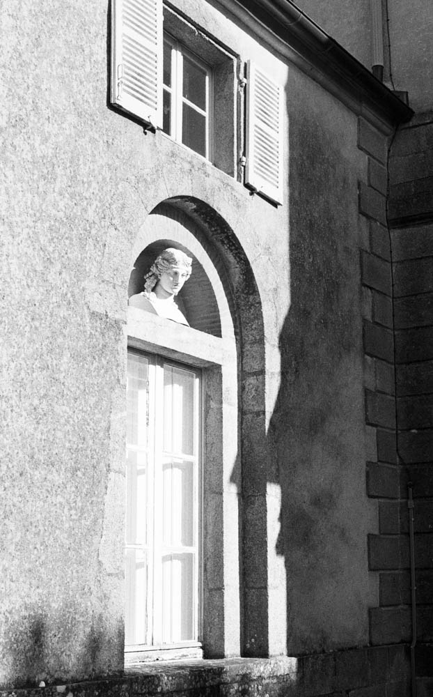
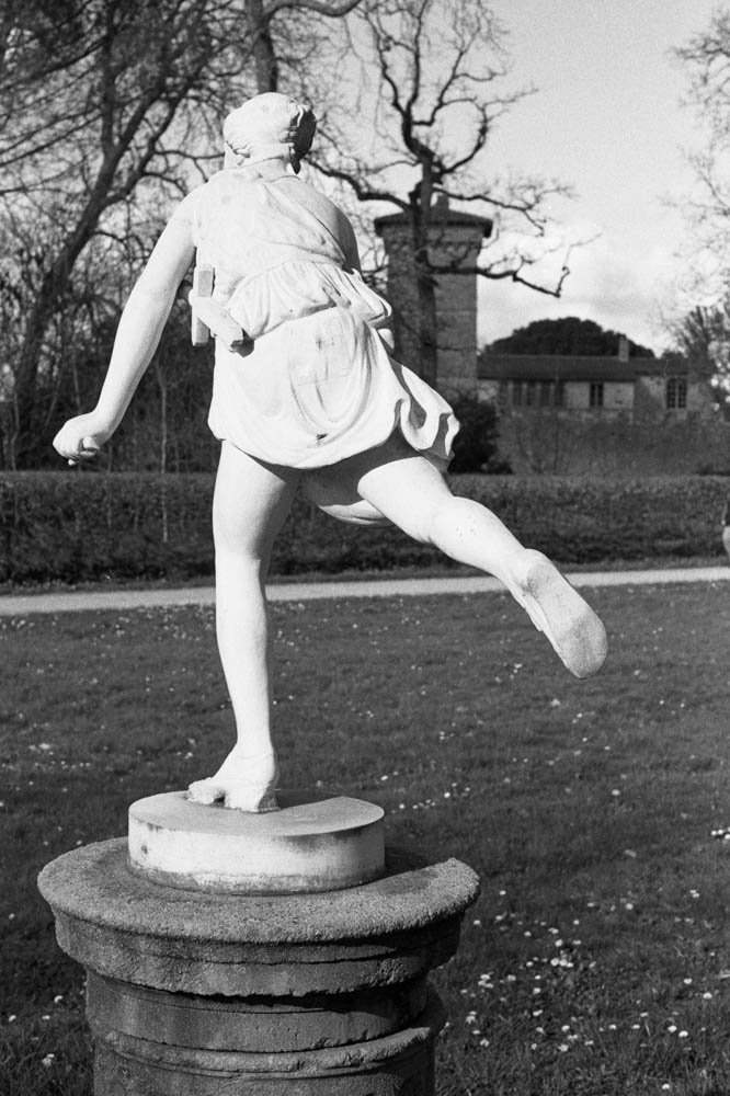
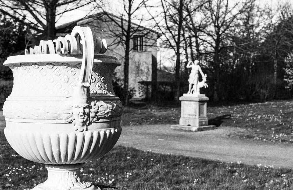
BARE TREE BRANCHES AGAINST SKY – Intricate branch pattern with grey skyThis is the proof – the sky retains beautiful tonal gradation despite overexposure

4. Tonal Range

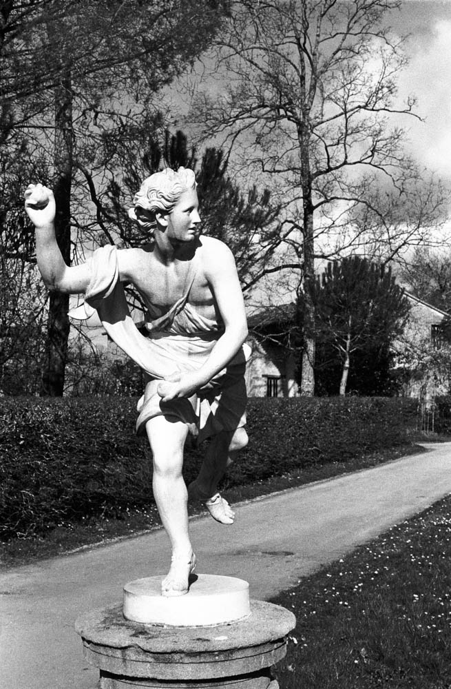
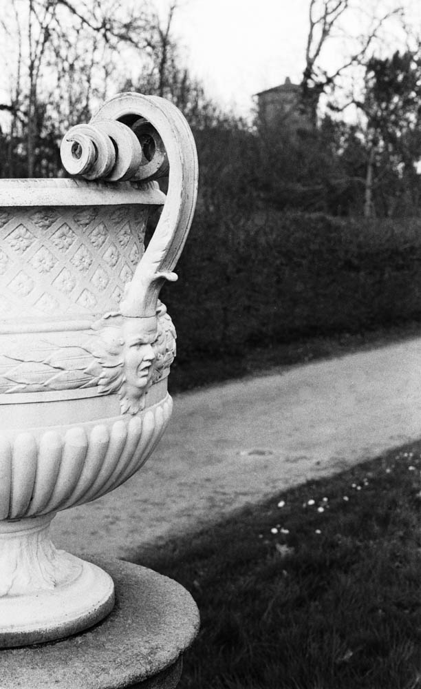
From the white marble of the statues to the dark foliage, the tonal separation is superb. The process gave me a creamy, classical look that I might not have achieved at box speed.

ORNATE URN WITH STATUE IN BACKGROUND – Layered compositionForeground and background detail with smooth tonal transitions
CLASSICAL COLONNADE – Stone pillars with cloudy skyWeathered stone texture and cloud detail demonstrate the technique’s versatility

The Verdict

So, was this a disaster? Absolutely not.

In fact, I was pleasantly surprised. Because I gave the film so much light and reduced the development, the shadow detail is incredibly rich and the highlights are held back. There is virtually no grain in the dark areas. The contrast is lower than standard HP5, which gives it a very smooth, almost medium-format look.

Ornate scrollwork detailRazor-sharp detail and micro-contrast prove no sharpness was lost

It turns out, what I thought was a stupid mistake is actually a technique some photographers use on purpose! Pull processing HP5 (rating it at 100 or 200 ISO and developing accordingly) is known to produce finer grain and lower contrast. I thought I was pushing my luck going two stops, but the film handled it like a champion.

Would I Do It Again?

Would I deliberately shoot HP5 400 at 100 ASA again? No, probably not. If I want 100 ASA film, I’ll just use 100 ASA film. It’s cheaper and more straightforward.

But it’s damned good to know that at a push (sorry, pull), it could work. If you’re ever in a situation where you’ve loaded the wrong film, or you’re caught out by changing light conditions, HP5 Plus can take the abuse.

Have you ever accidentally shot film at the wrong ISO? Did you save the roll or bin it? Let me know in the comments below.

Happy shooting

Ian from IJM Photography

Post Scriptum:

Optimizing Images On-the-Go: Mobile Photography Editing Guide


Introduction

As the title suggests, I will describe my workflow when out and about. While there are surely other ways to do it, this is my method. It works and has stood the test of time. I usually wander around taking photos, then find a café to sit down and transfer my images to my phone. Everything is better with a nice cup of tea (or coffee) and a piece of cake.

Downloading Photos to Your Phone

Most cameras today can connect to phones via Bluetooth or Wi-Fi. My two Fujis (X100F and XT2) and my Canon (6D Mark II) certainly can. I enable Wi-Fi on my camera and connect it directly to my phone. Next, I open the corresponding app—Canon Camera Connect for my Canon and Fujifilm Camera Remote for my Fujis. Each manufacturer provides its own app for Android or Apple devices. Once the camera is connected to my phone, I can import my photographs, selecting the images I prefer.

Sorting Photos

Now comes the fun bit: sorting through all those wonderful shots you took and deciding which ones are worth working on and editing. When I transfer my images from my camera to my phone, the phone creates a folder for the imported photos. Different apps will put them in different places, so I’ll leave that to you to manage. As a rule of thumb, you will see them in the gallery app, which will show you your latest photos.

In the gallery app, you can sort your photos by date taken, favourite images, or the place where the photo was taken.

I will assume you have read my last few articles on Photography 101, composition, and the types of lenses available and how to use them, or at least how I use them. If you haven’t had that pleasure, then go and have a read…

Is the photo worthy of publication, and are you happy with it representing your talent as a photographer? Is the image in focus? Is the image well exposed? Does it fulfil its storytelling role? Will it add to your narrative? Or simply, do you like it enough to want to share it?

Let’s assume that you answered yes. You then get to share your image to Snapseed.

Editing in Snapseed

Starting with Styles:

I like to begin by using the “Portrait” style. It is a preset that gives the photo a subtle glow and some vignette. I just seem to like it, and when you have something you like that flatters your image, you are tempted to stick with it. Most times, this will work a treat on well-exposed images. But let’s imagine that you have exposed for the highlights and that your shadows are “too dark” and you want to bring them up a bit. Then I would go to the “Tools” section and use the Tune Image.

En aparté:

When exposing in digital photography, we expose for the highlights, as it is easy to lighten, or “bring up” the shadows, and we don’t want to “blow out” our highlights and just turn it into a mass of white. In film photography, it’s the opposite. We expose for the shadows, as film has more difficulties capturing details in the shadows especially in a photo with lots of light.

Using the Tools

As I inferred in the title, this is my workflow, and shows the way I use Snapseed. There’s a whole load of tools to stylise your image and to completely change the look of it, but I’m more of a “less is more” disciple when editing. Also most apps out there will have similar tools, so you can carry this knowledge with you across the board.

Crop Tool:

One thing I learnt early one is to KISS, i.e. Keep it simple stupid. Sometimes I will have an element in my photo that distracts from my subject. With the crop tool I can just crop the image and make it disappear. I can also use the crop tool to format the image to fit certain social media post settings. I’m thinking about you Instagram and Facebook. Try searching google for social medi formats and you will be inundated with results.

Healing Tool:

Sometimes the crop isn’t enough to take away distracting elements from our photo. You might have a beautiful shy and want to get rid of that Jumbo Jet in the sky. One way of doing that is to wait until the Jumbo Jet has flown away, but let’s say that it’s too late… Using the healing tool will clone part of the image and replace the Jumbo Jet that just wants to noticed and validated man! To get the best results it’s better to zoom into the image and have a smaller area to work on.

Tune Image:

This is where I do the basic edits, bringing up the shadows or bringing down the highlights. I usually keep it to that. At a push, I will bring up the brightness if the photo has been underexposed. Somtimes I will add a little contrast but I tend not to use the other tools. I don’t want to denautre the photograph.

Rotate Tool:

We should always try and keep our horizons straight, except when making the conscious decision not to. The rotation tool tries to straighten what it thinks should be straight. It generally works quite well, but you do have total control as well as a grid to check the lines in your photo.

Brush Tool:

This is where we can do our burning and dodging. You can choose to highlight a certain area and darken others to emphasise your subject. This brings the photo to life. There are tutorials galore on YouTube that go into more detail than I will in this “basics” article.

Black and White Tool:

Welcome to the world of black and white conversion. It’s a process that a majority of my photography goes through. You can, of course, just use the saturation tool in the “Tune Image” section, and you will get a monochrome image. But you can do so much more.

So, let’s do so much more. The black and white tool offers you some presets which might correspond to your taste. I tend to leave them alone and instead press on the circle that will give a series of colour filters to choose from. This is a direct link back to black and white film photography, and you know how much I love that. I love using the red filter, which, as in film photography, will make your blues darker. This is beautiful for those landscape photos where you want a dark sky to complement those fluffy white clouds.  It’s also my default film simulation on the X100F that I use for all my street photography.  It’s just a look that I fell in love with years ago.
The other common filters are all covered too.

  • Orange:  Orange filters give stronger effects than  yellow filters but are not as bold and dramatic as a red. It is therefore an ideal choice to span the effects given by both these filters.  Blue skies will be recorded in very dark tones on the print, giving bold contrast between the sky and clouds. An orange filter will also penetrate haze and fog. Most flowers will be recorded with a significant difference in tone from the surrounding foliage giving impact and effect.
  • Yellow, the general purpose black and white filter,
  • Green:  When photographing foliage in black and white, a green filter is used almost exclusively.  It lightens green foliage, which is particularly important with dark green leaves which can record very dark without a filter. It therefore gives a more natural, lighter feel to the photograph.
  • Blue: A blue filter is not often associated with black & white photography however, it can really add “mood” to a photograph by increasing the effect of haze or fog.  It also lightens blues and darkens yellows, oranges and reds which helps separation in scenes containing a mix of colours.

Export

You have two options.  You can either press on “done” and Snapseed will record your image in the Snapseed folder and in your gallery in the Album neamed Snapseed, or you you can press “share “and you will be presented with various options on how to share your image, to Instagram, via gmail etc.

Before you do that you can press on settings where you can change the resolution of the image that will be exported.  This can help if you need to reduce the image to take up less space on your phone, or if you’re loading the photo up to a website and you require a “lighter” image.

Conclusion

You now have an idea about how I edit my images on the go, and the more time goes on, the more I do it this way.  Is it the same as Lightroom on my computer?  No.  I can’t have as much control as in Lightroom. I can’t batch edit, I can’t do this or that, but I can manage without, especially on the go.  There are of course other options for photo editing on the go like Lightroom mobile,VSCO, your native photo editor app on your phone.  As I said at the beginning of the article this is how “I” do things.  It works for me.  Try it out and it might just work for you too!

Seeing the World Through 35mm: Street Photography with the Fujifilm X100F


Introduction

I have been writing for this blog for a while now and everytime I get a comment it feels wonderful. Especially when I get a thought provoking comment.  LIke this one from my friend Joe:

Excellent post Ian I admire your willingness to stay neutral on the merits of which focal length lens is better for street photography. I personally find the 23mm 2.0 Fuji lens fairly close to what my eyes are seeing before I take the image. Of course we are talking about lenses designed for the APS-C sized Fuji sensor so 35mm would be the equivalent field of view for my 23mm lens (23mm x 1.5 = 34.5mm). Undoubtedly some people will say the nifty fifty is a closer field of view to what the human eye sees but in my opinion I will leave that up to other people that may care to argue that point….
Sorry for my long winded response but I enjoy your articles so much I cannot resist replying even though once I get started you can’t shut me up

I am grateful for Joe’s thoughtful comment and I am still going to stay neutral, and just explain why I use the 35mm (equivalent) on my X100F, for street photography, and environmental portraits, despite having the teleconverter to convert that lens into a 50mm (equivalent) lens.  As a special bonus I will present my latest street photography from Nantes, which just goes to show the sun can shine on us…

The Appeal of the 35mm Lens

The 35mm offers a world view which is very similar to that of the human eye albeit with a very slight distortion that disappears at 50mm.  So, when on the street, we know that our image will have much the same view as what “we” see.  When I get really close for a close up of a subject, the possible distortion remains manageable and doesn’t distract from the subject.   

My Journey with the Fujifilm X100F

I have fanboyed and waxed lyrical about this camera in previous articles and will not do that here. However, I have had mine since 2018 and still use it on a very regular basis, which tells you an awful lot. I use it during travel and when doing street photography because it is light, takes up next to no space, and is subtle, unlike the huge DSLRs and their massive lenses. Moreover, I have enough self-confidence to not need to compensate for anything. It’s also a very sexy little camera, and over the years that we have been together, I have learned how to use it to its full capacity. I can use it intuitively without having to think, which is always a relief. According to camera manufacturers, six years is a long time to be with just one camera, but the costs of replacing it with the latest version are prohibitive, and not enough of them are being produced. The old argument about one in the hand still holds true.

The Versatility of the 35mm Lens on the X100F 

The versatility of the lens, as with any lens, depends on the person “behind” the camera. I use it for documenting a scene. It’s just wide enough to get a good view, but not to distort or have too “busy” a scene, as can happen with the 28mm. It’s great for portraits. Dear Reader, I know I have previously talked about the distortion when close up, but what it is great for is a portrait of a person in his environment. It gives us more context about the person and tells more about him, as we can see his surroundings. Because of the silent shutter, I can also get nearer to my subject without making a flapping mirror sound when I press the shutter button. At F2.0, I can either get massive depth of field or shoot in relatively low light. My basic setup is ISO 3200 and F2.0. But on a day like today, I will put it into ISO 400, and if things get really bright, then I can use the inbuilt ND filter.

Comparisons with Other Focal Lengths

I have already touched upon the differences between the 28mm, the 35mm, and the 50mm focal lengths, but let’s get real for a second.  The 28mm is great, but too much distortion and makes the image very busy because of the wider field of view.  This is fine when used with intent, but you have to be so much more careful with your composition.  The 50mm is the lens that I grew up, but after having used the slightly wider 35mm, I find myself backing up to get the same field of view, which leads to banging into things and apologising profusely to the bin that I have just reversed into.  It has happened!

Practical Tips for Street Photography with the 35mm

Just use it, go back and use it again, and if you have any doubts then just go out and use it once more to be sure.  Don’t overthink it.  Don’t worry about the distortion I have mentioned.  It only really happens when you get right up to your subject.  If you have only used the nifty fifty then you shouldn’t notice a huge difference, but physically you will.  You’ll be moving closer to things, but it’s just “one step up.”  It will seamlessly “grow” on you.  

Be the man in grey, or whatever colour you fancy, but know the environment in which you’ll be shooting.  You might want to avoid fuchsia if you’re going to be in the woods shooting, or in that beautifully tailored three piece suit if you’re going to be in the stands at a football match.  Think sore thumb and being out standing in a field.

Conclusion

If you so wish, you now have the arguments for and against the 35mm lens.  I don’t think that arguing about ti will get you anywhere though…  The lens, as the camera, is a tool at your disposal to create an image.  Just getting a new lens won’t change your life despite what the guy in the shop might tell you.  You “can” use a 50mm for street photography, and some even use the 85mm to go for more details, and more candid shots.  Use what you have already.  I have just talked about my experience since using the 35mm (equivalent) on the X100F.  The information is purely subjective.  If you want an X100, then by all means go out and buy one.  Maybe go for an older model like the X100F or even the X100T for the price difference.  Or if you can get your hands on one, the X100VI is wonderful.  At the moment however, I cannot justify buying a more expensive camera to my wife!

I’ll leave you the comments section to debate the various merits of each piece of kit.  And you can use the hashtag “#ijmphotography” to share your images with me on the gram.  Look forward to hearing from you.  Until next time…