
In my last article, we talked about three of the rules of composition, rule of thirds, leading lines, and symmetry. We talked about the origins in classical art, as well of how to use them in our photography. We also explored the implementation of these rules “or guides” and how we should practice each one, master it, and then move on to the next one. You will still have your photos for the “Gram,” but more importantly, you will be growing as a photographer, gaining experience, and building a body of work. You will, by definition start becoming more deliberate in capturing your shots, and will be more mindful than somebody just shooting blindly and praying that they get at least on shot!
In this article we will continue to explore certain concepts that be used to make our photographs even more engaging and interesting. We will explore framing, i.e. using frames with in frames, and the use of negative space, used to isolate of emphasize our subject, and go minimalist.
Framing
When I say the word framing, I’m not talking about the gilded golden frame that you will use to frame your photography to give as gifts to your mother-in-law, but using visual frames inside your image to “frame” your subject…


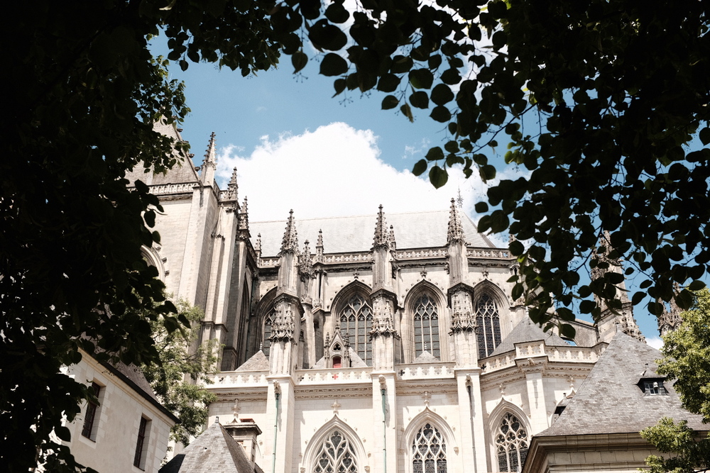
These examples illustrate how framing can be a powerful tool in photography, guiding the viewer into the image and providing depth and context to the subject or scene being captured. A technique that can make your photos more engaging and immersive. You can use trees, windows, element on the ground, buildings. Go out and explore the world around you and try and “frame” your shots.
Negative space
Negative space is the space that surrounds our subject, this empty space or unoccupied space is almost as important as the subject itself. It’s role is to create balance in the image and adds to the importance of the subject.


Key points
This negative “space” around the subject gives the subject room to breath, and takes away the clutter so we can concentrate on our subject. It emphasizes the subject and leaves no doubt where the subject is to be found. For those of you who want a “minimalist” approach to photography, it is one of the best ways to do this. Less is more after all. Think of simplicity, tranquillity, and elegance. It can be used to create mood and atmosphere, and in landscape photography can portray ideas of solitude or freedom. Think of a vast empty sky and rolling hills. Negative space doesn’t have to be completely devoid of detail. It can be an area of uniform colour or texture that complements the subject and adds visual interest, or we can use depth of field to emphasize our subject
When using negative space, it’s essential to pay attention to the balance between the subject and the surrounding empty areas. The goal is to create a harmonious composition where the negative space complements and enhances the subject, rather than overpowering it. This technique can lead to powerful and emotionally resonant photographs, adding depth and impact to your work.
When you look at my photos of the girl against the colourful walls in Trentemoult in Nantes, think about how placing the model on the left or right of the frame makes you feel. Looking forwards or looking backwords…
Colour Theory

Colour theory is not just for those trendy designers in those advertising agencies. If you go onto my Instagram feed, you will see that most of my work is predominantly black and white. “So no colour,” I hear you say. Well, yes and no. Black and white photography concentrates on tones, but we can look at colour in the same way and seek balance in our colours. So what’s this colour wheel then? Well, it’s a way of looking at colours that go together, like green and red (think of Christmas cards), blue and orange, yellow and purple, all these colour are opposite on the colour wheel. Also, think about complimentary colours that are next to each other on the wheel, such as yellow, light green and dark green. You will find yourself becoming aware of colours in nature and how they complement each other. There will be some photographs that depend on this colour for their artistic value, and that won’t work in black and white photography.
Think about the portraits in the previous section and the natural colour in the photos in the country side.
Conclusion
We’ve continued our journey into composition by exploring how to use elements in our photos to frame our subjects. We’ve delved into the concept of negative space, emphasizing our subjects in our images. To conclude, we’ve begun to consider how colour can add harmony to our compositions. My advice is to incorporate these elements into your photography one step at a time. Don’t rush; there’s no need to feel overwhelmed. It’s a lot of information to take in, but as you explore each aspect mindfully, you’ll witness an evolution in your approach. Keep up the excellent work, and I look forward to our next session where we will talk about pattern and repetition, scale and proportion, and depth and layering.


